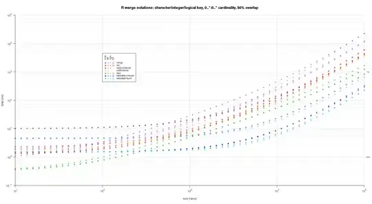
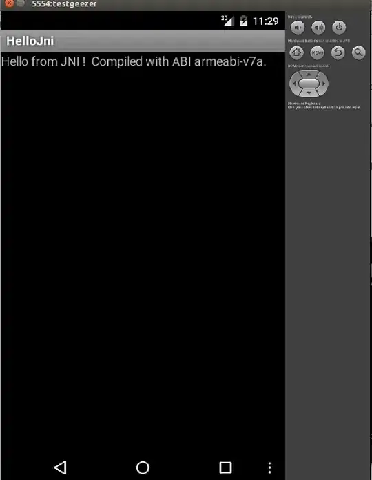
You can achieve this effect with SVG filters.
img {
  width: 400px;
}

.blob {
  background-color: white;
  padding: 40px;
  filter: url(#blobby);
}

/* Hide the SVG element */
svg {
  width: 0px;
  height: 0px;
  position: absolute;
  left: -999px;
}
<img src="https://i.stack.imgur.com/dreFV.jpg"/>
<br>
<div class="blob">
  <img src="https://i.stack.imgur.com/dreFV.jpg"/>
</div>

<svg>
  <defs>
    <filter id="blobby" color-interpolation-filters="sRGB">
      <!-- Convert to greyscale -->
      <feColorMatrix type="saturate" values="0"/>
      <!-- Threshhold to black or white -->
      <feComponentTransfer>
        <feFuncR type="discrete" tableValues="0 0 0 0 0 1"/>
        <feFuncG type="discrete" tableValues="0 0 0 0 0 1"/>
        <feFuncB type="discrete" tableValues="0 0 0 0 0 1"/>
      </feComponentTransfer>
      <!-- Morphology filter to "erode" (shrink) the white areas -->
      <feMorphology operator="erode" radius="8"/>
      <!-- Blur to cause image to "spread" -->
      <feGaussianBlur stdDeviation="10"/>
      <!-- High contrast to threshhold again -->
      <feComponentTransfer>
        <feFuncR type="discrete" tableValues="0 0 0 0 0 1"/>
        <feFuncG type="discrete" tableValues="0 0 0 0 0 1"/>
        <feFuncB type="discrete" tableValues="0 0 0 0 0 1"/>
      </feComponentTransfer>
    </filter>
  </defs>
</svg>
The steps in the filter are:
- Step 1 & 2: Convert from a colour image to greyscale, and then threshold to black or white only.
- Step 3: Use a "morphology" filter element to expand the black areas. This makes the thin parts of the image , like the text, more bold.
- Step 4 & 5: Blur the black areas and threshhold again. This gives the final result a more rounded look.
The values in this filter are tuned to this particular image somewhat. If you need to do this for other images, you may need to tweak the filter element values a little.
Note also that I have put the image inside a white <div>, and applied the filter to the div instead of the image. This is because the filter causes the contents of the image to "expand" and we need to avoid it being clipped to the (smaller) image bounds.


