I have a container with an inner div containing items.
<div class="container">
 <div class="inner">
  <span class="item">1</span>
 </div>
</div>
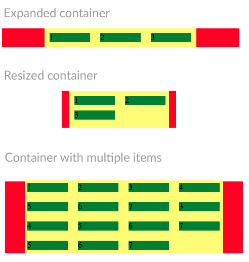
The container or the inner div width is not fixed. The container can be resized. And the inner div should always fit it’s content.
What should happen is, the inner div should always be centered inside the container.
When items inside the inner div can no longer fit inside the container it should break into a second line.
I’m using display: flex and display: inline-flex to center the inner div. But when the items wrap into a second line the inner div takes the container’s width and doesn’t fit the content anymore. Because of that it will not be centered to the container.
Here is a fiddle of how it currently is.
How can I always make the inner div centered to the container at all times while keeping the inner div width dynamic.
Expected results: