Set the following on the grid container:
grid-template-columns: auto 1fr;
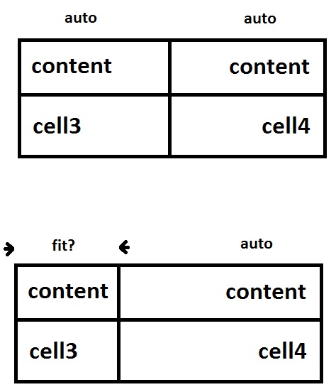
This sets the width of the first column to equal the width of the widest item in that column, and the width of the second column to get the remaining width of the grid.
To right-align the content of the second column we can simply use text-align: right
span:nth-child(2n) {
  text-align: right;
}
div {
  display: grid;
  grid-template-columns: auto 1fr;
}
span {
  padding: 0.5em;
}
span:nth-child(2n) {
  text-align: right;
}
span:nth-child(1) {
  background-color: beige; /* colors for demo */
}
span:nth-child(2) {
  background-color: wheat;
}
span:nth-child(3) {
  background-color: lightgreen;
}
span:nth-child(4) {
  background-color: salmon;
}
<div>
  <span>some content here</span>
  <span>content</span>
  <span>cell3</span>
  <span>cell4</span>
</div>
NB: Setting column widths with min-content is a little more aggressive :) and will set the width of the column to the width of the largest word in the column.
div {
  display: grid;
  grid-template-columns: min-content auto;
}
span {
  padding: 0.5em;
}
span:nth-child(2n) {
  text-align: right;
}
span:nth-child(1) {
  background-color: beige;
}
span:nth-child(2) {
  background-color: wheat;
}
span:nth-child(3) {
  background-color: lightgreen;
}
span:nth-child(4) {
  background-color: salmon;
}
<div>
  <span>some content here</span>
  <span>content</span>
  <span>cell3</span>
  <span>cell4</span>
</div>