1

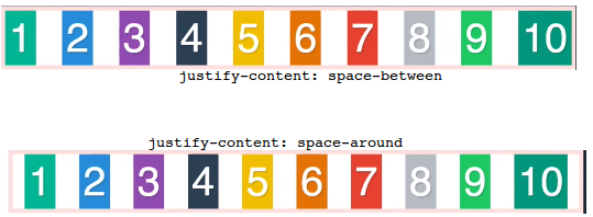
On main axis, justify-content as space-between or space-around looks intuitive.

enter image description here

------------------------------------------------------------

For below elements,

<!doctype html>
<html>
  <head>
  <meta charset="UTF-8">
  <title>Sample document</title>
  <link rel="stylesheet" href="style.css">
  </head>
  <body>
     <div class = "container">
      <div class = "box box1">1</div>
      <div class = "box box2">2</div>
      <div class = "box box3">3</div>
      <div class = "box box4">4</div>
      <div class = "box box5">5</div>
      <div class = "box box6">6</div>
      <div class = "box box7">7</div>
      <div class = "box box8">8</div>
      <div class = "box box9">9</div>
      <div class = "box box10">10</div>
     </div>

  </body>
</html>

with styling on cross axis,

.box{
    color: white;
    font-size: 100px;
    text-align: center;
    text-shadow: 4px 4px 0 rgba(0, 0, 0, 0, 1);
}

.box1{ background: #1abc9c; }
.box2{ background: #3498db; }
.box3{ background: #9b59b6; }
.box4{ background: #34495e; }
.box5{ background: #f1c40f; }
.box6{ background: #e67e22; }
.box7{ background: #e74c3c; }
.box8{ background: #bdc3c7; }
.box9{ background: #2ecc71; }
.box10{ background: #16ae85; }


/* Property of parent container - start */
/* Justify-content works on main axis of the border*/
.container{
    display:flex;
    justify-content: space-between;
    flex-direction: column;
}
/* Property of parent container - start */

Below is the output for both space-between & space-around on cross axis:

enter image description here


In the above output,

What does space-around & space-between mean?

Michael Benjamin
  • 346,931
  • 104
  • 581
  • 701
overexchange
  • 15,768
  • 30
  • 152
  • 347
  • `space-around` mean to share the left space equally, on each side of the item, `space-between` between the item. Simply put, the former acts like a _left/right margin_ and the latter acts like a _gap_. – Asons Nov 08 '17 at 11:03
  • A really important note, `justify-content` affect the _main axis_, not _cross axis_, and no matter which property value being used, so for a flex row it is horizontal and a flex column vertical. – Asons Nov 08 '17 at 11:08
  • 1
    For _cross axis_ one use `align-items`, which has its property values, i.e. `flex-start | flex-end | center | baseline | stretch`, but no `space-*` – Asons Nov 08 '17 at 11:11
  • @VXp flex items shouldn't stetch right? this is where the confusion is. `display:flex` on container makes flex items(within) flexible to occupy atmost space required for it's content. flex item doesn't stretch when I just say `.container{display: flex.}` on main axis. Why flex item should stretch on cross axis, when I say, `.container{display: flex; flex-direction:column}`? – overexchange Nov 08 '17 at 11:15
  • What VXp meant was that they by default stretch in their _cross axis_, where column item fill width and row item fill height. – Asons Nov 08 '17 at 11:16
  • 1
    on a row, container is 100% width , so the space appears if the content all together is less than 100% width. on column, there is no defaut height, elements will stack and container will grow to wrap them. Set an height to the container higher than the heighs of the children and your justify-content rule will dispatch the extra space in between them. – G-Cyrillus Nov 08 '17 at 11:17
  • Does this answer make sense?: https://stackoverflow.com/a/36461099/2827823 – Asons Nov 08 '17 at 11:20
  • @LGSon Before thinking about distributing children evenly across entire width, Let me first understand, why `.container{display: flex; flex-direction:column}` is **breaking** the purpose of flex item being flex to occupy the atmost space required for it's content? flex item should n't stretch, with my understanding – overexchange Nov 08 '17 at 11:23
  • As you can see in your second sample, the items is as wide as their parent. Does that seem strange to you? ... They do as `display: flex; flex-direction: column` work similar to a block element, which takes its parent width. If to be as wide as content, like an inline element, use `display: inline-flex`. ... Does things make more sense now? – Asons Nov 08 '17 at 11:24
  • Irrespective of `flex-direction` value, flex item should be as wide as it's content, **but not** as wide as it's container, because my container is `display:flex` but not `display:block`. It is strange for me that on cross axis(`flex-direction: column`) flex item is as wide as it's container width. – overexchange Nov 08 '17 at 11:28
  • But `display: flex` comes in 2 flavors, like block `flex`, like inline `inline-flex` ... so for `flex-direction: column` the `inline-flex` acts similar to wrapping `div` in a `span` and `flex` like wrapping `div` in a `div` .... and for `flex-direction: row` the `inline-flex` acts similar to wrapping `span` in a `span` and `flex` like wrapping `span` in a `div` – Asons Nov 08 '17 at 11:31
  • @LGSon `inline-flex` acts similar to wrapping `div` in a `span` makes sense to me now, but I did not get you when you say, `flex` like wrapping `div` in `div`, because child `div` occupies container width unlike `flex` – overexchange Nov 08 '17 at 11:35
  • Updated previous comment ... does it make more sense? – Asons Nov 08 '17 at 11:37
  • _because child `div` occupies container width unlike `flex`_, that statement is wrong for `flex`, items work like a `div` when in column direction – Asons Nov 08 '17 at 11:38
  • @LGSon Very first line on flex module in MDN, w3 & other css-tricks should have this [comment](https://stackoverflow.com/questions/47177962/justify-content-on-cross-axis-flex#comment81306074_47177962). – overexchange Nov 08 '17 at 11:39
  • Thanks...:) and agree – Asons Nov 08 '17 at 11:40
  • And now I'm sure Pete's answer make sense. – Asons Nov 08 '17 at 11:41
  • @LGSon one supple question. For layouts using, *block/inline* Vs *flex* Vs *grid*, Can I say that css coding for grid layout is more close to human psychology that visualise the design of a page? In the sense, to avoid less hacks(like applying float, position etc...) in box model & not restricting yourself to one dimension in flex model. How do you see grid model, amidst css coding? – overexchange Nov 09 '17 at 03:05
  • 1
    @overexchange I would say _Yes_ ... and personally, as soon as CSS Grid has the same browser support as Flexbox, I will switch to it in many cases, and it does simple tasks as good too, though there will still be situations where simple block/inline has a role. – Asons Nov 09 '17 at 07:20
  • @LGSon Can you define `grid` in a way you defined flex [here](https://stackoverflow.com/questions/47177962/justify-content-on-cross-axis-flex?noredirect=1#comment81306074_47177962)? – overexchange Nov 09 '17 at 07:24
  • No, I can't do that yet, as I haven't dived deep enough into Grid, though since it is 2-dimensional it will take a lot more to explain its deeper tech, but on a simple level, it works similar to Flexbox, having both a block like `grid` and an inline like `inline-grid`. Here is a great guide: https://css-tricks.com/snippets/css/complete-guide-grid/ – Asons Nov 09 '17 at 07:48

1 Answers1

1

From https://developer.mozilla.org/en-US/docs/Web/CSS/justify-content

justify-content: space-between; /* Distribute items evenly
                               The first item is flush with the start,
                               the last is flush with the end */

justify-content: space-around;  /* Distribute items evenly
                               Items have a half-size space
                               on either end */

In the second example, where you have not set a height for the column, there will be no space to fill as the column is as high as the content, so space around and space between will not really take any extra space

In the first example where your flex is row, there is extra space to fill as the container has a width of 100% and the width of each item does not add up to that width

Pete
  • 57,112
  • 28
  • 117
  • 166
  • Yes, Items are distributed evenly in both cases but, what does `space-around` flex item mean in cross axis? what does `space-between` flex item mean in cross axis? – overexchange Nov 08 '17 at 11:04
  • 1
    See edit, was just saying why there is no space in the second example – Pete Nov 08 '17 at 11:05