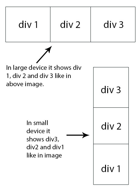
I have problem to achieve design. I have 3 divs: one after another in horizontal way say div1, div2 and div3. When it goes on small device it shows div3, div2, and div1. How can I achieve using HTML, CSS.
I have attached an image for reference.
I have problem to achieve design. I have 3 divs: one after another in horizontal way say div1, div2 and div3. When it goes on small device it shows div3, div2, and div1. How can I achieve using HTML, CSS.
I have attached an image for reference.
You can use flex for that.
* { box-sizing: border-box; margin: 0; padding: 0; }
.box {
  border: 1px solid black;
  display: flex;
}
.box > div {
  border: 1px solid red;
  width: 33%;
  height: 150px;
}

@media screen and (max-width: 400px)  {
  .box {
    flex-direction: column-reverse;
  }
  .box > div {
    width: 100%;
  }
}
<div class="box">
<div class="div1">DIV 1</div>
<div class="div2">DIV 2</div>
<div class="div3">DIV 3</div>
</div>You can see a demo here: https://jsfiddle.net/75tsv8bp/
Make the result window smaller to see it working...
You can do it with the Flexbox and @media queries:
.parent {
  display: flex; /* displays flex-items (children) inline */
}

.child {
  flex-grow: 1; /* each flex-item grows and takes 1/3 of the parent's width */
  text-align: center;
  border: 1px solid;
}

@media (max-width: 568px) { /* adjust to your needs */
  .parent {flex-direction: column} /* stacks them vertically */
  .child:first-child {order: 1} /* down 1 spot */
  .child:last-child {order: -1} /* up 1 spot */
  /* "order: 0" is by default, therefore :nth-child(2) stays where it is */
  /* the order property only works with flexbox or grid */
}
<div class="parent">
<div class="child">DIV 1</div>
<div class="child">DIV 2</div>
<div class="child">DIV 3</div>
</div>