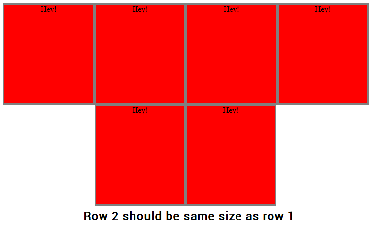
My problem is that whenever I resize the window, the divs should warp to the next row if there is not place with the same size as all the other divs.
View this in "Full Page" and try to resize yourself.
<html>
<body>
  <div id="wrapper" style="display: flex; width: 100%; flex-wrap: wrap; justify-content: center;">
    <div id="content" style="display: inline-block; flex: 13px; text-align: center; background-color: red; border: 3px solid grey; height: 200px; min-width: 150px; max-width: 250px;">
      Hey!
    </div>
    <div id="content" style="display: inline-block; flex: 13px; text-align: center; background-color: red; border: 3px solid grey; height: 200px; min-width: 150px; max-width: 250px;">
      Hey!
    </div>
    <div id="content" style="display: inline-block;flex: 13px; text-align: center; background-color: red; border: 3px solid grey; height: 200px; min-width: 150px; max-width: 250px;">
      Hey!
    </div>
    <div id="content" style="display: inline-block;flex: 13px; text-align: center; background-color: red; border: 3px solid grey; height: 200px; min-width: 150px; max-width: 250px;">
      Hey!
    </div>
    <div id="content" style="display: inline-block;flex: 13px; text-align: center; background-color: red; border: 3px solid grey; height: 200px; min-width: 150px; max-width: 250px;">
      Hey!
    </div>
    <div id="content" style="display: inline-block;flex: 13px; text-align: center; background-color: red; border: 3px solid grey; height: 200px; min-width: 150px; max-width: 250px;">
      Hey!
    </div>
  </div>
</body>
</html>
This is how it should look like: