1

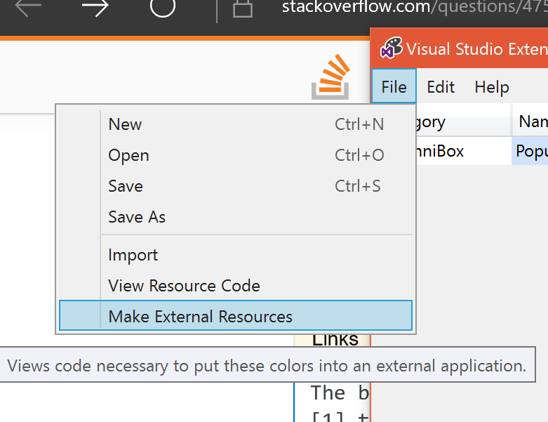
I am working on a VSIX project wherein I am trying to make the extension responsive to all kinds of Themes(Light, Dark and Blue) whichever the user selects. The controls and the text becomes unreadable on certain theme. I tried using the ThemeDictionaries in the Resource Dictionary in the UserControl.Resources but my controls do not adapt to the selected theme. Can someone tell me what is the correct way of using the ThemeDictionaries in a VSIX Project Below is the code I tried:

<UserControl.Resources>
<ResourceDictionary>
    <ResourceDictionary.ThemeDictionaries>
                <ResourceDictionary x:Key="Light">
                    <SolidColorBrush x:Key="myBrush" Color="{StaticResource SystemBaseHighColor}"/>
                </ResourceDictionary>
                <ResourceDictionary x:Key="Dark">
                    <SolidColorBrush x:Key="myBrush" Color="{StaticResource SystemBaseHighColor}"/>
                </ResourceDictionary>
                <ResourceDictionary x:Key="HighContrast">
                    <SolidColorBrush x:Key="myBrush" Color="{ThemeResource SystemColorButtonFaceColor}"/>
                </ResourceDictionary>
            </ResourceDictionary.ThemeDictionaries>
        </ResourceDictionary>
 </UserControl.Resources>
Ryan Blues
  • 19
  • 2

1 Answers1

2

The best way to theme Visual Studio extensions is to use the VSIX Color Editor to either create your own set of color keys for each in-box VS theme, or select pre-existing VS color keys to export for use in your extension.

Once you have your themes designed, you can File > Save As a PKGDEF file, and Generate Code for Accessing the Colors, to create a PKGDEF file containing your theme resoures, and a code file for accessing these resources, respectively.

Then, add both of these files to your Visual Studio VSIX Project. Add the code file as C# sources, and set the PKGDEF file to install with your VSIX by changing the PKGDEF's Build Action Property to 'Content'.

Then, in your XAML, you can consume these color keys by binding to them with XAML similar to:

<Setter Property="Background" Value="{DynamicResource {x:Static uicolors:VSColors.PopupBackgroundTextBrushKey}}" />

Where uicolors is the C# namespace containing the generated C# class, declared in the root XAML element:

 xmlns:uicolors="clr-namespace:VSOmniBox.UI.Colors"

And PopupBackgroundTextBrushKey is a C# property generated by the VSIX Color Editor:

public static ThemeResourceKey PopupBackgroundTextColorKey { get { return _PopupBackgroundTextColorKey ?? (_PopupBackgroundTextColorKey = new ThemeResourceKey(Category, "PopupBackground", ThemeResourceKeyType.ForegroundColor)); } }

Visual Studio's Theming system is smart enough to return the correct color resource from the PKGDEF based on the current theme and will live update any visible UI.

A full sample of theming can be found in my hacky, not-yet-complete VSOmniBox project. Don't judge the code quality, it's quite bad :)

If for any reason you find that colors are failing to load, check your package's installation directory (usually in %localappdata%\Microsoft\VisualStudio\15.*\Extensions..) for the PKGDEF, then, run the following from a Developer Command Prompt:

devenv.exe /updateconfiguration

VSIX Color Editor is installed with the VS Extensibility workload and it lives in: "C:\Program Files (x86)\Microsoft Visual Studio\2017\Community\VSSDK\VisualStudioIntegration\Tools\Bin\VsixColorEditor.exe"