2

i really lack of css animation. i try to create animation effect on div like google form.

image gif google form effect

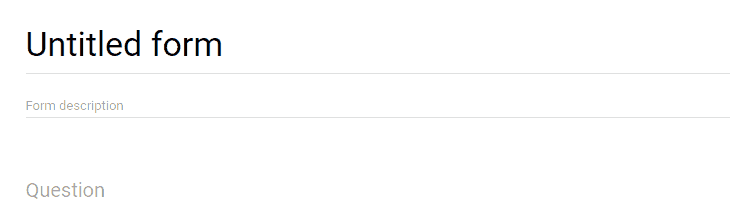
if above link not work (like in my pc now), you can see it here https://ibb.co/cYsYKb

i try transition: all 1s ease; background: linear-gradient(to right, #673ab7); but not work.

this is my fiddle: https://jsfiddle.net/hL8mncqa/

i try to find it in google, but still cant solve my problem, since i dont know what keyword to find it.

How to do this? any advice are welcome.

VXp
  • 11,598
  • 6
  • 31
  • 46
plonknimbuzz
  • 2,594
  • 2
  • 19
  • 31
  • You are asking for background and not for `border-bottom` correct? – divy3993 Dec 05 '17 at 12:45
  • Your demo image shows border and you have Question asking for background. Can you please clear that once? – divy3993 Dec 05 '17 at 12:46
  • 1
    I'm sure they are using before and after pseudoelements when on click on the form and getting out of them with the blur jquery, adding classes, as jquery cannot access this pseudoelements – Zander Dec 05 '17 at 12:46
  • **divy3993** : yes. Look my fiddle and my GIF. **Cheshire:** is not pseudo, this is just a `div`, you can see it in google form website using web console. **divy3993**: is not border. it's an background-color. This is a `div` not a textarea border. you can find it in google form website – plonknimbuzz Dec 05 '17 at 12:52
  • 1
    You can use both @plonknimbuzz You can have a container with pseudoelements to make the transition =) – Zander Dec 05 '17 at 12:57
  • 1
    @plonknimbuzz no problem! we all learn with time. Also, with pseudoelements, you can have your HTML cleaner from unnecessary divs that those could do. – Zander Dec 05 '17 at 13:04
  • 1
    @Cheshire: i learn a lot from **VXp** and your answer. Big thanks for you both – plonknimbuzz Dec 05 '17 at 13:15

4 Answers4

5

You can do it with the CSS3 Animation:

$(function(){
  $('body').on('focus', 'textarea', function(){
    $(this).next().addClass('active');
  });

  $('body').on('focusout', 'textarea', function(){
    $(this).next().removeClass('active');
  });
});
body {
  background: #fff; 
}
.container {
  position: relative; /* needs to be set since the child has position absolute */
}
textarea {
  width: 100%;
  border: 0;
  outline: 0;
}
.txt-underline {
  background: rgba(0,0,0,0.12);
  height: 1px;
  /* to grow from center: */
  position: absolute;
  left: 50%;
  transform: translateX(-50%);
}
.txt-underline.active {
  background: #673ab7;
  height: 2px;
  animation-name: underline; /* "calling" the animation */
  animation-duration: .3s; /* adjust to your needs */
  animation-timing-function: ease; /* also experiment with other values */
  animation-fill-mode: forwards; /* retains 100% width when it gets there */
}
@keyframes underline { /* lets call it the "underline" */
  0%   {width:0} /* start width */
  100% {width:100%} /* end width */
}
<script src="https://ajax.googleapis.com/ajax/libs/jquery/2.1.1/jquery.min.js"></script>

<div class="container">
  <textarea>asddas dasdasdas asdas</textarea>
  <div class="txt-underline"></div>
</div>
VXp
  • 11,598
  • 6
  • 31
  • 46
3

You could use :before and :after pseudo elements on parent div to create such border and change its state by toggling active class.

$('.element textarea').on('focus blur', function() {
  $(this).parent('.element').toggleClass('active')
})
body {
  background-color: #ffffff;
}

.element {
  display: inline-block;
  position: relative;
}
textarea {
  width: 100%;
  border: 0;
  outline: 0;
}
.element:before,
.element:after {
  content: '';
  bottom: 0;
  position: absolute;
  left: 0;
  width: 100%;
  height: 1px;
  background: rgba(0, 0, 0, 0.12);
}

.element:after {
  background:  #673ab7;
  width: 0;
  left: 50%;
  transform: translateX(-50%);
  transition: all 0.3s ease-in;
}

.element.active:after {
  width: 100%;
}
<script src="https://ajax.googleapis.com/ajax/libs/jquery/2.1.1/jquery.min.js"></script>
<div class="element">
  <textarea>Text</textarea>
</div>
Nenad Vracar
  • 118,580
  • 15
  • 151
  • 176
3

This is What you Looking for..

* { box-sizing:border-box; }

/* basic stylings ------------------------------------------ */
body      { background:url(https://scotch.io/wp-content/uploads/2014/07/61.jpg); }
.container   { 
  font-family:'Roboto';
  width:600px; 
  margin:30px auto 0; 
  display:block; 
  background:#FFF;
  padding:10px 50px 50px;
}
h2    { 
  text-align:center; 
  margin-bottom:50px; 
}
h2 small { 
  font-weight:normal; 
  color:#888; 
  display:block; 
}
.footer  { text-align:center; }
.footer a  { color:#53B2C8; }

/* form starting stylings ------------------------------- */
.group      { 
  position:relative; 
  margin-bottom:45px; 
}
input     {
  font-size:18px;
  padding:10px 10px 10px 5px;
  display:block;
  width:300px;
  border:none;
  border-bottom:1px solid #757575;
}
input:focus   { outline:none; }

/* LABEL ======================================= */
label      {
  color:#999; 
  font-size:18px;
  font-weight:normal;
  position:absolute;
  pointer-events:none;
  left:5px;
  top:10px;
  transition:0.2s ease all; 
  -moz-transition:0.2s ease all; 
  -webkit-transition:0.2s ease all;
}

/* active state */
input:focus ~ label, input:valid ~ label   {
  top:-20px;
  font-size:14px;
  color:#5264AE;
}

/* BOTTOM BARS ================================= */
.bar  { position:relative; display:block; width:300px; }
.bar:before, .bar:after  {
  content:'';
  height:4px; 
  width:0;
  bottom:0px; 
  position:absolute;
  background:#5264AE; 
  transition:0.2s ease all; 
  -moz-transition:0.2s ease all; 
  -webkit-transition:0.2s ease all;
}
.bar:before {
  left:50%;
}
.bar:after {
  right:50%; 
}

/* active state */
input:focus ~ .bar:before, input:focus ~ .bar:after {
  width:50%;
}

/* HIGHLIGHTER ================================== */
.highlight {
  position:absolute;
  height:60%; 
  width:100px; 
  top:25%; 
  left:0;
  pointer-events:none;
  opacity:0.5;
}

/* active state */
input:focus ~ .highlight {
  -webkit-animation:inputHighlighter 0.3s ease;
  -moz-animation:inputHighlighter 0.3s ease;
  animation:inputHighlighter 0.3s ease;
}

/* ANIMATIONS ================ */
@-webkit-keyframes inputHighlighter {
 from { background:#5264AE; }
  to  { width:0; background:transparent; }
}
@-moz-keyframes inputHighlighter {
 from { background:#5264AE; }
  to  { width:0; background:transparent; }
}
@keyframes inputHighlighter {
 from { background:#5264AE; }
  to  { width:0; background:transparent; }
}
<div class="container">
  
  <h2>Material Design in  CSS3<small>Inputs</small></h2>
  
  <form>
    
    <div class="group">      
      <input type="text" required>
      <span class="highlight"></span>
      <span class="bar"></span>
      <label>Name</label>
    </div>
      
    <div class="group">      
      <input type="text" required>
      <span class="bar"></span>
      <label>Email</label>
    </div>
    
    <div class="group">      
      <input type="text" required>
      <span class="highlight"></span>
      <span class="bar"></span>
      <label>Email</label>
    </div>
    
  </form>


</div>

happy Coding:)

Darshit Hedpara
  • 660
  • 6
  • 17
1

Here is a quick solution made with CSS3 animations and with pseudolements of a container: https://jsfiddle.net/nv92uoo4/

$(document).ready(function() {
  $("div").on("click", function() {
   $(this).addClass("hover")
  });
});
input {
  position: relative;
  border: 0;
  background-color: transparent;
  border-bottom: 1px solid #a0a0a0;
  padding-bottom: 2px;
  outline: 0;
}
div {
  position: relative;
  display: inline-block;
}
div.hover:after {
  content: '';
  display: block;
  height: 2px;
  width: 0;
  background-color: purple;
  animation-duration: 1s;
  animation-name: hover;
  animation-fill-mode: forwards;
  position: absolute;
  bottom: -2px;
  left: 50%;
  transform: translate(-50%, 0);
}
@keyframes hover {
  from {
    width: 0;
  }
  to {
    width: 100%;
  }
}
<script src="https://ajax.googleapis.com/ajax/libs/jquery/2.1.1/jquery.min.js"></script>
<div>
  <input type="text" value="My value">
</div>
Zander
  • 1,076
  • 1
  • 9
  • 23
  • omg.. you make me feel stupid dude. XD , i dont know if this possible to solve this using pseudo. btw, Thanks for this example. – plonknimbuzz Dec 05 '17 at 13:03