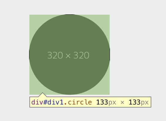
I'm trying to make a circle-shaped image with an overlay that shows on hover. However, the "hitbox" of hovering (and clicking) is incorrect, as shown in the snippet below.
This issue seems to only occur in Chrome (not sure about Safari). I've found some fixes on the Internet, but none of them worked. JSFiddle for testing
$(document).ready(function() {
 $(".circle").click(function() {
  alert($(this).attr("id"));
 });
});
#canvas {
width: 100%;
padding-bottom: 75%;
position: relative;
overflow: hidden;
background-color: #eee;
}
.circle {
position: absolute;
width: 25%;
padding-bottom: 25%;
border-radius: 50%;
top: 50%;
left: 50%;
transform: translate(-50%, -50%);
overflow: hidden;
cursor: pointer;
/*https://stackoverflow.com/a/32987370/5532169*/
-webkit-backface-visibility: hidden;
-moz-backface-visibility: hidden;
/*https://stackoverflow.com/a/25206004/5532169*/
z-index: 1;
/*https://stackoverflow.com/a/10296258/5532169*/
-webkit-mask-image: url(data:image/png;base64,iVBORw0KGgoAAAANSUhEUgAAAAEAAAABCAIAAACQd1PeAAAAGXRFWHRTb2Z0d2FyZQBBZG9iZSBJbWFnZVJlYWR5ccllPAAAAA5JREFUeNpiYGBgAAgwAAAEAAGbA+oJAAAAAElFTkSuQmCC);
/*https://stackoverflow.com/a/16878347/5532169*/
-webkit-mask-image: -webkit-radial-gradient(circle, white, black);
}
.mid {
width: 100%;
height: 100%;
position: absolute;
}
.inner {
width: 100%;
height: 100%;
position: relative;
}
.inner>* {
position: absolute;
top: 0;
bottom: 0;
left: 0;
right: 0;
width: 100%;
height: 100%;
}
.hover {
background-color: rgba(255, 255, 255, 0.6);
opacity: 0;
transition: opacity 0.5s;
}
.hover:hover {
opacity: 100;
transition: opacity 0.5s;
}
span {
position: absolute;
top: 50%;
left: 50%;
transform: translate(-50%, -50%);
width: 72%;
text-align: center;
font-family: monospace;
font-size: 2em;
font-weight: bold;
color: #08f;
}<script src="https://ajax.googleapis.com/ajax/libs/jquery/2.1.1/jquery.min.js"></script>
<div id="canvas">
<div id="div1" class="circle">
<div class="mid">
<div class="inner">
<img src="https://dummyimage.com/320x320/000/fff" alt="">
<div class="hover">
<span>Hello World!</span>
</div>
</div>
</div>
</div>
</div>Edit: Tested in Firefox 57, works without problem. IE and Edge were tested already, so it's a Chrome-/webkit-specific issue.