I am trying to build a responsive web layout with w3.css. It is supposed to consit of rows with three columns on large screens, two on medium, and one column on small/mobile devices. Each row consists of tiles which can have one of two fixed heights.
<div class="w3-content w3-white" style="max-width:600px">
    <div class="w3-row-padding ">
        <div class="w3-col l4 m6 s12 w3-margin-bottom w3-green" style="height:200px">1</div>
        <div class="w3-col l4 m6 s12 w3-margin-bottom w3-green" style="height:200px">2</div>
        <div class="w3-col l4 m6 s12 w3-margin-bottom w3-blue" style="height:120px">3</div>
        <div class="w3-col l4 m6 s12 w3-margin-bottom w3-green" style="height:200px">4</div>
        <div class="w3-col l4 m6 s12 w3-margin-bottom w3-blue" style="height:120px">5</div>
        <div class="w3-col l4 m6 s12 w3-margin-bottom w3-blue" style="height:120px">6</div>
        <div class="w3-col l4 m6 s12 w3-margin-bottom w3-blue" style="height:120px">7</div>
    </div>
</div>
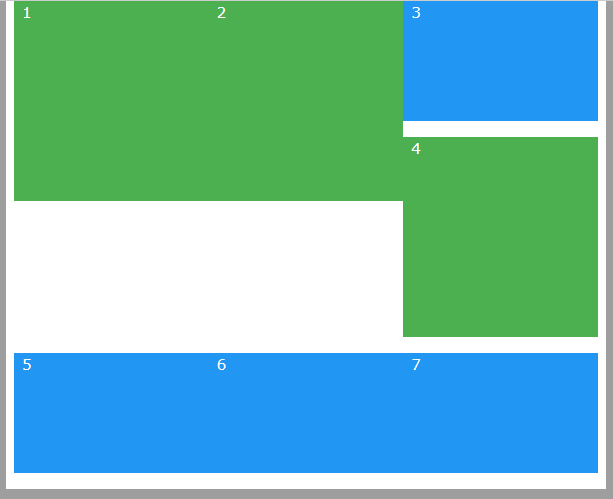
I'd expect the following result in a large screen in 3 columns layout:
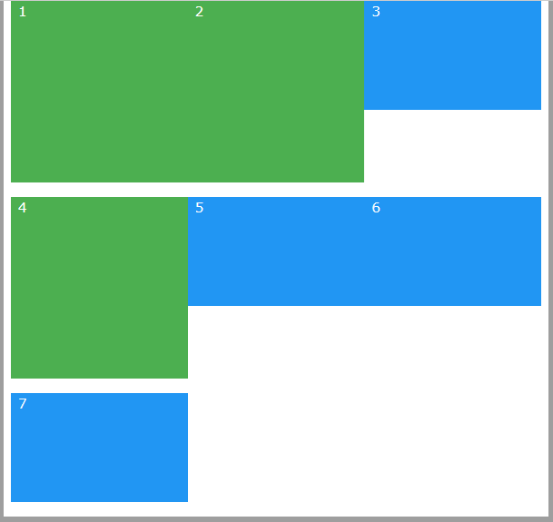
The above code is fine with a one and two column layout, but produces the following unwanted output with three columns:
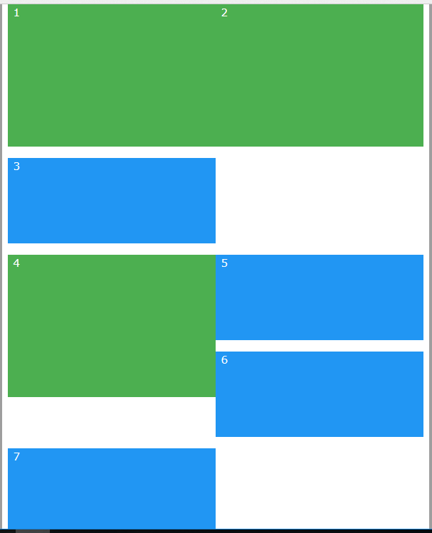
If I end the w3-row-padding after three tiles, the three column layout is ok, but I get a mess with medium screens with two columns
<div class="w3-content w3-white" style="max-width:600px">
    <div class="w3-row-padding">
        <div class="w3-col l4 m6 s12 w3-margin-bottom w3-green" style="height:200px">1</div>
        <div class="w3-col l4 m6 s12 w3-margin-bottom w3-green" style="height:200px">2</div>
        <div class="w3-col l4 m6 s12 w3-margin-bottom w3-blue" style="height:120px">3</div>
    </div>
    <div class="w3-row-padding">
        <div class="w3-col l4 m6 s12 w3-margin-bottom w3-green" style="height:200px">4</div>
        <div class="w3-col l4 m6 s12 w3-margin-bottom w3-blue" style="height:120px">5</div>
        <div class="w3-col l4 m6 s12 w3-margin-bottom w3-blue" style="height:120px">6</div>
    </div>
    <div class="w3-row-padding">
        <div class="w3-col l4 m6 s12 w3-margin-bottom w3-blue" style="height:120px">7</div>
    </div>
</div>
This is what the above code produces on medium screens:
Any help is appreciated