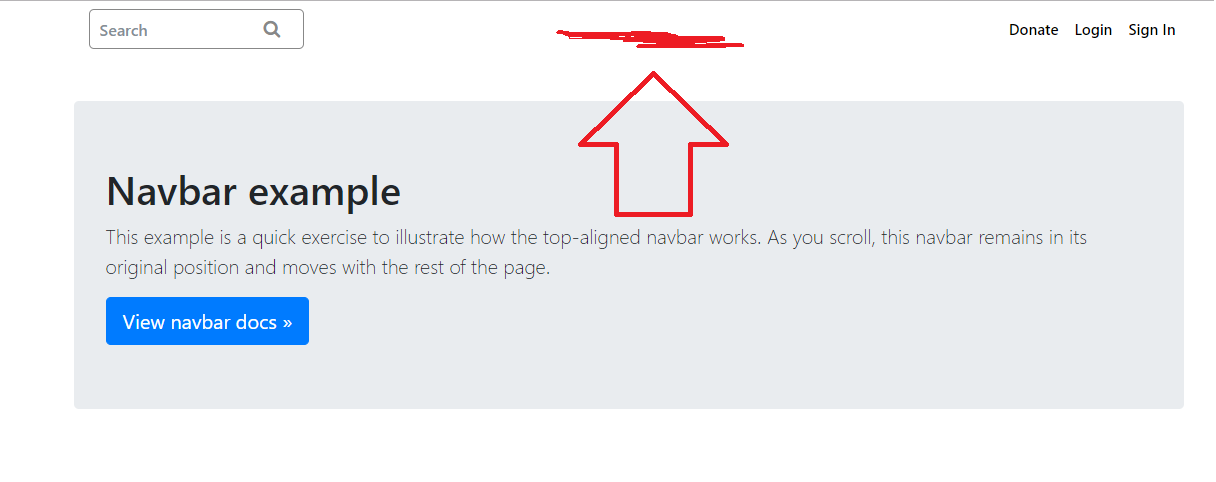
I am trying to place the text in the middle of the header in Bootstrap 4. I have also tried margin:0 auto along with float:none but it is also working.I have used two different ul. One ul has a form which is on the left-hand side and the other ul is on the right-hand side now I want to place the content in the middle of the header. I am stuck on it.
this is my html code
  <nav class="navbar navbar-expand-md fixed-top navbar-dark mb-4">

 <div class="container">
 <div class="col-md-2">
  <ul class="navbar-nav mr-auto">
   <form class="form-inline navbar-form" role="search">
        <div class="search">

        <span class="fa fa-search"></span>

        <input type="text" class="form-control" placeholder="Search">

        </div>
        </form>
  </ul>
  </div>


   <button class="navbar-toggler" type="button" data-toggle="collapse" data-target="#navbarCollapse" aria-controls="navbarCollapse" aria-expanded="false" aria-label="Toggle navigation">
        <span class="navbar-toggler-icon"></span>
      </button>
       <div class="collapse navbar-collapse" id="navbarCollapse">

  <ul class="navbar-nav ml-auto">

     <li class="nav-item">
      <a class="nav-link">Donate</a>
    </li>

    <li class="nav-item">
      <a class="nav-link">Login</a>
    </li>
    <li class="nav-item">
      <a class="nav-link">Sign In</a>
    </li>
  </ul>
  </div>
  </div>
</nav>