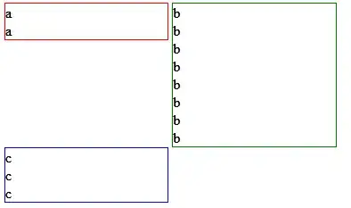
I have three divs: a, b, and c. They are each 48% wide and displayed as inline blocks. This style will be applied to several pages. Div a will always be shorter than div b. This creates a gap between the bottom of a and the top of c. (Divs a and b will be slightly different heights on each page, but a will always be shorter. Because of the inconsistent heights, I don't feel I can reliably use margin-top:-10px for example.)
How it is:
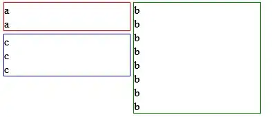
How I want it:
edit
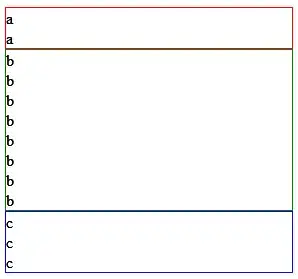
Mobile:
/edit
CSS
div {
     width:48%;
     box-sizing:border-box;
     display:inline-block;
     border:1px solid;
     vertical-align:top;
}

@media only screen and (max-width: 600px) {
     div {
          width:100%;
     }
}
HTML
<div style="border-color:red;">a<br>a</div>
<div style="border-color:green;">b<br>b<br>b<br>b<br>b<br>b<br>b<br>b</div>
<div style="border-color:blue;">c<br>c<br>c<br></div>
The media query allows the three divs will be stacked in one column on smaller screen sizes. That's why the divs need to be in this order.