Context: I have a container using display: flex and I am centering one svg element vertically in the center of the page. The only other things on the page are A) a fixed header that gets taken out of the document flow and isn't taking up space and B) a footer with position: absolute that should also not be taking up space. The centering works correctly on every browser but mobile chrome/mobile ios. Vertical centering appearing correctly on firefox mobile.
Problem: The child element of the flex container is not being centered on IOS Safari and Chrome Mobile. It seems like the address bar is throwing off the alignment for some reason. Can anyone offer any insight or help me with a way to debug the issue? I cannot replicate the problem in chrome dev tools.
Any help appreciated. Thank you community.
.logo-flexcontainer {
  align-items: center;
  display: flex;
  height: 100vh;
  margin: 0 auto;
  width: 90%;
  @media (min-width: 1024px) {
    width: 50%;
  }
}

.logo-flexcontainer > div {
  flex: 1 0 auto;
}

#mobile-navbar {
  display: flex;
  align-items: center;
  position: fixed; /* Set the navbar to fixed position */
  width: 100%; /* Full width */
  height: 50px;
  top: 0; /* Position the navbar at the top of the page */
  transition: transform .1s ease, background-color .5s ease;
  &.hidden {
    transform: translate3d(0,-100%,0);
  }
  &.scroll-background {
    background-color: rgba(0, 0, 0, 0.8)
  }
  @media (min-width: 1024px) {
    display: none;
  }
  #page-title {
    margin: 5px 0 0 5%;
    h3 {
      font-size: 6vw;
      text-shadow: 1px 1px #000;
      @media (min-width: 600px) {
        font-size: 2rem;
      }
      a {
        text-decoration: none;
      }
    }
  }
  #hamburger {
    position: absolute;
    width: 50px;
    height: 50px;
    top: 5px;
    right: 10px;
    cursor: pointer;
    span {
      display: block;
      position: absolute;
      height: 6px;
      width: 100%;
      background: #FFFFFF;
      box-shadow: 1px 1px #000;
      &:nth-child(1) {
        top: 6px;
      }
      &:nth-child(2) {
        top: 18px;
      }
      &:nth-child(3) {
        top: 30px;
      }
    }
  }
}

footer {
  position: absolute;
  text-align: center;
  left: 0;
  bottom: 0;
  height: 100px;
  width: 100%;
  svg {
   height: 90%;
    @media (max-width: 550px) {
    height: 80%;
    }
  }
}
<div class="logo-flexcontainer">
<div>
<svg id="logo" xmlns="http://www.w3.org/2000/svg" viewBox="0 0 598.6 323.5">
<g>svg code goes here...</g>
</svg>
</div>
</div>
<footer>
social icons here, code not important
</footer>Here is a live link to the project here: project link See if you can replicate the problem on your Android or iPhone device.
Two pictures of homepage on chrome mobile and firefox mobile.

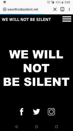
The left is the incorrect orientation and the right is the expected result.