I'm trying to create a table using CSS grid, with equal columns based on the content. I want to avoid using <table>. This is a follow-up to this question: Auto-adjusting columns with CSS grid
What I'm trying to achieve:
This table works: https://codepen.io/anon/pen/baExYw
But I want to wrap the each row in a div, which unsurprisingly breaks the table.
This table is broken: https://codepen.io/anon/pen/qpbMgG
app.html
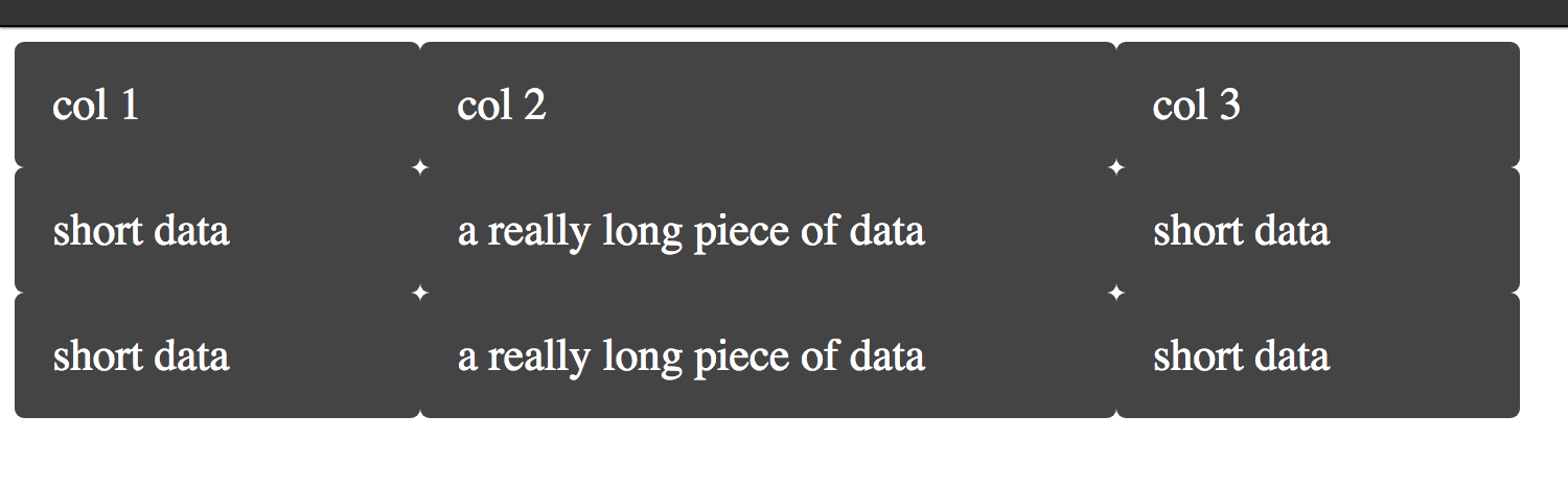
<div class="wrapper">
  <div class="box a">col 1</div>
  <div class="box b">col 2</div>
  <div class="box c">col 3</div>

  <!-- Table Row -->
  <div class="row">
    <div class="box d">short data</div>
    <div class="box e">a really long piece of data</div>
    <div class="box f">short data</div>
  </div>

  <!-- Table Row -->
  <div class="row">
    <div class="box d">short data</div>
    <div class="box e">a really long piece of data</div>
    <div class="box f">short data</div>
  </div>
</div>
app.css
.wrapper {
  display: grid;
  grid-template-columns: repeat(3, auto);
  background-color: #fff;
  color: #444;
  max-width:  800px;
}

.box {
  background-color: #444;
  color: #fff;
  border-radius: 5px;
  padding: 20px;
  font-size: 150%;
}
I'm still very new to CSS Grid, so I'm still having trouble understanding how half of this stuff works behind the scenes.
Any help is appreciated. Thanks in advance.