Hi I'm trying to make my site responsive. Now I have a media query that handles a certain screen size of devices but a different styling when viewing via web. It works just fine in chrome, safari and opera. But when trying in mozilla it seems that my media query is being executed eventhough I'm accessing it via desktop. Is there anything that I'm missing? Below is my media query
.my-target-class {
   display: inline;
}

@media only screen and (min-device-width: 400px) and (max-device-width: 600px) and (min-device-height: 300px) and (max-device-height: 750px){
      .my-target-class {
          display: block;
       }
}
As you can see I'm targetting a clas and display is change if its being viewed via mobile. But upon viewing on mozilla its running the @media screen query and applying ng display: block on the class. Any idea or fix for this? Would appreciate if explanation on why its behaving like this
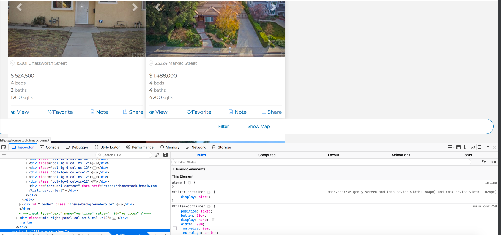 As you can see on the lower right part of the screenshot it's applying the css styling meant for mobile. Eventhough I'm acessing it via a desktop browser. I assume that if I place @media only screen this will only be applied when viewing on mobile. But it seems firefox is behaving differently