8

I am trying to place 2 elements next to each other where one is takes 25% of the screen and the other is an angular router outlet which takes up the rest of the container. Using the following ends up with both elements on either side of the screen with space in the middle. The ** portion is the one in question

  <div class="container"
         fxLayout>
    <admin-route-menu fxFlex="25%" fxShow.lt-sm="false"></admin-route-menu>
    <router-outlet fxFlex></router-outlet>
  </div>

comes out looking like enter image description here

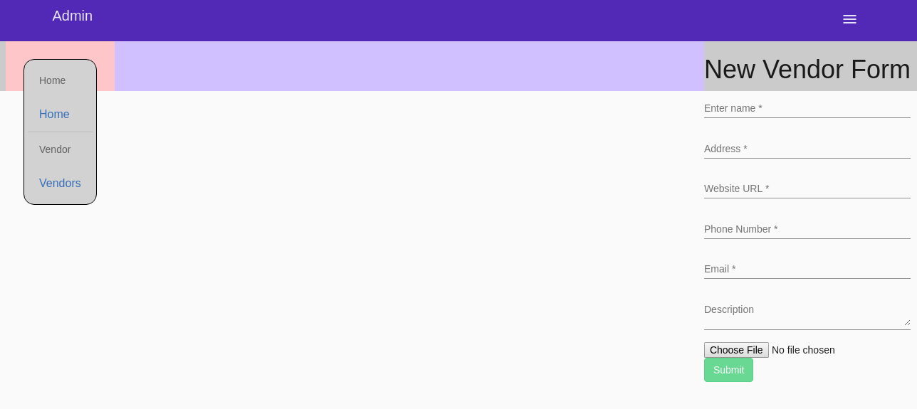
The admin-route-menu tag on the left is just basic html and css where the html has a mat-list in it. The router-outlet can take on any element as per angular specs. I can include the admin-route-menu if that is also helpful.

I also tried with regular flex boxes but the result is the same.

.wrapper {
  display: flex;
  flex-direction: row;
  align-items: stretch;
  width: 100%;
  height: 5em;
  background: #ccc;
}
.wrapper > .wrapper-left
{
  background: #fcc;
}
.wrapper > .wrapper-right
{
  background: #ccf;
  flex: 1;
}

Any help is appreciated, thanks

Michael Benjamin
  • 346,931
  • 104
  • 581
  • 701
dinamix
  • 651
  • 8
  • 22
  • With regular Flexbox, those rules work: https://jsfiddle.net/6d8r4ffk/ ... and a gap like that one get when e.g. the `justify-content` is set to `space-between`, or your form is right aligned inside the _right_ wrapper – Asons Dec 27 '17 at 07:24
  • If you add a working code snippet, we would be able to provide a proper answer. – Asons Dec 27 '17 at 07:29
  • @LGSon Added more code as requested. You are correct that normally it works which is why I think this may be an angular issue with flex box and angular router. – dinamix Dec 27 '17 at 15:12
  • As we still doesn't have a _working_ code snippet that reproduce the issue you describe, not much more to say. – Asons Dec 28 '17 at 20:04

2 Answers2

14

For anyone having a similar issue the problem was solved by doing

<div class="container"
         fxLayout>
    <div fxFlex="25%" fxShow.lt-sm="false">
      <admin-route-menu></admin-route-menu>
    </div>
    <div fxFlex>
      <router-outlet></router-outlet>
    </div>
  </div>

Basically always use divs with the angular flex layout module as some custom elements dont play nice with it, like the router outlet

dinamix
  • 651
  • 8
  • 22
3

The solution provided by @dinamix works well. So, I would explain the reason behind this issue.

The issue you are hitting is expected due to the obvious reason that you have given flex attribute to router-outlet. And hence router-outlet is occupying all the space left(width here).

This confusion should disappear if one understands that Angular does not replace the router-outlet with the component corresponding to the route. Rather, it appends the component next to the router-outlet.

So, by wrapping the router-outlet in a container and setting flex on that will leave the router-outlet untouched, and the flex effect will be visible to its sibling(Vendor-form in your example) appended by angular.