-1

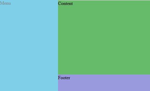
I have this structure ... it's similar to the WordPress administration area ... the point is that I need .main taking all the space available in width and height and .foot remains down while there is no content that lowers it. I want to use flex because I will have columns inside the .main and I need these columns take full height as well... Maybe someone can give me another solution, but I can NOT change the html, only the CSS

.wrap {
  display: flex;
}

.sidebar {
  position: fixed;
  top: 0;
  bottom: -100px;
  background-color: #00a0d2;
  width: 200px;
}

.main {
  background-color: #66BB6A;
  display: flex;
}

.foot {
  margin-left: -200px;
  background-color: #9999dd;
  height: 60px;
}
<div class="wrap">
  <div class="sidebar">Menu</div>
  <div class="main">Content</div>
  <div class="foot">Footer</div>
</div>

where the final result would be something like this, thx

enter image description here

lecaro
  • 495
  • 6
  • 18

2 Answers2

0

A fixed position sidebar will not be affected by flexbox, so you need to adjust your margins to make room for it.

html,
body {
  height: 100%;
}

body {
  min-height: 100%;
}

.wrap {
  display: flex;
  flex-direction: column; /* required to establish column layout */
  min-height: 100%;
}

.sidebar {
  position: fixed;
  top: 0;
  bottom: 0; /* full height - change if required */
  background-color: #00a0d2;
  width: 200px;
  opacity: .5/* for demo purposes */
  ;
}

.main {
  background-color: #66BB6A;
  display: flex;
  flex: 1; /* take remaining height*/
  margin-left: 200px; /* width of sidebar */
}

.foot {
  margin-left: 200px; /* width of sidebar */
  background-color: #9999dd;
  height: 60px;
}
<div class="wrap">
  <div class="sidebar">Menu</div>
  <div class="main">Content</div>
  <div class="foot">Footer</div>
</div>
Paulie_D
  • 107,962
  • 13
  • 142
  • 161
-1

You could use css grid. It allows room for 2d grid with minimal code.

.wrap {
  display: grid;
  /*Make 2 columns with the first having a min width of 200px*/
  grid-template-columns: minmax(200px, 1fr) 10fr;
}

.sidebar {
  background-color: #00a0d2;
  /*Make sidebar take up the space of the 2 rows*/
  grid-row: 1/3;
}

.main {
  background-color: #66BB6A;
  /*Let the main content take up the space of view height*/
  height: 100vh;
}

.foot {
  /*set footer to span the last row leaving the space for the sidebar*/
  grid-column: 2/3;
  background-color: #9999dd;
  height: 60px;
}
<div class="wrap">
  <div class="sidebar">Menu</div>
  <div class="main">Content</div>
  <div class="foot">Footer</div>
</div>
omukiguy
  • 1,401
  • 3
  • 17
  • 36