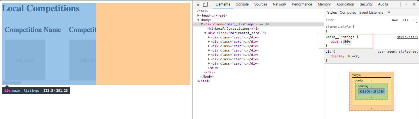
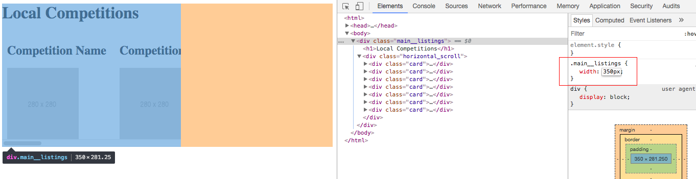
I have a horizontally scrolling div in the second column in my layout. For some reason, the contents of this div are stretching my page out and breaking my layout. I have identified main__listing as the offending div. To test that this was the offending div I changed the width to 10%. It shrunk the content of the div to the ridiculous size you would expect however my page was still broken. I used to Firefox dev tools to find the width in pixels (290px). Then I set the width to 290px. This fixed my page. I need the div to be fluid so this isn't a real fix but I want to know why this is.
TL;DR A div with a width set in % has a different width than one set to the same size in pixels.
CSS:
.main__listings {
  width: 100%;
}
.horizontal_scroll {
  display: flex;
  flex-wrap: nowrap;
  overflow-x: auto;
  overflow-y: hidden;
  -webkit-overflow-scrolling: touch;
}
.card {
  flex: 0 0 200px;
  margin: auto 10px;
}
HTML:
<div className="main__listings">
  <h1>Local Competitions</h1>
  <div className="horizontal_scroll">
    <div className="card">
      <h2>Competition Name</h2>
      <img src="http://via.placeholder.com/280x280" alt="" width="140" height="140"/>
    </div>
    <div className="card">
      <h2>Competition Name</h2>
      <img src="http://via.placeholder.com/280x280" alt="" width="140" height="140"/>
    </div>
    <div className="card">
      <h2>Competition Name</h2>
      <img src="http://via.placeholder.com/280x280" alt="" width="140" height="140"/>
    </div>
    <div className="card">
      <h2>Competition Name</h2>
      <img src="http://via.placeholder.com/280x280" alt="" width="140" height="140"/>
    </div>
    <div className="card">
      <h2>Competition Name</h2>
      <img src="http://via.placeholder.com/280x280" alt="" width="140" height="140"/>
    </div>
    <div className="card">
      <h2>Competition Name</h2>
      <img src="http://via.placeholder.com/280x280" alt="" width="140" height="140"/>
    </div>
    <div className="card">
      <h2>Competition Name</h2>
      <img src="http://via.placeholder.com/280x280" alt="" width="140" height="140"/>
    </div>
  </div>
</div>