97

I am using Angular with Material

 <button mat-icon-button><mat-icon svgIcon="thumb-up"></mat-icon>Start Recording</button>

I am trying to add an icon to button, but I can't figure out how to do it, and can't find documentation for this.

https://material.angular.io/components/button/api

looking the docs, there is this:

enter image description here

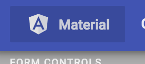
that button has the following html:

<a _ngcontent-c1="" aria-label="Angular Material" class="docs-button mat-button" mat-button="" routerlink="/" tabindex="0" aria-disabled="false" href="/"><span class="mat-button-wrapper">
    <img _ngcontent-c1="" alt="angular" class="docs-angular-logo" src="../../../assets/img/homepage/angular-white-transparent.svg">
    <span _ngcontent-c1="">Material</span>
  </span> <div class="mat-button-ripple mat-ripple" matripple=""></div><div class="mat-button-focus-overlay">
</div>
</a>

is that the right way to do it?

FAISAL
  • 33,618
  • 10
  • 97
  • 105
Alexander Mills
  • 90,741
  • 139
  • 482
  • 817

6 Answers6

179

Just add the <mat-icon> inside mat-button or mat-raised-button. See the example below. Note that I am using material icon instead of your svg for demo purpose:

<button mat-button>
    <mat-icon>mic</mat-icon>
    Start Recording
</button>

OR

<button mat-raised-button color="accent">
    <mat-icon>mic</mat-icon>
    Start Recording
</button>

Here is a link to stackblitz demo.

FAISAL
  • 33,618
  • 10
  • 97
  • 105
  • thanks, any idea how I can use an icon that is not one of the default icons? I want to use a "play" button (like a filled-in chevron), but "play" is not an available icon. – Alexander Mills Jan 05 '18 at 18:37
  • 1
    In that case you have to register and icon using mat icon registry. – FAISAL Jan 06 '18 at 10:56
  • Hi @Faisal I used this also and it worked, but I'm registering the icons as an SVG and using them as it follows but when using it inside a – DJ22T May 31 '18 at 23:34
  • @DannyG you will have to register your svg icons: https://material.angular.io/components/icon/overview#registering-icons – FAISAL Jun 01 '18 at 08:02
  • can you please help me to fix this https://stackoverflow.com/questions/51925724/how-to-customize-angular-material-design-stepper-in-angular-4 @Faisal – Zhu Aug 20 '18 at 09:33
  • According to what I understand of the spec, why didn't you put `mat-icon-button` instead of `mat-button`? https://material.angular.io/components/button/overview – Pipo Dec 28 '19 at 14:54
  • @Pipo , `mat-icon-button` will only render a circular "icon button" with transparent background, without any text. When we have to add text + icon, then we use `mat-icon` inside a `mat-button`. – FAISAL Dec 28 '19 at 17:14
22

All you need to do is add the mat-icon-button directive to the button element in your template. Within the button element specify your desired icon with a mat-icon component.

You'll need to import MatButtonModule and MatIconModule in your app module file.

From the Angular Material buttons example page, hit the view code button and you'll see several examples which use the material icons font, eg.

<button mat-icon-button>
  <mat-icon aria-label="Example icon-button with a heart icon">favorite</mat-icon>
</button>

In your case, use

<mat-icon>thumb_up</mat-icon>

As per the getting started guide at https://material.angular.io/guide/getting-started, you'll need to load the material icon font in your index.html.

<link href="https://fonts.googleapis.com/icon?family=Material+Icons" rel="stylesheet">

Or import it in your global styles.scss.

@import url("https://fonts.googleapis.com/icon?family=Material+Icons");

As it mentions, any icon font can be used with the mat-icon component.

Jason Schroder
  • 298
  • 1
  • 5
  • 6
    Just FYI, this creates a circular button around the icon only. So, if you add a button-text next to the icon, it'll break. – ganeshk Aug 23 '18 at 18:34
20

My preference is to utilize the inline attribute. This will cause the icon to correctly scale with the size of the button.

    <button mat-button>
      <mat-icon inline=true>local_movies</mat-icon>
      Movies
    </button>

    <!-- Link button -->
    <a mat-flat-button color="accent" routerLink="/create"><mat-icon inline=true>add</mat-icon> Create</a>

I add this to my styles.css to:

  • solve the vertical alignment problem of the icon inside the button
  • material icon fonts are always a little too small compared to button text
button.mat-button .mat-icon,
a.mat-button .mat-icon,
a.mat-raised-button .mat-icon,
a.mat-flat-button .mat-icon,
a.mat-stroked-button .mat-icon {
  vertical-align: top;
  font-size: 1.25em;
}
rynop
  • 50,086
  • 26
  • 101
  • 112
10

Add to app.module.ts

import {MatIconModule} from '@angular/material/icon';

& link in your global index.html.

1

the above CSS can be written in SASS as follows (and it actually includes all button types, instead of just button.mat-button)

button,
a {
    &.mat-button,
    &.mat-raised-button,
    &.mat-flat-button,
    &.mat-stroked-button {
        .mat-icon {
            vertical-align: top;
            font-size: 1.25em;
        }
    }
}
Remco Nonhebel
  • 165
  • 1
  • 6
0

The Material icons use the Material icon font, and the font needs to be included with the page.

Here's the CDN from Google Web Fonts:

<link rel="stylesheet" href="https://fonts.googleapis.com/icon?family=Material+Icons">
joh04667
  • 7,159
  • 27
  • 34
Alex
  • 1,013
  • 1
  • 13
  • 27