i am very new to .net, i just wanted to know how to make an UI of this sort? which controls do i need to use to make the UI of above sort. if not can i know in WPF is it possible if so how?..
Thanks
i am very new to .net, i just wanted to know how to make an UI of this sort? which controls do i need to use to make the UI of above sort. if not can i know in WPF is it possible if so how?..
Thanks
Your question is not that specific so you have to give more details or ask more detailed questions.
Some shots in the dark (is this what you are looking for?)
You could use a HeaderedContentControl and style/template it. Put the black text labels in its content (perhaps a grid too). Then put a couple of them in the rows (Height="auto") of a Grid.
This Grid could be the content of yet another HeaderedContentControl and style it so it has the UI style you want it to have.
As for the fading blue line, that could be made using a LinearGradientBrush.
EDIT Ok here goes. the XAML below nearly resembles the image above. There are a couple of guesses and assumptions because it wasn't always clear what the UI should do (hyperlinks/buttons?). The code shows that WPF is quite capable of displaying the requested UI. This could be developed into a control but because I expect that you will want to add several kinds of fields/items/buttons/labels I stuck to the basic layout. Many things could be improved (styles, templates) but this shows the basics.
<Window
xmlns="http://schemas.microsoft.com/winfx/2006/xaml/presentation"
xmlns:x="http://schemas.microsoft.com/winfx/2006/xaml"
xmlns:d="http://schemas.microsoft.com/expression/blend/2008" xmlns:mc="http://schemas.openxmlformats.org/markup-compatibility/2006" mc:Ignorable="d"
x:Class="WpfApplication1.MainWindow"
x:Name="Window"
Title="MainWindow"
UseLayoutRounding="True"
Width="640" Height="480">
<Window.Resources>
<ControlTemplate x:Key="SubheaderTemplate" TargetType="{x:Type Label}">
<Border BorderThickness="0,0,0,1">
<Border.BorderBrush>
<LinearGradientBrush StartPoint="0,0" EndPoint="1,0">
<GradientStop Offset="0" Color="#FFAAAAFF"/>
<GradientStop Offset="1" Color="#00AAAAFF"/>
</LinearGradientBrush>
</Border.BorderBrush>
<TextBlock FontWeight="Bold" Margin="10,0,0,0" Text="{TemplateBinding Content}"/>
</Border>
</ControlTemplate>
<Style x:Key="SubheaderStyle" TargetType="{x:Type Label}">
<Setter Property="Template" Value="{StaticResource ResourceKey=SubheaderTemplate}"/>
</Style>
</Window.Resources>
<Grid x:Name="LayoutRoot">
<Border BorderThickness="1,0,1,1" BorderBrush="Silver" HorizontalAlignment="Left" VerticalAlignment="Top" Margin="20" >
<Grid Width="223">
<Grid.RowDefinitions>
<RowDefinition Height="Auto"/>
<RowDefinition Height="Auto"/>
<RowDefinition Height="Auto"/>
<RowDefinition Height="Auto"/>
<RowDefinition Height="Auto"/>
<RowDefinition Height="Auto"/>
<RowDefinition Height="Auto"/>
<RowDefinition Height="Auto"/>
<RowDefinition Height="Auto"/>
<RowDefinition Height="Auto"/>
<RowDefinition Height="Auto"/>
<RowDefinition Height="Auto"/>
<RowDefinition Height="Auto"/>
<RowDefinition Height="Auto"/>
</Grid.RowDefinitions>
<Rectangle>
<Rectangle.Fill>
<LinearGradientBrush EndPoint="0.5,1" StartPoint="0.5,0">
<GradientStop Color="#FFC4C4C4" Offset="1"/>
<GradientStop Color="White"/>
</LinearGradientBrush>
</Rectangle.Fill>
</Rectangle>
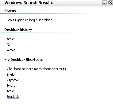
<TextBlock Margin="10,5,5,5" FontWeight="Bold" FontSize="13.333" Text="Windows Search Results"/>
<Label VerticalAlignment="Top" Style="{StaticResource ResourceKey=SubheaderStyle}" Content="Status" Grid.Row="1" />
<Label VerticalAlignment="Top" Style="{StaticResource ResourceKey=SubheaderStyle}" Content="Deskbar history" Grid.Row="3" />
<Label VerticalAlignment="Top" Style="{StaticResource ResourceKey=SubheaderStyle}" Content="My Deskbar Shortcuts" Grid.Row="7" />
<TextBox Margin="15,5,5,5" Grid.Row="2" Text="Start typing to begin searching."/>
<TextBlock Margin="15,5,5,5" Grid.Row="4" Text="!calc" />
<TextBlock Margin="15,5,5,5" Grid.Row="5" Text="C:" />
<TextBlock Margin="15,5,5,5" Grid.Row="6" Text="=calc" />
<TextBlock Margin="15,5,5,5" Grid.Row="8" Text="Click here to learn more about shortcuts" />
<TextBlock Margin="15,5,5,5" Grid.Row="9" Text="?help" />
<TextBlock Margin="15,5,5,5" Grid.Row="10" Text="?syntax" />
<TextBlock Margin="15,5,5,5" Grid.Row="11" Text="!word" />
<TextBlock Margin="15,5,5,5" Grid.Row="12" Text="!calc" />
<TextBlock Margin="15,5,5,5" Grid.Row="13" Text="!outlook" />
<Button Margin="0,5,5,5" HorizontalAlignment="Right" Content="x"/>
<Button Margin="0,5,20,5" HorizontalAlignment="Right" Content="_"/>
</Grid>
</Border>
</Grid>
OK. THis is pretty crude, becasue I am manually loading the listview via code. Also, you may need to play with your layout a bit. Check out your documentation on Listview.Groups. I think it is only available in Icon mode. You'll want to play around with this a little. Not ethat this is NOT wpf; This is Windows Forms Listview. However, I am betting the wpf version does something similar, and probably looks cooler, too! (I haven't messed with wpf yet, but plan to in the near future . . .).
Private Sub Form1_Load(ByVal sender As System.Object, ByVal e As System.EventArgs) Handles MyBase.Load

    Dim Guitars As New List(Of String)
    Dim GuitarPlayers As New List(Of String)

    With Guitars
        .Add("Gibson Les Paul")
        .Add("Fender Stratocaster")
        .Add("Fender Telecaster")
    End With

    With GuitarPlayers
        .Add("Eric Clapton")
        .Add("Jimi Hendrix")
        .Add("Mark Knopfler")
    End With

    Dim lv As ListView = Me.ListView1
    lv.View = View.SmallIcon

    Dim lvGroup As ListViewGroup
    Dim lstItm As ListViewItem

    With lv.Items

        .Clear()
        lvGroup = lv.Groups.Add("GuitarsGroup", "Guitars")
        For Each Str As String In Guitars
            lstItm = .Add(Str)
            lstItm.Name = Str
            lvGroup.Items.Add(lstItm)
        Next

        lvGroup = lv.Groups.Add("GuitarsPlayersGroup", "GuitarPlayers")
        For Each Str As String In GuitarPlayers
            lstItm = .Add(Str)
            lstItm.Name = Str
            lvGroup.Items.Add(lstItm)
        Next

    End With

End Sub
I believe finally in WPF it should be something like ItemsControl with grouping:
http://msdn.microsoft.com/en-us/library/system.windows.controls.itemscontrol.isgrouping.aspx
Of course it can also be implemented using two nested ItemsControls.