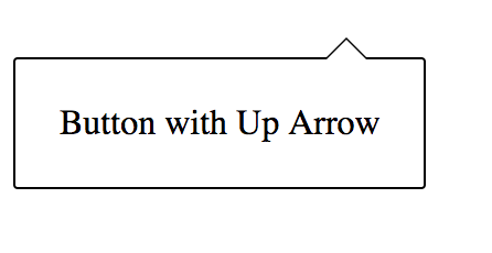
I have taken a tooltip from another Stack Overflow post, and slightly modified it. It looks like this:
Generated from the following code:
.up-arrow {
    display: inline-block;
    position: relative;
    border: 1px solid black;
    text-decoration: none;
    border-radius: 2px;
    padding: 20px;
    margin-top: 50px;
}
.up-arrow:before {
    content: '';
    display: block;
    position: absolute;
    left: 140px;
    bottom: 100%;
    width: 0;
    height: 0;
    border: 10px solid transparent;
    border-bottom-color: black;
}

.up-arrow:after {
    content: '';
    display: block;
    position: absolute;
    left: 141px;
    bottom: 100%;
    width: 0;
    height: 0;
    border: 9px solid transparent;
    border-bottom-color: white;
}
<div href="#" class="up-arrow">Button with Up Arrow</div>If you look very closely, you can see that the color of the :before element is not actually black, it is #77777.

This problem has left my coworkers and I stumped. It is consistent across browsers. Can anyone provide some insight?