I am running into a bug with how Safari is handling some flexbox elements. In Chrome, all elements are contained within the DIV and are handled properly. In Safari, the only thing inside the DIV is the SVG, and the remaining two elements are forced out and start exactly where the margin ends for the DIV.
I even tried to swap the SVG out with a PNG and it doesnt seem to be that. Its hard trying to figure out what could be causing it, when non of the code in the dev tools is really triggering it to even be closer to what it is supposed to be. There is no extra padding, and even when clearing the media queries, it still is messed up. I have a script that adds all of the prefixes to the CSS when building the SASS, and when I took that out, it still does the exact same behavior.
Is there something in Safari to handle flexed DIVs differently than Chrome that I might not have learned on my own? Any help is appreciated. Thank you. I tried setting the flex shrink and grow, adding different position or display settings, and even trying other elements in the DIV.
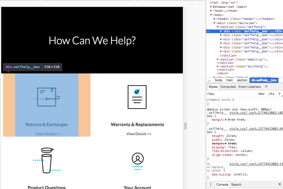
Here is an image of the DIV in Chrome being nice and contained.
And here it is in Safari with the two elements outside.

Here is a link to the live site link
Here is a link to the code github
And here is the code for that specific DIV and its elements.
.miirhelp {
 display: flex;
 flex-wrap: wrap;
 justify-content: space-around;
 margin-bottom: 8rem;


 &__box {
  height: 21rem;
  width: 21rem;
  margin: 5rem;

  display: flex;
  flex-direction: column;
  align-items: center;

  &-logo {
   max-height: 100%;
   max-width: 100%;
  }

  &-text {
   font-size: 1.5rem;
   font-weight: 700;
  }

  &-btn {
   background-color: #fff;
   color: var(--color-grey-dark-1);
   margin-top: 1rem;
   margin-left: 1rem;
   border: none;
   font-size: 1.2rem;
   cursor: pointer;
   text-decoration: none;
  }

  @media screen and (max-width: 1244px) {
   margin: 1rem;
  }

  @media screen and (max-width: 950px) {
   margin: 0rem 0rem;
  }
  @media screen and (max-width: 850px) {
   margin: 0rem 4rem;
  }
  @media screen and (min-width: 1200px) {
   height: 23rem;
   width: 23rem;
   margin: 3rem;
  }
  @media screen and (min-width: 1600px) {
   height: 30rem;
   width: 30rem;
  }
 }
}