I have an html5 canvas game for desktop browsers that uses the keyboard, and I'm trying to create compatibility for smartphones by adding touch-screen controls.
The current issue is that the events for touch input are returning X and Y coordinates that don't match the location where I'm touching.
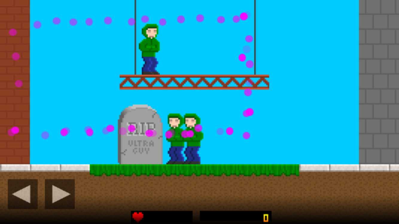
The purple dots in the image above are a diagnostic test I added. The game places a circle in each location where it detects a touch event. In this case, I traced the border of my phone screen. The placement of dots illustrates the difference between where my screen actually is and where the game seems to think it is.
<body onload="html_init()">
  <div class="canvas_div" id="canvas_div">
    <canvas width="1050" height="600" id="canvas"></canvas>
  </div>
</body>

function html_init()
  {
  canvas_html = document.getElementById ("canvas");
  window.addEventListener ("resize", resize_canvas, false);
  canvas_html.addEventListener ("touchstart",  function(event) {touch_start (event)},  false);
  }

function resize_canvas ()
  {
  // Scale to fit window, decide which scaling reaches edge first.

  canvas_2d.restore();
  canvas_2d.save();

  var game_ratio = canvas_2d.canvas.width / canvas_2d.canvas.height;
  var window_ratio = window.innerWidth / window.innerHeight;
  var xratio = window.innerWidth / canvas_2d.canvas.width;
  var yratio = window.innerHeight / canvas_2d.canvas.height;

  var ratio;
  if (game_ratio > window_ratio) ratio = xratio;
  else ratio = yratio;
  if (ratio > 1) ratio = 1;

  canvas_2d.scale (ratio, ratio);
  }

function touch_start (event)
  {
  var touch = event.changedTouches;
  var x = touch[0].pageX;
  var y = touch[0].pageY;

  // this goes on to add the purple test sprite to the screen at that location.
  }
I've tried referencing pageX, clientX and screenX, but none of them have the correct values. Even though my canvas is set to 1050 x 600, which is what my game runs at, the touch screen seems to think it's somewhere around 650 x 350. If it matters, the test phone is an iPhone 6.
I'm not sure what to check at this point. Any ideas are appreciated.
UPDATE: I've narrowed the problem down to two facts - that the canvas size is larger than the display area of the web page being shown, and that I'm using resize_canvas() to set the scale. It looks like I'm going to have to either reduce the overall size of the canvas to fit the phone or add a formulaic adjustment to the coordinates based on the scale ratio.