My current situation looks like this:

The image is obviously too large so I had added the following code in my CSS:
max-width: 800px;
But then my image moves way too high. As you can see in the in the link below:

My question is how can I make the image smaller and keep it directly above on top of the footer? So that it exactly just fits on the footer like I had shown in the first image.
And here is a part of the HTML code of my page:
<section class="section-main section-about">
    <div class="container">
        <div class="row">
            <div class="col-md-4">
                <h2 class="page-header heading-primary-a">Over mij</h2>
                <p>In lacinia ipsum sit amet ultricies semper. Nulla facilisi. Proin et nulla consequat mauris gravida vestibulum. Donec non risus et velit auctor lobortis. Aliquam in placerat justo. Etiam nisi libero, suscipit vel nulla eget, blandit ultricies quam. Nunc pretium pharetra tellus sed suscipit. Fusce rhoncus metus est, quis facilisis eros luctus vestibulum. Morbi vestibulum, urna vitae feugiat tincidunt, urna magna pharetra enim, id congue lectus elit sit amet quam. Vivamus sit amet enim eros. Etiam nec molestie risus.</p>
                <p>Donec non est gravida, condimentum mauris sed, bibendum lectus. Duis poid.</p>
            </div>
            <div class="col-md-8">
                <img class="over-img" src="../../../images/zaky_upper.png" alt="Zaky">

            </div>
        </div>
    </div>
</section>
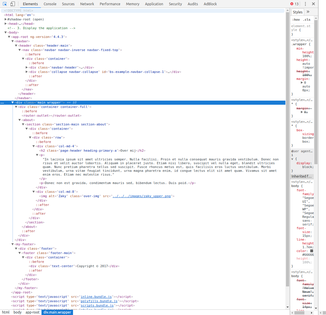
And here is a image of the HTML tree, it's a bit difficult to share the HTML code because it's an Angular app where I keep my navbar, content and footer separated. That's why I'm sharing the HTML code also through a image:
And below is a part of the CSS code:
.page-header {
  margin-top: 30px;
}

.heading-primary, .heading-primary-a {
  color: #FF5700;
}

.heading-primary-a {
  border-bottom: 2px solid #FF5700;
}

.section-main {
  padding-bottom: 0px;
}

.section-about {
  margin-top: 90px;
}

.over-img {
  /* currently commented out */
  /* max-width: 800px; */
}
If you want to see the whole CSS code you can find it in the link below:
Thanks in advance.