I have what I think is a version of remove data points when using stat_summary to generate mean and confidence band or How to set multiple colours in a ggplot2 stat_summary plot? and may also relate to this bug report relating to the SE parameter https://github.com/tidyverse/ggplot2/issues/1546, but I can't seem to figure out what I am doing wrong.
I have weekly data and I am trying to plot current year, previous year, 5 year average, and 5 year range. I can get the plot and all the elements that I want, but I can't get the fill in the range to relate to my scale_fill command.
Here is the code I am using:
library(plyr)
require(dplyr)
require(tidyr)
library(ggplot2)
library(lubridate)
library(zoo)
library(viridis)

  ggplot(df1,aes(week,value)) +
  geom_point(data=subset(df1,year(date)==year(Sys.Date()) ),size=1.7,aes(colour="1"))+
  geom_line(data=subset(df1,year(date)==year(Sys.Date()) ),size=1.7,aes(colour="1"))+
  geom_line(data=subset(df1,year(date)==year(Sys.Date())-1 ),size=1.7,aes(colour="2"))+
  geom_point(data=subset(df1,year(date)==year(Sys.Date())-1 ),size=1.7,aes(colour="2"))+
  #stat_summary(data=subset(df1,year(date)<year(Sys.Date()) &year(date)>year(Sys.Date())-6),geom = 'smooth', alpha = 0.2,size=1.7,
  #             fun.data = median_hilow,aes(colour=c("1","2","3"),fill="range"))+
  stat_summary(data=subset(df1,year(date)<year(Sys.Date()) &year(date)>year(Sys.Date())-6),geom="smooth",fun.y = mean, fun.ymin = min, fun.ymax = max,size=1.7,aes(colour="c",fill="b"))+
  #stat_summary(fun.data=mean_cl_normal, geom='smooth', color='black')+
  scale_color_viridis("",discrete=TRUE,option="C",labels=c(year(Sys.Date()), year(Sys.Date())-1,paste(year(Sys.Date())-6,"-",year(Sys.Date())-1,"\naverage",sep ="")))+
  scale_fill_viridis("",discrete=TRUE,option="C",labels=paste(year(Sys.Date())-6,"-",year(Sys.Date())-1,"\nrange",sep =""))+
  #scale_fill_continuous()+
  scale_x_continuous(limits=c(min(df1$week),max(df1$week)),expand=c(0,0))+
  theme_minimal()+theme(
    legend.position = "bottom",
    legend.margin=margin(c(0,0,0,0),unit="cm"),
    legend.text = element_text(colour="black", size = 12),
    plot.caption = element_text(size = 14, face = "italic"),
    plot.title = element_text(face = "bold"),
    plot.subtitle = element_text(size = 14, face = "italic"),
    #panel.grid.minor = element_blank(),
    text = element_text(size = 14,face = "bold"),
    axis.text.y =element_text(size = 14,face = "bold", colour="black"),
    axis.text.x=element_text(size = 14,face = "bold", colour="black",angle=90, hjust=1),
  )+
  labs(y="Crude Oil Imports \n(Weekly, Thousands of Barrels per Day)",x="Week",
       title=paste("US Imports of Crude Oil",sep=""),
       caption="Source: EIA API, graph by Andrew Leach.")
I have placed an test.Rdata file here with the df1 data frame: https://drive.google.com/file/d/1aMt4WQaOi1vFJcMlgXFY7dzF_kjbgBiU/view?usp=sharing
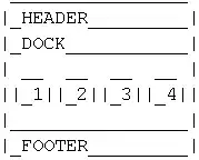
Ideally, I'd like to have a fill legend item that looks like this, only with the text as I have it in my graph:

Any help would be much appreciated.


