0

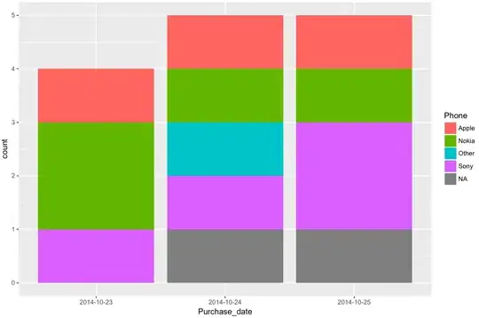
I'm trying to recreate this kind of plot in R but I'm not very successful. Where X = date and Y = frequency of a discrete variable, cumulative on one bar. Also I'm trying to put it in a function so it would be easier to use this kind of plot for different variables.

Link to the plot image <---

I'd appreciate any help!

Data example: Excel plot example <---

Purchase_date Phone
2014-10-23  Sony
2014-10-23  Apple
2014-10-23  Nokia
2014-10-23  Nokia
2014-10-24  NA
2014-10-24  Nokia
2014-10-24  Sony
2014-10-24  Other
2014-10-24  Apple
2014-10-25  Sony
2014-10-25  NA
2014-10-25  Apple
2014-10-25  Sony
2014-10-25  Nokia

Also I have something like this but it's definitely far from universal method for different variables:

  base_table %>%
  filter(year(as.Date(BUY_DATE)) >= 2014, year(as.Date(BUY_DATE)) <= 2017) %>%
  mutate(BUY_DATE = as.yearmon(as.Date(BUY_DATE))) %>%
  group_by(PHONETYPE, BUY_DATE) %>% summarise(n = n()) -> applPerTypeAndMonth

applPerTypeAndMonth %>% pull(PHONETYPE) %>% table()
filter(applPerTypeAndMonth, PHONETYPE == '') -> x
xts(x$n, order.by = x$BUY_DATE) -> type1
filter(applPerTypeAndMonth, PHONETYPE == 'NOKIA') -> x
xts(x$n, order.by = x$BUY_DATE) -> type2
filter(applPerTypeAndMonth, PHONETYPE == 'APPLE') -> x
xts(x$n, order.by = x$BUY_DATE) -> type3
filter(applPerTypeAndMonth, PHONETYPE == 'SONY') -> x
xts(x$n, order.by = x$BUY_DATE) -> type4
filter(applPerTypeAndMonth, PHONETYPE == 'HUAWEI') -> x
xts(x$n, order.by = x$BUY_DATE) -> type5
filter(applPerTypeAndMonth, PHONETYPE == 'LG') -> x
xts(x$n, order.by = x$BUY_DATE) -> type6
filter(applPerTypeAndMonth, PHONETYPE == 'OTHER') -> x
xts(x$n, order.by = x$BUY_DATE) -> type7
merge(type1,type2,type3,type4,type5,type6,type7) -> types
na.fill(types, fill = 0.0) -> types
barplot(types, col = rainbow(7))
types %>% apply(1, function(x) x / sum(x)) %>% barplot(col = rainbow(7))
# legend("topright", legend = names(types), fill = rainbow(7))
3 Answers3

0

something along the lines of this,

dta <- structure(list(Purchase_date = structure(c(1L, 1L, 1L, 1L, 2L, 
2L, 2L, 2L, 2L, 3L, 3L, 3L, 3L, 3L), .Label = c("2014-10-23", 
"2014-10-24", "2014-10-25"), class = "factor"), Phone = structure(c(4L, 
1L, 2L, 2L, NA, 2L, 4L, 3L, 1L, 4L, NA, 1L, 4L, 2L), .Label = c("Apple", 
"Nokia", "Other", "Sony"), class = "factor")), .Names = c("Purchase_date", 
"Phone"), class = "data.frame", row.names = c(NA, -14L))

# install.packages(c("ggplot2"), dependencies = TRUE)
library(ggplot2)
g <- ggplot(dta, aes(Purchase_date))
g + geom_bar(aes(fill = Phone))

updated, here's the plot wrapped in a function,

function.name <- function(df)
{
 require(ggplot2)
  p <- ggplot(df, aes(x = Purchase_date))
  p + geom_bar(aes(fill = Phone))
}

function.name(dta)

devils work

I'll obviously recommend you take a look at this site to learn how to label, color, reorder, etc.

Eric Fail
  • 8,191
  • 8
  • 72
  • 128
  • The problem is you have to change absolutely everything if you want different data in it. And also wide range of dates. – Piotr Konopnicki Jan 18 '18 at 16:21
  • What do you mean by "you have to change absolutely everything?" Could you possibly provide some date that show what the problem is. I took the data you provided and showed you how to plot it in accordance with the link you provided. No? As it say in the link provided by Joshua Grant above ``a minimal dataset, _necessary to reproduce the error_' ' [emphasis mine] – Eric Fail Jan 18 '18 at 16:24
  • Aye, but I also wanted, let's say more universal method, meaning that I will have a different set of data (meaning dates and character variable for frequencies) and I was wondering if there is a possibility of making some kind of base function for this type of barplot, that when I will put different set of data it will create something similar. – Piotr Konopnicki Jan 18 '18 at 16:30
  • Then you should have asked for that. The answer is most likely _yes_. You can create a function. I will recommend to take a look at the [how do I ask a good question](https://stackoverflow.com/help/how-to-ask), in addition to the post linked by Joshua Grant above. It's also generally good to demonstrate you already put some effort into it. – Eric Fail Jan 18 '18 at 16:36
  • I did ask about that in the first place. – Piotr Konopnicki Jan 18 '18 at 16:44
0

Using data.table first create a summary table that details the frequency of each phone by each day.

summary = purchases[,list(Purchases = .N), by = list(Purchase_date, Phone)

Then split this out by phone type, and in each sub-dataset order by date and add in a cumulative purchases variable.

splitted = split(summary, summary$Phone)
splitted = lapply(splitted, function(x){
      x = x[order(PurchaseDate)]
      x$CumulativePurchases = cumsum(x$Purchases)
      return(x)})

Then rbindlist back together into a single dataframe and then you can use GGplot easily.

summary = rbindlist(splitted)
plotted = ggplot(summary, aes(x = PurchaseDate, y = CumulativePurchases, fill = Phone)) + geom_bar(stat = "identity")
0
# load packages
library(tidyverse)
library(lubridate)

# create a dataframe from your data
df <- frame_data(
    ~Purchase_date, ~Phone
    , "2014-10-23", "Sony"
    , "2014-10-23", "Apple"
    , "2014-10-23", "Nokia"
    , "2014-10-23", "Nokia"
    , "2014-10-24", "NA"
    , "2014-10-24", "Nokia"
    , "2014-10-24", "Sony"
    , "2014-10-24", "Other"
    , "2014-10-24", "Apple"
    , "2014-10-25", "Sony"
    , "2014-10-25", NA
    , "2014-10-25", "Apple"
    , "2014-10-25", "Sony"
    , "2014-10-25", "Nokia"
)

# make dates dates, if you want to
df <- df %>%
    mutate(Purchase_date = as_date(Purchase_date))

# and plot it
df %>%
    ggplot(aes(Purchase_date, fill = Phone)) +
    geom_bar()

ggplot() and geom_bar() ARE a functions and they do what you want (and actually a whole lot more if desired). How to plot can be read up, e.g., in the R-Graphics Cookbook which really helps whenever you need it.

Georgery
  • 7,643
  • 1
  • 19
  • 52