1

Is there a trick to changing the COL grouping?

As you can see in the picture, the first COL 12 should be long in the MD, in the LG only 9. In the LG, the right column should slide up, this way:

I want that this way.

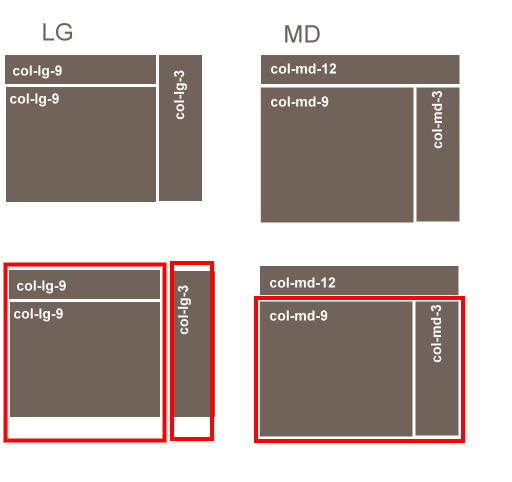
Question: How can I realize this different grouping in Bootstrap 3? Or is there a trick without grouping by MD/LG?

Example Code XS-MD: OK. BUT LG: the right column (News) does not slip up.

    <div class="container">
  <div class="row">
    <div class="col-md-12 col-lg-9 text-center">
      <h4>Title Text</h4>
    </div>
    <div class="col-sm-6 col-md-9 col-lg-9 text-center">
      <h4>Main</h4>
      .<br>
      .<br>
      .<br>
      .<br>
    </div>
    <div class="col-sm-6 col-md-3 col-lg-3 text-center">
      <h4>News</h4>
      .<br>
      .<br>
      .<br>
      .<br>
      .<br>
      .<br>
      .<br>
      .<br>
    </div>
   </div>
</div>

Live example at bootply: https://www.bootply.com/uDkg1vTKkZ

WebDevBooster
  • 14,674
  • 9
  • 66
  • 70
Sarah Trees
  • 822
  • 12
  • 28

4 Answers4

3

I would do this:

<div class="container">
  <div class="row">
    <div class="col-md-12 hidden-lg text-center">
      <h4>Title</h4>
    </div>
    <div class="col-sm-6 col-md-9 text-center">
      <div class="visible-lg"><h4>Title</h4></div>
      <h4>Main</h4>
    </div>
    <div class="col-sm-6 col-md-3 text-center">
      <h4>Sidebar</h4>
    </div>
   </div>
</div>

This solution hides the col-md-12 on the large view, using the hidden-lg class. At the same time it shows an extra title div within the col-md-9 div, using the visible-lg class.

The only drawback is that it duplicates your title (div). If you do not like that you can achieve exactly the same result with some javascript using window.onresize. Javascript can actually remove the unused element from the DOM, instead of hiding it.

Mr. Hugo
  • 11,887
  • 3
  • 42
  • 60
  • +1 for duplicating the least costy element (title). but it will be within the same container as the main element's which is slightly different than what the op wanted – CME64 Feb 07 '18 at 10:52
  • True. Unfortunately I do not know how to solve it in another way. – Mr. Hugo Feb 07 '18 at 10:53
1

You can achive this layout with flexbox. First, set the parent to display:flex; with flex-direction:row and flex-wrap: wrap;. Next set the flex attribute of the title (flex: 1 0 100%), main container (flex: 1 0 75%) and news container (flex: 1 0 25%). This will achieve the initial look you want of one row across the top and two columns split 75% 25% in the next row.

Then, I set a breakpoint at width 1200px, use absolute positioning to shift the lower column to the upper right hand corner (position: absolute; right:0; top:0;), and make the column take up the entire height of the container (height: 100%). Finally, I set the widths of of title-container and main-container to 75% (flex: 0 0 75%;).

html, body  { 
    height: 100%;
    width: 100%;
}

.parent {
    display:flex;
    flex-direction:row;
    flex-wrap:wrap;
    height: 500px;
    width: 100%;
}

.title-container {
    background-color:red;
    height:50%;
    flex: 1 0 100%; 
}

.main-container {
    background-color:green;
    height: 50%;
    flex: 1 0 75%;
}

.news-container {
    background-color:orange;
    height: 50%;
    flex: 1 0 25%;
}

@media (min-width: 1200px){


.news-container {
    height:100%;
    position: absolute;
    right:0;
    top:0;
    width:25%;
}

.title-container, .main-container {
    flex: 0 0 75%;
}

.parent {
    position:relative;
}

.main-container {
    height:50%;
}
}

<div id="parent-container" class="container">
    <div id="row-container" class="row parent">
        <div class="col-md-12 col-lg-9 text-center title-container">
            <h4>Title Text</h4>
        </div>
        <div class="col-sm-6 col-md-9 col-lg-9 text-center main-container">
            <h4>Main</h4>
        </div>
        <div class="col-sm-6 col-md-3 col-lg-3 text-center news-container">
            <h4>News</h4>
        </div>
    </div>
</div>

Here is a fiddle

Jonathan Chaplin
  • 2,442
  • 1
  • 18
  • 21
  • “flex“, great idea! But Bootstrap 3 works for old browsers to. Is “flex“ supported in all old browsers, included by bootstrap 3? How can I do that in IE8? – Sarah Trees Jan 31 '18 at 11:58
  • I'm bowing out of this one. media queries aren't supported in IE8 (https://stackoverflow.com/questions/5769493/ie8-support-for-css-media-query). You can try conditional stylesheets. Also you can use respond.js if you need media query support in IE8 (https://getbootstrap.com/docs/3.3/getting-started/). Good luck and godspeed. – Jonathan Chaplin Feb 01 '18 at 12:15
  • Yes, unfortunately we still have to consider IE8. A small part of our users works with old notebooks, standard browser IE8. _ Yes, we are using respond.js for Internet Explorer 8 and 9! – Sarah Trees Feb 01 '18 at 14:01
  • and html5shiv.js – Sarah Trees Feb 01 '18 at 14:04
1

Just swap the 2nd and 3rd div and add .pull-right like this

<div class="container">   <div class="row">
    <div class="col-md-12 col-lg-9 text-center">
      <h4>col-md-12 col-lg-9</h4>
    </div>
    <div class="col-sm-6 col-md-3 col-lg-3 text-center pull-right">
      <h4>col-sm-6 col-md-3 col-lg-3</h4>
      .<br>
      .<br>
      .<br>
      .<br>
      .<br>
      .<br>
      .<br>
      .<br>
    </div>
    <div class="col-sm-6 col-md-9 col-lg-9 text-center">
      <h4>col-sm-6 col-md-9 col-lg-9</h4>
      .<br>
      .<br>
      .<br>
      .<br>
    </div>    </div> </div>

Check demo

For clearing float, check clearfix

Yuri
  • 3,082
  • 3
  • 28
  • 47
1

this does the trick but will require duplicating the middle element to be displayed in both layouts correctly. or you can just insert it dynamically using javascript.

/* BOOTSTRAP 3.x GLOBAL STYLES
-------------------------------------------------- */
body {
  padding-bottom: 40px;
  color: #5a5a5a;
}
DIV.row{
  border: 1px solid blue;
}
DIV.text-center{
  border: 1px solid red;
}

div[class^="col-lg-"],div[class^="col-md-"]{
padding:0;
}
<link href="//maxcdn.bootstrapcdn.com/bootstrap/3.2.0/css/bootstrap.min.css" rel="stylesheet" />
<script src="https://code.jquery.com/jquery-1.11.1.min.js" type="text/javascript" ></script>
<script src="//maxcdn.bootstrapcdn.com/bootstrap/3.2.0/js/bootstrap.min.js" type="text/javascript" ></script>

<div class="container">
  <div class="row">

    <div class="col-md-12 col-lg-9">
      <div class="text-center">
        <h4>header</h4>
      </div>
    
      <!-- duplicate for display in different grid -->
      <div class="visible-lg visible-xs visible-sm text-center">
        <h4>Main</h4>
        <br/><br/><br/><br/><br/><br/>
      </div>
    </div>
    
    <div class="col-md-12 col-lg-3">
      <!-- duplicate for display in different grid -->
      <div class="visible-md col-md-9 text-center">
        <h4>Main</h4>
        <br/><br/><br/><br/><br/><br/>
      </div>
      
      <div class="text-center">
      <h4>News</h4>
        <br/><br/><br/><br/><br/><br/>
      </div>
    </div>

    
  </div>
</div>

and here is a working fiddle to test it better (note I removed the padding for better visibility, you can remove the css) JSBin

CME64
  • 1,673
  • 13
  • 24