6

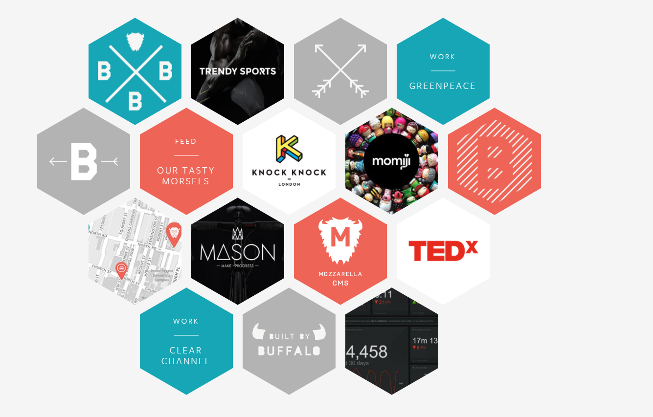
This is the layout I'm looking to achieve:

I've created the hexagon with this css:

.hexagon {
  width: 100px;
  height: 55px;
  background: red;
  position: relative;
  display:inline-block;
  margin:0.2em;
}
.hexagon:before {
    content: "";
    position: absolute;
    top: -25px;
    left: 0;
    width: 0;
    height: 0;
    border-left: 50px solid transparent;
    border-right: 50px solid transparent;
    border-bottom: 25px solid red;
}
.hexagon:after {
    content: "";
    position: absolute;
    bottom: -25px;
    left: 0;
    width: 0;
    height: 0;
    border-left: 50px solid transparent;
    border-right: 50px solid transparent;
    border-top: 25px solid red;
}

However, I'm looking to find out how to fill them with an image. Here is a pen:https://codepen.io/1istbesser/pen/ddypXK

How do I put images inside the hexagon so that it covers all of it? If I use background-image on #hexagon1, the image only covers the middle part.

1istbesser
  • 127
  • 2
  • 9

4 Answers4

2

The problem you're going to run into is that using CSS triangles to create a hexagon actually yields square boxes with one or two borders filled in (and the rest transparent). This has two effects:

  1. You can't easily put an image into the filled border so that it's clipped.
  2. You can't make the hexagon - and only the hexagon - clickable: the whole set of rectangles will always be clickable, which will make your layout tricky where they overlap.

You're going to need something that can produce an actual hexagon. Inline SVG with a clip-path is a good fit - unlike clip-path in CSS, it's supported pretty much wherever SVG is. Here's an example:

<svg class="svg-graphic" width="300" height="300" viewBox="0 0 300 300" xmlns="http://www.w3.org/2000/svg" xlink="http://www.w3.org/1999/xlink" version="1.1">
    <defs>
       <clipPath id="hexagonal-mask">
          <polygon points="300,150 225,280 75,280 0,150 75,20 225,20" />
       </clipPath>
    </defs> 
    <image clip-path="url(#hexagonal-mask)" height="100%" width="100%" xlink:href="https://i.imgur.com/grp9BU1.png" preserveAspectRatio="xMidYMin slice"/>
</svg>

Here's a more detailed example showing clickable hexagons, and re-use of the clip path definition:

.svg-template {
  position: absolute;
}

.honeycomb {
  list-style: none;
  margin: 0;
  padding: 0;
  position: relative;
  width: 1200px;
  height: 1200px;
  border: 1px solid #DDD;
}

.honeycomb li {
 margin: 0;
 padding: 0;
 position: absolute;
}

.honeycomb li:nth-child(1) {
  top: 0;
  left: 0;
}

.honeycomb li:nth-child(2) {
  top: 0;
  left: 290px;
}

.honeycomb li:nth-child(3) {
  top: 0;
  left: 580px;
}

.honeycomb li:nth-child(4) {
  top: 240px;
  left: 145px;
}

.honeycomb li:nth-child(5) {
  top: 240px;
  left: 435px;
}

.honeycomb li:nth-child(6) {
  top: 240px;
  left: 725px;
}

.honeycomb li a {
  cursor: pointer;
}

.honeycomb li a:hover image{
 opacity: 0.5;
}
<svg class="svg-template" viewBox="0 0 100 100" xmlns="http://www.w3.org/2000/svg" xlink="http://www.w3.org/1999/xlink" version="1.1">
   <defs>
      <clipPath id="hexagonal-mask">
         <polygon points="50 0, 95 25, 95 75, 50 100, 5 75, 5 25" />
      </clipPath>
    </defs>
</svg>

<ul class="honeycomb">
  <li>
     <svg width="300" height="300" viewBox="0 0 100 100" >
      <a href="#something">
        <image clip-path="url(#hexagonal-mask)" height="100%" width="100%" xlink:href="https://i.imgur.com/grp9BU1.png"/>
       </a>
    </svg>
  </li>
  <li>
     <svg width="300" height="300" viewBox="0 0 100 100" >
      <a href="#something">
        <image clip-path="url(#hexagonal-mask)" height="100%" width="100%" xlink:href="https://i.imgur.com/grp9BU1.png"/>
       </a>
    </svg>
  </li>
  <li>
     <svg width="300" height="300" viewBox="0 0 100 100" >
      <a href="#something">
        <image clip-path="url(#hexagonal-mask)" height="100%" width="100%" xlink:href="https://i.imgur.com/grp9BU1.png"/>
       </a>
    </svg>
  </li>
  <li>
     <svg width="300" height="300" viewBox="0 0 100 100" >
      <a href="#something">
        <image clip-path="url(#hexagonal-mask)" height="100%" width="100%" xlink:href="https://i.imgur.com/grp9BU1.png"/>
       </a>
    </svg>
  </li>
  <li>
     <svg width="300" height="300" viewBox="0 0 100 100" >
      <a href="#something">
        <image clip-path="url(#hexagonal-mask)" height="100%" width="100%" xlink:href="https://i.imgur.com/grp9BU1.png"/>
       </a>
    </svg>
  </li>
  <li>
     <svg width="300" height="300" viewBox="0 0 100 100" >
      <a href="#something">
        <image clip-path="url(#hexagonal-mask)" height="100%" width="100%" xlink:href="https://i.imgur.com/grp9BU1.png"/>
       </a>
    </svg>
  </li>
</ul>
Ben Hull
  • 7,524
  • 3
  • 36
  • 56
1

You need to consider another way if you want to use image as background. You are relying on pseudo element so your hexagone is not one element and thus you cannot use background image to cover the whole area.

Here is an idea using clip-path:

* {
  background-color: black;
}

section {
  margin-top: 3em;
  display: flex;
  flex-flow: column;
  align-items: center;
}

.hexagon {
  width: 100px;
  height: 100px;
  background: url(https://lorempixel.com/100/100/) 0 0/cover no-repeat;
  position: relative;
  display: inline-block;
  margin: -10px 0.2em;
  -webkit-clip-path: polygon(50% 0%, 100% 25%, 100% 75%, 50% 100%, 0% 75%, 0% 25%);
clip-path: polygon(50% 0%, 100% 25%, 100% 75%, 50% 100%, 0% 75%, 0% 25%);
}
<section>
  <div class="row">
    <div class="hexagon" id="hexagon1"></div>
    <div class="hexagon" id="hexagon2"></div>
    <div class="hexagon" id="hexagon3"></div>
    <div class="hexagon" id="hexagon4"></div>
  </div>
  <div class="row">
    <div class="hexagon" id="hexagon5"></div>
    <div class="hexagon" id="hexagon6"></div>
    <div class="hexagon" id="hexagon7"></div>
    <div class="hexagon" id="hexagon8"></div>
    <div class="hexagon" id="hexagon9"></div>
  </div>

</section>
Temani Afif
  • 245,468
  • 26
  • 309
  • 415
1

What you could do is draw an SVG and than put the image as mask in css

https://codepen.io/noahblon/post/coloring-svgs-in-css-background-images

*{
  background-color:black;
}
section{
  margin-top:3em;
  display:flex;
  flex-flow: column;
  align-items: center;
}
.hexagon {
 width: 100px;
 height: 110px;
 background: red;
 position: relative;
  display:inline-block;
  margin:0.2em;
  -webkit-mask:url(https://svgshare.com/i/5Fk.svg) no-repeat 50% 50%;
  mask:url(https://svgshare.com/i/5Fk.svg) no-repeat 50% 50%;
  background-image: url('https://img1.ibxk.com.br/2017/07/13/13160112901226.jpg?w=700');
  background-size: cover;
  background-position: center;
}
.row{
  text-align: center;
  margin-top: -25px
}
<section>
      <div class="row">
      <div class="hexagon" id="hexagon1"></div>
      <div class="hexagon" id="hexagon2"></div>
      <div class="hexagon" id="hexagon3"></div>
      <div class="hexagon" id="hexagon4"></div>
      <div class="row">
      <div class="hexagon" id="hexagon5"></div>
      <div class="hexagon" id="hexagon6"></div>
      <div class="hexagon" id="hexagon7"></div>
      </div>
      <div class="row">
      <div class="hexagon" id="hexagon8"></div>
      <div class="hexagon" id="hexagon9"></div>
      </div>
 </section>
SpaceDogCS
  • 2,808
  • 3
  • 20
  • 49
  • This is a clean option from my POV. You can the easily switch with another svg mask and create a new design. +1 from me – Dinca Adrian Jan 29 '18 at 13:26
0

I made this code

Codepen

I changed the way you draw the element, instead adding the border top with the color red, I added the sides with a background, but you'd need to know the background-color of the page to do that, so I put the image above the box and the before and after above the image

CSS

*{
  background-color:black;
}
section{
  margin-top:3em;
  display:flex;
  flex-flow: column;
  align-items: center;
}
.hexagon {
    width: 100px;
    height: 110px;
    background: red;
    position: relative;
  display:inline-block;
  margin:0.2em;
  overflow: hidden;
}
.hexagon img{
  position: absolute;
  left: 50%;
  top: 50%;
  min-width: 100%;
  min-height: 100%;
  height: 100%;
  transform: translate(-50%, -50%);
  z-index: 1;
}
.hexagon:before {
    content: "";
    position: absolute;
    top: 0;
    left: 0;
    width: 0;
    height: 0;
    border-right: 50px solid black;
    border-left: 50px solid black;
    border-bottom: 25px solid transparent;
  z-index: 2;
}
.hexagon:after {
    content: "";
    position: absolute;
    bottom: 0;
    left: 0;
    width: 0;
    height: 0;
    border-right: 50px solid black;
    border-left: 50px solid black;
    border-top: 25px solid transparent;
  z-index: 2;
}
.row{
margin-top:1.3em;
}
.hexagon#hexagon2{
  background-color: purple;
}
.hexagon#hexagon2:before{
  border-bottom-color: purple;
}
.hexagon#hexagon2:after{
  border-top-color: purple;
}
.hexagon#hexagon3{
  background-color: white;
}
.hexagon#hexagon3:before{
  border-bottom-color: white;
}
.hexagon#hexagon3:after{
  border-top-color: white;
}
.hexagon#hexagon4{
  background-color: orange;
}
.hexagon#hexagon4:before{
  border-bottom-color: orange;
}
.hexagon#hexagon4:after{
  border-top-color: orange;
}
SpaceDogCS
  • 2,808
  • 3
  • 20
  • 49