4

I have a Xamarin Android application that uses a Picker to select from a list of values. I have been changing the style of the application, but run into problems with the Picker. Although I can set the TextColor, I could not set the colour of the placeholder text.

After searching SO for help, I've implemented a custom renderer, and I now have the text and placeholder showing in the correct text. However, previously when I touched the placeholder text, the child dialog appeared and displayed all the items, allowing the user to select one. Now I have the custom renderer implemented, the child dialog only shows the top two items, and the user has to scroll through them before hitting OK.

I have two questions:

  1. At a minimum, how can I get the child dialog displaying the full list again?
  2. Is it possible to set the background and text colour for the items list dialog?

The XAML looks like this:

<c:CustomPicker x:Name="DivisionList" Title="{x:Static prop:Resources.PickerDivision}" 
                        SelectedIndexChanged="DivisionList_SelectedIndexChanged">
    <Picker.Behaviors>
        <b:RequiredPickerValidator x:Name="DivValidator" IsValid="{Binding Path=BindingContext.IsDivisionValid, Mode=OneWayToSource, Source={x:Reference contentPage}}" />
    </Picker.Behaviors>
</c:CustomPicker>

The CustomPicker class is as follows:

namespace <myapp>.Portable.Controls
{
    public class CustomPicker : Picker
    {
        public Color PlaceholderColour
        {
            get { return (Color)App.Current.Resources["PlaceholderTextColour"]; }
        }

        public Color TextColour
        {
            get { return (Color)App.Current.Resources["LabelTextColour"]; }
        }

        public Color BackgroundColour
        {
            get { return (Color)App.Current.Resources["PaneBackgroundColour"]; }
        }
    }
}

And the customer renderer is this:

[assembly: ExportRendererAttribute(typeof(CustomPicker), typeof(CustomPickerRenderer))]
namespace <myapp>.Droid.Controls.Renderers
{
    public class CustomPickerRenderer : PickerRenderer
    {
        protected override void OnElementChanged(ElementChangedEventArgs<Picker> e)
        {
            base.OnElementChanged(e);

            Control?.SetPadding(20, 20, 20, 20);
            if (e.OldElement != null || e.NewElement != null)
            {
                var customPicker = e.NewElement as CustomPicker;

                Android.Graphics.Color phCol = customPicker.PlaceholderColour.ToAndroid();
                Android.Graphics.Color textCol = customPicker.TextColour.ToAndroid();
                Android.Graphics.Color bgCol = customPicker.BackgroundColour.ToAndroid();

                Control.SetBackgroundColor(bgCol);
                Control.SetHintTextColor(phCol);
                Control.SetTextColor(textCol);
            }
        }
    }
}

Many thanks in advance!

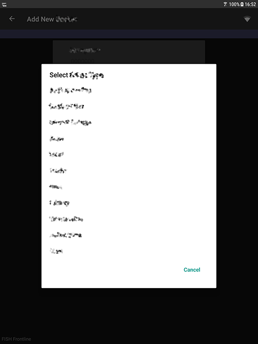
Picker popup before custom renderer: Picker popup before custom renderer

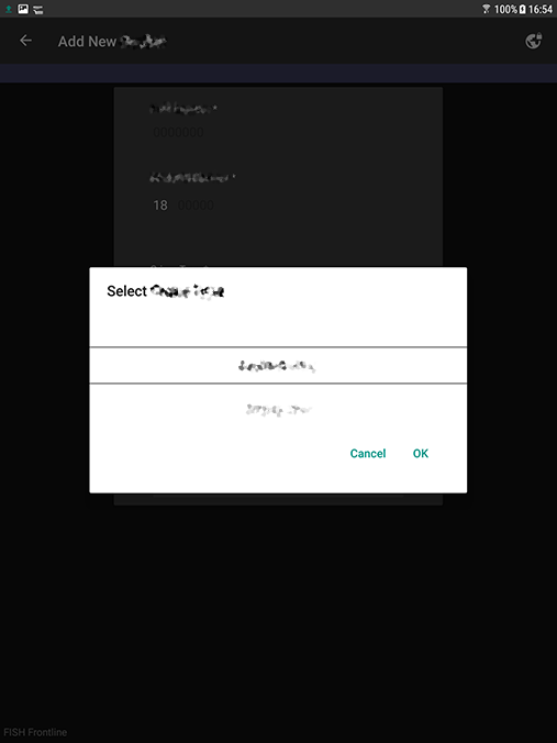
Picker popup after custom renderer: Picker popup after custom renderer

OriginalBigBri
  • 163
  • 2
  • 13
  • Hi, have you test my answer? Have you solved your problem? – Robbit Feb 08 '18 at 14:49
  • Hi, thanks for the answer. Yes, I have tried it and it does indeed bring up the dialog defined, but I was hoping to progress a little further before commenting. I now have to figure out how to match the styles to the rest of the app, as everything else is defined in XAML in the portable part of the project. I'm very new to Xamarin - all my previous development has been for Windows or using native Android.... – OriginalBigBri Feb 09 '18 at 15:16

3 Answers3

7

There appear to be 2 picker renderers.

Xamarin.Forms.Platform.Android.PickerRenderer & Xamarin.Forms.Platform.Android.AppCompat.PickerRenderer

Make sure you use the last one and your layout will be the same as before!!!

The source where i got my answer: https://forums.xamarin.com/discussion/97150/how-to-write-a-custom-renderer-for-bindable-picker-to-change-its-font-attributes-family-size

Renderers (no real indication there are 2): https://learn.microsoft.com/en-us/xamarin/xamarin-forms/app-fundamentals/custom-renderer/renderers

Andy
  • 71
  • 1
  • 2
  • Hi, thanks for adding another answer (sorry I was on holiday when it got posted and missed the notification). I'm off the project at the moment, but will probably be back on it next week, so I'll try this out. – OriginalBigBri Aug 17 '18 at 12:30
3

You can add Click event on Control, and then you can custom a dialog, in this dialog, you can custom anything what you want, background, item text color, etc.

In your CustomPickerRenderer, do like this:

protected override void OnElementChanged(ElementChangedEventArgs<Picker> e)
{
    base.OnElementChanged(e);

    Control?.SetPadding(20, 20, 20, 20);
    if (e.OldElement != null || e.NewElement != null)
    {
        var customPicker = e.NewElement as CustomPicker;
        ...
        // add click event
        Control.Click += Control_Click;
    }
}

You can show a Dialog, and custom it's layout, for example, add a ListView in its layout, so you will get the child dialog displaying the full list:

private void Control_Click(object sender, EventArgs e)
{
    Toast.MakeText(Xamarin.Forms.Forms.Context,"111111",ToastLength.Short).Show();
    dialog = new Dialog(Forms.Context);
    dialog.SetContentView(Resource.Layout.dialog);
    Android.Widget.Button b1 = (Android.Widget.Button)dialog.FindViewById(Resource.Id.button1);
    Android.Widget.Button b2 = (Android.Widget.Button)dialog.FindViewById(Resource.Id.button2);
    Android.Widget.ListView listView = (Android.Widget.ListView)dialog.FindViewById(Resource.Id.lv);
    listView.Adapter=new ArrayAdapter<String>(Forms.Context, Android.Resource.Layout.SimpleExpandableListItem1,
        new List<String>() { "111","222","333", "444", "555", "666", "777", "888", "999", });
    b1.Click += B1_Click;
    b2.Click += B2_Click;
    dialog.Show();
}

Below is dialog layout, you can set the background and text color for the items list dialog:

<?xml version="1.0" encoding="utf-8"?>
<LinearLayout xmlns:android="http://schemas.android.com/apk/res/android"
    android:layout_width="fill_parent"
    android:layout_height="wrap_content"
              android:orientation="vertical">
  <TextView 
    android:text="123456"
    android:layout_width="match_parent"
      android:layout_height="wrap_content"/>
  <ListView
      android:id="@+id/lv"
      android:layout_width="wrap_content"
      android:layout_height="0dp"
      android:layout_weight="1"/>
  <LinearLayout
    android:layout_width="fill_parent"
      android:layout_height="wrap_content"
    android:orientation="horizontal">
  <Button
      android:id="@+id/button2"
      android:layout_width="wrap_content"
      android:layout_height="wrap_content"
      android:text="Cancel" />

  <Button
      android:id="@+id/button1"
      android:layout_width="wrap_content"
      android:layout_height="wrap_content"
      android:text="Ok" />
  </LinearLayout>
</LinearLayout>
Robbit
  • 4,300
  • 1
  • 13
  • 29
0

To remove the lines and revert back to the default Picker View without modifying your custom renderer just extend this class

Xamarin.Forms.Platform.Android.AppCompat.PickerRenderer

It should look a little like this;

public class CustomPickerRenderer : Xamarin.Forms.Platform.Android.AppCompat.PickerRenderer
{
    [logic]
}

instead of

public class CustomPickerRenderer : PickerRenderer
{
    [logic]
}

It seems by default you extend Xamarin.Forms.Platform.Android and Class seems to be adding the different picker view.

Kydark
  • 1