16

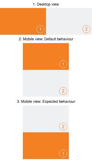
Is it possible to stack right side div over the left sided div in mobile view with the help of CSS? The default behavior is the right sided div floats under the left sided div.

CSS:

.left {
    position: relative;
    float: left;
    background: #F48024;
    width:576px;
    height: 324px;
}
.right {
    position: relative;
    float: left;
    background: #EFF0F1;
    width:576px;
    height: 324px;
}

HTML:

<div class="main">
    <div class="left"></div>
    <div class="right"></div>
</div>

Trying to achieve 3rd layout of this diagram.

enter image description here

Kunj
  • 1,980
  • 2
  • 22
  • 34
  • Have you searched media-query?. you can reposition that div as you want using media-query. https://css-tricks.com/forums/topic/swapping-the-locations-of-two-s-in-a-media-query/ – Saurabh Bayani Feb 09 '18 at 07:13
  • Possible duplicate of [How can I reorder my divs with CSS?](https://stackoverflow.com/questions/220273/how-can-i-reorder-my-divs-with-css) – Temani Afif Feb 09 '18 at 07:51

4 Answers4

19

You can achieve this by using flex box! Change Your css to this:

.main{
    display:flex;
    flex-wrap:wrap;
    justify-content: center;
}

.left {
    position: relative;
    background: #F48024;
    width:576px;
    height: 324px;
}

.right {
    position: relative;
    background: #EFF0F1;
    width:576px;
    height: 324px;
}

@media screen and (min-width:1152px){
  .main {
      justify-content: space-between;
  }

  .left {
      order:2;
  }

  .right {
      order:1;
  }
}

order property determines which element stacks first. You can read more about flex box here: https://css-tricks.com/snippets/css/a-guide-to-flexbox/

dshukertjr
  • 15,244
  • 11
  • 57
  • 94
  • You can also achieve the desired effect with css `grid` layouts, as described [here](https://css-tricks.com/snippets/css/complete-guide-grid/), but browser support is a bigger issue with grid – Cody Haines Feb 09 '18 at 07:16
  • Hi @dshukertjr thanks for reply but your code initially sets the grey div to the left whereas it should be in right in desktop view. – Kunj Feb 09 '18 at 07:24
  • Right. You need to user media queries to apply different css at different screen sizes. Let me edit my answer right now – dshukertjr Feb 09 '18 at 07:27
  • Great! However, won't work in – Kunj Feb 20 '18 at 10:08
11

This may serve as a quick fix:

@media screen and (max-width:480px){
    .main {
        display: flex;
        flex-direction: column-reverse;
    }
}

Note:

You may have to use other flex related css props too to align and justify the content with in the div props like justify-content and align-items.

But if you have many div elements, all of them will be reversed.

div-n
...
div-2
div-1
Oliver Tappin
  • 2,511
  • 1
  • 24
  • 43
pranay kumar
  • 404
  • 3
  • 8
0
@media only screen and (max-width: 1000px) and (min-width: 200px) {
  .div {
    margin-top: 200px;
    position: absolute;
    display:flex;
    flex-direction: column-reverse;
  }
}
Nirav Joshi
  • 2,924
  • 1
  • 23
  • 45
-1

You can do something like this using media query:

div {
  width: 500px;
  height: 200px;
}

.left {
  float: left;
  background-color: yellow;
}

.right {
  float: left;
  background-color: green;
}

@media only screen and (max-width: 1000px) {
  .left {
    margin-top: 200px;
    position: absolute;
  }
  .right {
    position: absolute;
  }
}
<div class="left">left</div>
<div class="right">right</div>
Kunj
  • 1,980
  • 2
  • 22
  • 34
Saurabh Bayani
  • 3,350
  • 2
  • 25
  • 44
  • Thanks Saurabh, however your code wrapping divs in desktop view, it should not. – Kunj Feb 09 '18 at 07:57
  • @KunJ, you can modify `media-query` as per your need. Tell me if modifying media-queries works for you. This is a most simple solution without using next-gen things like `flex` or `grids` – Saurabh Bayani Feb 09 '18 at 08:41
  • Won't work with variable content inside the div. For all that, thanks for your effort. – Kunj Feb 20 '18 at 10:08
  • 1
    This only allows for fixed content. If you have variable content this is not a viable solution. Also, does not cater for multiple screen resolutions when entering from a different device. Using CSS flex option allows for it all to be fluid and dynamic. – Epik Jul 05 '19 at 01:52