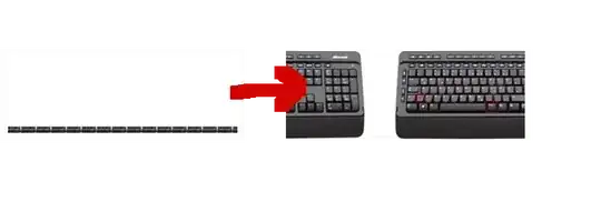
I'm using this code to generate some endless running banner:
<style>
  #myimage {
    position: fixed;
    left: 0%;
    width: 100%;
    bottom: 0%;
    background:url("http://static.giga.de/wp-content/uploads/2014/08/tastatur-bildschirm-senkrechter-strich.jpg") repeat-x scroll 0% 0% / contain;
  }
</style>

<div id="myimage">.</div>


<script>
    var offset = 0
    setInterval(function() {
        offset +=1
        document.getElementById("myimage").style.backgroundPosition = offset + 'px 0px';
    },50)
</script>
To my question: Now I'd like every single image to have a size of 100% of the screen.
I thought about just adding the attribute ...
background-size: 100%;
... but it doesn't seems working that way.
How can I set the width of every single image to 100% of the screens width without removing my style attributes?
