Use bootstrap Grid System
<!DOCTYPE html>
<html lang="en">
<head>
<title>Bootstrap Example</title>
<meta charset="utf-8">
<meta name="viewport" content="width=device-width, initial-scale=1">
<link rel="stylesheet" href="https://maxcdn.bootstrapcdn.com/bootstrap/3.3.7/css/bootstrap.min.css">
<script src="https://ajax.googleapis.com/ajax/libs/jquery/3.3.1/jquery.min.js"></script>
<script src="https://maxcdn.bootstrapcdn.com/bootstrap/3.3.7/js/bootstrap.min.js"></script>
</head>
<body>
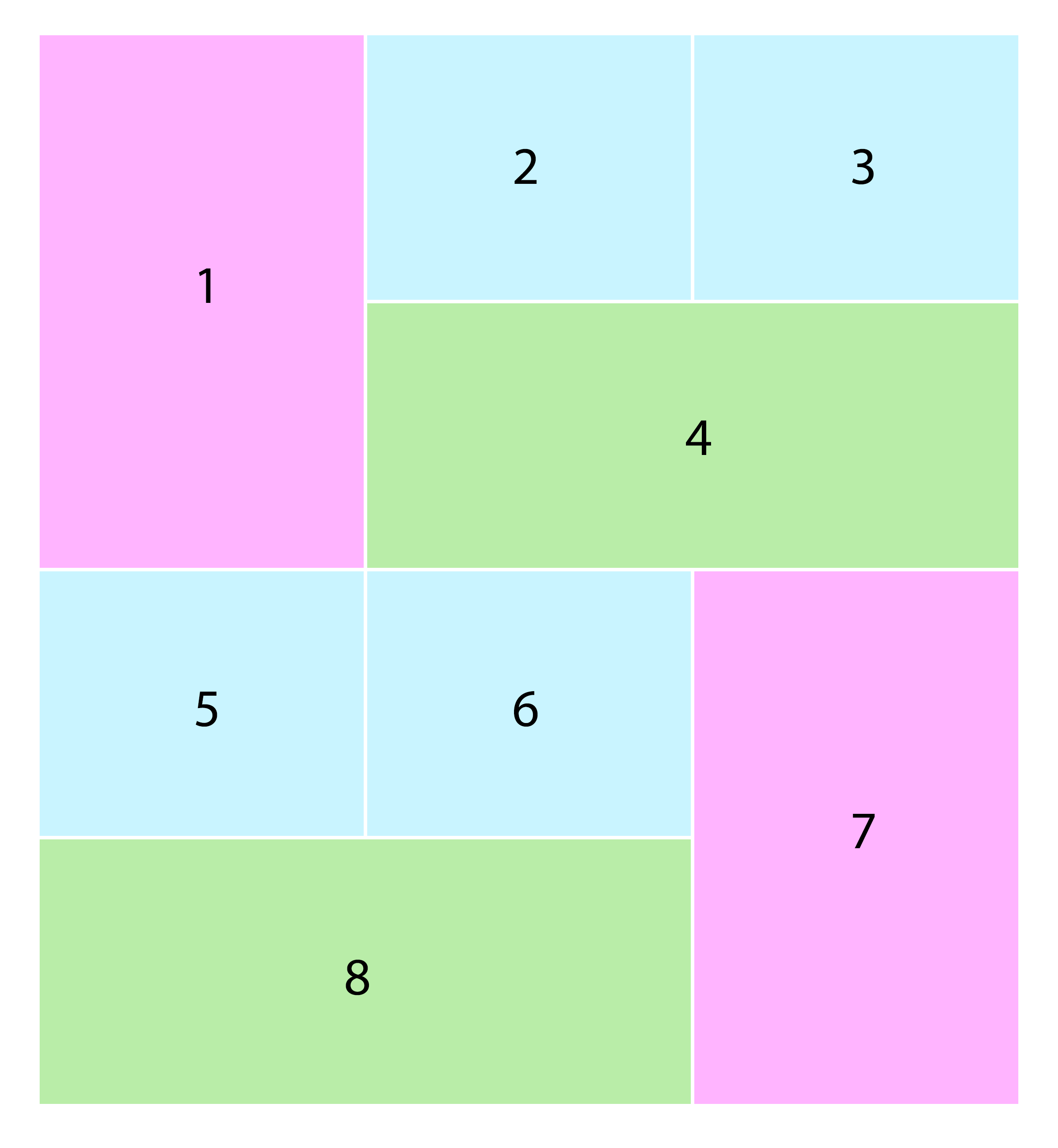
<div class="col-md-12 col-sm-12 col-xs-12">
<div class="col-md-4 col-sm-12 col-xs-12">
<div class="pink">
</div>
</div>
<div class="col-md-8 col-sm-12 col-xs-12">
<div class="col-md-6 col-sm-6 col-xs-6">
<div class="lightblue">
</div>
</div>
<div class="col-md-6 col-sm-6 col-xs-6">
<div class="lightblue">
</div>
</div>
<div class="clearfix">
</div>
<div class="col-md-12 col-sm-12 col-xs-12">
<div class="gray">
</div>
</div>
</div>
</div>
<div class="col-md-12 col-sm-12 col-xs-12">
<div class="col-md-8 col-sm-12 col-xs-12">
<div class="col-md-6 col-sm-6 col-xs-6">
<div class="lightblue">
</div>
</div>
<div class="col-md-6 col-sm-6 col-xs-6">
<div class="lightblue">
</div>
</div>
<div class="clearfix">
</div>
<div class="col-md-12 col-sm-12 col-xs-12">
<div class="gray">
</div>
</div>
</div>
<div class="col-md-4 col-sm-12 col-xs-12">
<div class="pink">
</div>
</div>
</div>
</body>
</html>
In CSS
.pink
{
  background-color:#FFB5FB;
  height:230px;
}
.lightblue
{
  background-color:#C6F4FE;
  height:100px;
}
.gray
{
  background-color:#B3EDAD;
  height:100px;
  margin:30px 0px;

}
.col, .col-1, .col-10, .col-11, .col-12, .col-2, .col-3, .col-4, .col-5, .col-6, .col-7, .col-8, .col-9, .col-auto, .col-lg, .col-lg-1, .col-lg-10, .col-lg-11, .col-lg-12, .col-lg-2, .col-lg-3, .col-lg-4, .col-lg-5, .col-lg-6, .col-lg-7, .col-lg-8, .col-lg-9, .col-lg-auto, .col-md, .col-md-1, .col-md-10, .col-md-11, .col-md-12, .col-md-2, .col-md-3, .col-md-4, .col-md-5, .col-md-6, .col-md-7, .col-md-8, .col-md-9, .col-md-auto, .col-sm, .col-sm-1, .col-sm-10, .col-sm-11, .col-sm-12, .col-sm-2, .col-sm-3, .col-sm-4, .col-sm-5, .col-sm-6, .col-sm-7, .col-sm-8, .col-sm-9, .col-sm-auto, .col-xl, .col-xl-1, .col-xl-10, .col-xl-11, .col-xl-12, .col-xl-2, .col-xl-3, .col-xl-4, .col-xl-5, .col-xl-6, .col-xl-7, .col-xl-8, .col-xl-9, .col-xl-auto
{
  padding-right: 3px;
    padding-left: 3px;
}
Here is the demo on Jsfiddle https://jsfiddle.net/d3aht26z/11/

