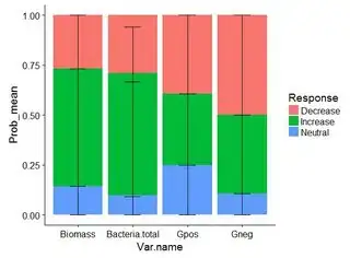
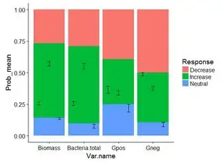
I am working with probability data in a barplot. The barplot looks fine, but when I try to add the errorbars they are not organized or bound to the appropriate column. It'd be perfect if I didn't have to do this manually. (This example only shows a subset.)
Can you help me figure out how to add the errorbars in the right location?
This is my code:
data[complete.cases(data),] %>%
  ggplot(aes(x = Var.name, y = Prob_mean, fill = Response)) +
  geom_bar(stat = "identity", position = "fill") +
  geom_errorbar(aes(ymin = lower, ymax = Prob_mean), stat = "identity",
                position = position_dodge(width = 0.9), width = 0.3)
Picture of the graph:
This is my data:
> dput(data)
structure(list(Var.name = structure(c(1L, 1L, 1L, 2L, 2L, 2L,
3L, 3L, 3L, 4L, 4L, 4L), .Label = c("Biomass", "Bacteria.total",
"Gpos", "Gneg"), class = "factor"), Response = c("Decrease",
"Increase", "Neutral", "Decrease", "Increase", "Neutral", "Decrease",
"Increase", "Neutral", "Decrease", "Increase", "Neutral"), Prob_mean = c(0.267825247615756,
0.589316466289715, 0.142858286094529, 0.272971629090396, 0.575649507723523,
0.09076335727541, 0.392857191685997, 0.357142750965404, 0.250000057348599,
0.499952457038418, 0.392844812870964, 0.107202730090619), Prob_n = c(56L,
56L, 56L, 33L, 33L, 33L, 28L, 28L, 28L, 28L, 28L, 28L), Prob_se = c(0.023672823211199,
0.0344812896356437, 0.0143539351411692, 0.0319407298087323, 0.0477306098555942,
0.0300122568287155, 0.0553692531148468, 0.036801084975757, 0.0609410527844315,
0.0252493129246497, 0.0320001555212106, 0.0344986116155648),
    lower = c(0.244152424404557, 0.554835176654071, 0.12850435095336,
    0.241030899281664, 0.527918897867928, 0.0607511004466945,
    0.33748793857115, 0.320341665989647, 0.189059004564168, 0.474703144113768,
    0.360844657349753, 0.0727041184750539), upper = c(0.291498070826955,
    0.623797755925359, 0.157212221235698, 0.304912358899128,
    0.623380117579117, 0.120775614104125, 0.448226444800843,
    0.393943835941161, 0.310941110133031, 0.525201769963067,
    0.424844968392174, 0.141701341706184)), .Names = c("Var.name",
"Response", "Prob_mean", "Prob_n", "Prob_se", "lower", "upper"
), row.names = c(NA, -12L), class = c("tbl_df", "tbl", "data.frame"
))
EDIT:
I would like to have the errorbars stacked, but when I use "stack" this happens:

and the error: Stacking not well defined when not anchored on the axis. I would like to have lower errorbars as stacked position instead of dodge.
My question is different from How to stack error bars in a stacked bar plot using geom_errorbar?, because it uses the "stack" function and my problem with the errorbars is when using the "fill" function.
