The core problem faced by the implementation of the Paper Theme is it does so by styling the <input type="checkbox" /> elements using :before or :after pseudo-elements.
Per this the W3C specs and this answer in can I use a pseudo-element on an input field?
:before and :after render inside a container and <input>s can not contain elements
The fact that it works in chrome is the exception, not the rule, but we're not out of luck ...
Pure CSS Approach
So we'll want to avoid styling anything within the actual checkbox itself, but we can apply those same styles to the label instead, which will still toggle the checkbox that it describes.
Step 1 - Label Based Toggle
We do have to restructure the HTML so that checkbox comes before the label, instead of inside it. We'll do that so we can use the :checked and adjacent sibling selector + to conditionally style the label based on whether or not the checkbox is checked.
<!-- Old Format -->
<div class="checkbox">
  <label>
    <input type="checkbox" value="check1"/>
    Check Label Text
  </label>
</div>

<!-- New Format -->
<div class="label-check">
   <input type="checkbox" value="check1" id="myCheck">
   <label for="myCheck">Check Label Text</label>
</div>
Note: In order for this solution to work, you do need to make sure that you have valid HTML with unique IDs for every input and corresponding for attributes in the labels that describe them.
At this point in time, we can ditch the inputs, and style the labels with our own :before pseudo elements that look like checkboxes or radio buttons. To keep things simple for now, in step one, we can mimic the controls with the following Unicode Characters ... ☐, ☑, ⭘, ◉
Here's an bare bones version with the basic gist of the CSS to style each label conditionally:
input[type='checkbox'],[type='radio']     { display: none; }
[type='checkbox']         + label::before { content: "\2610";}
[type='checkbox']:checked + label::before { content: "\2611";}
[type='radio']            + label::before { content: "\2B58";}
[type='radio']:checked    + label::before { content: "\25C9";}
We can also improve on this baseline quite a bit by adding some colorization, hovering effects, cursor properties, transition effects, and text shadows to make the unicode characters look and feel like actual buttons.
Here's a more fleshed out demo in jsFiddle and Stack Snippets:
body {
  font-size:1.3em;
  color: #2b2b2b;
  background:white;
}
.label-check input {  display:none; }

.label-check label::before {
  width: 1.4em;
  text-align: center;
  display: inline-block;
  cursor: pointer;
  color: black;
  transition: color .3s ease;
  text-shadow: 0px 0px 1px #cccccc;
}
.label-check label:hover::before {
  text-shadow: 0px 0px 1px #6286d0;
}
.label-check [type='checkbox']:checked + label::before,
.label-check [type='radio']:checked    + label::before{
  color: #056dce;
}

.label-check [type='checkbox']         + label::before { content: "\2610";}
.label-check [type='checkbox']:checked + label::before { content: "\2611";}
.label-check [type='radio']            + label::before { content: "\2B58";}
.label-check [type='radio']:checked    + label::before { content: "\25C9";}
<h3>
  Inputs... we don't need no stinkin Inputs
</h3>

<div class="label-check">
  <div>
    <input type="checkbox" name="checkGrp1" id="check1_Opt1">
    <label for="check1_Opt1">A Label Here 1</label>
  </div>
  <div>
    <input type="checkbox" name="checkGrp1" id="check1_Opt2" checked>
    <label for="check1_Opt2">A Label Here 2</label>
  </div>
</div>

<div class="label-check">
  <div>
    <input type="radio" name="radioGrp1" id="radio1_Opt1">
    <label for="radio1_Opt1">Radio Label 1</label>
  </div>
  <div>
    <input type="radio" name="radioGrp1" id="radio1_Opt2" checked>
    <label for="radio1_Opt2">Radio Label 2</label>
  </div>
</div>
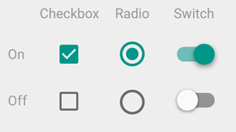
Step 2 - Apply Material Style to label:before with CSS
With the concept of using a the label's stylized pseudo elements as a toggle in play, we can apply Paper's styles / CSS instead of just { content: "\2610";} to give our checkboxes a Material look and feel.
To do that, let's look at how the styles were supposed to work. We can look at the source code that describes checks and radios on Github in bootstrap.css#L7182
The :after element is being used to style the surrounding box/circle while the :before element adds the inner selection when the box is :checked.
Here are the high level styles for the checkbox:
Note: The check mark is made by rotating a rectangle 45 degrees and adding a white border to the bottom and right.
And here's a high level view of the styles for the radio button:

Note: The radio button container and inside is just a regular CSS circle (border-radius:50%) with varying sizes which can animate by scaling up or down.
So we'll migrate any pseudo elements found on the checkbox input to it's adjacent label like this:
/* old */ input[type="radio"]:before
/* new */ input[type="radio"] + label:before
After some careful conversion, here's a demo in jsFiddle and Stack Snippets:
body {
  padding: 0 25px;
  font-size: 1.2em;
}


.checkbox, .radio {
    margin: 10px;
}
.checkbox, .radio {
    position: relative;
}


.label-check label {
  padding-left: 20px;
}
.label-check input[type="radio"],
.label-check input[type="checkbox"] {
  -webkit-appearance: none;
     -moz-appearance: none;
          appearance: none;
    opacity: 0;
    position: absolute;
    margin: 0;
    z-index: -1;
    width: 0;
    height: 0;
    overflow: hidden;
    left: 0;
    pointer-events: none;
}
.label-check input[type="radio"]:focus {
  outline: none;
}
.label-check input[type="radio"] + label:before,
.label-check input[type="radio"] + label:after {
  content: "";
  display: block;
  position: absolute;
  left: -10px;
  top: 1px;
  width: 18px;
  height: 18px;
  border-radius: 50%;
  -webkit-transition: 240ms;
  -o-transition: 240ms;
  transition: 240ms;
}
.label-check input[type="radio"] + label:before {
    left: -8px;
    top: 3px;
}
.label-check input[type="radio"] + label:before {
  background-color: #2196f3;
  -webkit-transform: scale(0);
      -ms-transform: scale(0);
       -o-transform: scale(0);
          transform: scale(0);
}
.label-check input[type="radio"] + label:after{
  top: 1px;
  border: 2px solid #666666;
  z-index:1;
}
.label-check input[type="radio"]:checked + label:before {
  -webkit-transform: scale(0.6);
      -ms-transform: scale(0.6);
       -o-transform: scale(0.6);
          transform: scale(0.6);
}
.label-check input[type="radio"]:disabled:checked + label:before {
  background-color: #bbbbbb;
}
.label-check input[type="radio"]:checked + label:after {
  border-color: #2196f3;
}
.label-check input[type="radio"]:disabled + label:after,
.label-check  input[type="radio"]:disabled:checked + label:after {
  border-color: #bbbbbb;
}
.label-check input[type="checkbox"]:focus {
  outline: none;
}
.label-check input[type="checkbox"]:focus + label:after{
  border-color: #2196f3;
}
.label-check input[type="checkbox"] + label:after {
  content: "";
  position: absolute;
  top: 2px;
  left: -10px;
  display: block;
  width: 18px;
  height: 18px;
  margin-top: -2px;
  margin-right: 5px;
  border: 2px solid #666666;
  border-radius: 2px;
  -webkit-transition: 240ms;
       -o-transition: 240ms;
          transition: 240ms;
}
.label-check input[type="checkbox"]:checked + label:before {
  content: "";
  position: absolute;
  top: 2px;
  left: -3px;
  display: table;
  width: 6px;
  height: 12px;
  border: 2px solid #fff;
  border-top-width: 0;
  border-left-width: 0;
  -webkit-transform: rotate(45deg);
      -ms-transform: rotate(45deg);
       -o-transform: rotate(45deg);
          transform: rotate(45deg);
  z-index:1;
}
.label-check input[type="checkbox"]:checked + label:after{
  background-color: #2196f3;
  border-color: #2196f3;
}
.label-check input[type="checkbox"]:disabled + label:after {
  border-color: #bbbbbb;
}
.label-check  input[type="checkbox"]:disabled:checked + label:after {
  background-color: #bbbbbb;
  border-color: transparent;
}
<h3>
 Material Label Based Checks
</h3>

<div class="label-check">
  <div class="checkbox">
    <input type="checkbox" name="checkGrp1" id="check1_Opt1">
    <label for="check1_Opt1">A Label Here 1</label>
  </div>
  <div class="checkbox">
    <input type="checkbox" name="checkGrp1" id="check1_Opt2" checked>
    <label for="check1_Opt2">A Label Here 2</label>
  </div>
</div>

<div class="label-check">
  <div class="radio">
    <input type="radio" name="radioGrp1" id="radio1_Opt1">
    <label for="radio1_Opt1">Radio Label 1</label>
  </div>
  <div class="radio">
    <input type="radio" name="radioGrp1" id="radio1_Opt2" checked>
    <label for="radio1_Opt2">Radio Label 2</label>
  </div>
</div>
HTML/JS Approach
There are some other material implementations that have hit this target in a cross browser friendly way. All of which typically rely on:
- Hiding the actual
<input> element
- Placing a stylized checkbox box inside of the label
In some cases, this relies on formatting the HTML appropriately yourself at design time, or generating it when the site initializes.
For example, FezVrasta's Material Design for Bootstrap, in both V3 and V4 will take an HTML structure like this:
<div class="checkbox">
  <label>
    <input type="checkbox">
    Notifications
  </label>
</div>
And insert a new span when you call $.material.init() so the result looks like this:
<div class="checkbox">
  <label>
    <input type="checkbox">
    <span class="checkbox-material">
      <span class="check"></span>
    </span>
    Notifications
  </label>
</div>
While this relies on the initialization to occur, it allows much more fine grained control of the CSS checkbox and radio button rather than shoving it all into pseudo elements.


