10

Using CSS-Grid, I try to put my items in the center of a grid cell, without shrinking them completely to only the content. Is this possible?

I made a simple example on stackblitz. You can see that the items there don't fill the entire grid-cell with the background color. What is the proper way to get that working? I can remove the justify-items/align-items classes, but then the content isn't centered anymore.

https://stackblitz.com/edit/angular-8bggtq?file=app/app.component.html

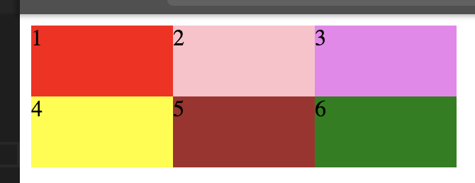
Cells filled, but content not in center:

enter image description here

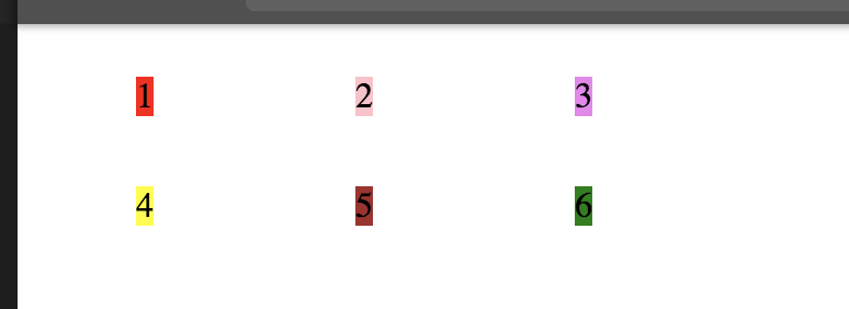
Cells not filled, but content is centered:

enter image description here

.wrapper {
  display: grid;
  height: 100vh;
  grid-template-columns: 1fr 1fr;
  grid-template-rows: 1fr 1fr 1fr;
  justify-items: center;
  align-items: center;
}

.item {
  //justify-self: stretch;
  //align-self: stretch;
}

.one {
  background: red;
}

.two {
  background: pink;
}

.three {
  background: violet;
}

.four {
  background: yellow;
}

.five {
  background: brown;
}

.six {
  background: green;
}

html,
body {
  margin: 0;
}
<div class="wrapper">
  <div class="item one">1</div>
  <div class="item two">2</div>
  <div class="item three">3</div>
  <div class="item four">4</div>
  <div class="item five">5</div>
  <div class="item six">6</div>
</div>
Michael Benjamin
  • 346,931
  • 104
  • 581
  • 701
codepleb
  • 10,086
  • 14
  • 69
  • 111

4 Answers4

13

The HTML structure of a grid container has three levels:

  • the container
  • the items (the children of the container)
  • the content (the grandchildren of the container and children of the items)

The problem you're having is that you're taking a two-level approach instead of the correct three-level approach. When you set align-items and justify-items on the container, they apply to the grid items, not to the content.

That's exactly what you are seeing: The grid items are being vertically and horizontally centered.

If you want to center the grid item children (the content), you need to specify that on the items. You can repeat on the items what you did on the container:

.item {
  display: grid;
  justify-items: center;
  align-items: center;
}

Or, if you don't need grid layout in the items, here's another simple method:

.item {
  display: flex;
  justify-content: center;
  align-items: center;
}

The above concepts apply to flex containers, as well.

For a more complete explanation and other centering methods see this post: Centering in CSS Grid

.wrapper {
  display: grid;
  height: 100vh;
  grid-template-columns: 1fr 1fr;
  grid-template-rows: 1fr 1fr 1fr;
}

.item {
  display: flex;
  align-items: center;
  justify-content: center;
}

.one   { background: red;   }
.two   { background: pink;  }
.three { background: violet; }
.four  { background: yellow; }
.five  { background: brown; }
.six   { background: green; }
body   { margin: 0; }
<div class="wrapper">
  <div class="item one">1</div>
  <div class="item two">2</div>
  <div class="item three">3</div>
  <div class="item four">4</div>
  <div class="item five">5</div>
  <div class="item six">6</div>
</div>
Michael Benjamin
  • 346,931
  • 104
  • 581
  • 701
2

I would say the only way to do that just with CSS-grid is to insert a additional element- / grid-level.

However, I would also say that here - as @Zuber has already showed - the combination between grid and flexbox is the best way to achieve what you want.

Grid is designed to be used with flexbox, not instead of it

Ollie Williams: Things I’ve Learned About CSS Grid Layout


Pure Grid-example:

* { margin: 0; padding: 0; box-sizing: border-box; }
body { margin: 20px; }

.wrapper {
  height: 100vh;
  display: grid;
  grid-template-columns: 1fr 1fr;
  grid-template-rows: 1fr 1fr 1fr;
  grid-gap: 20px;
}

.wrapper__item {
  display: grid;
  align-items: center;
  justify-items: center;
  background: gray;
  color: white;
  font-size: 2em;
}
<div class="wrapper">
  <div class="wrapper__item"><span>1</span></div>
  <div class="wrapper__item"><span>2</span></div>
  <div class="wrapper__item"><span>3</span></div>
  <div class="wrapper__item"><span>4</span></div>
  <div class="wrapper__item"><span>5</span></div>
  <div class="wrapper__item"><span>6</span></div>
</div>

Grid- & Flexbox-example:

* { margin: 0; padding: 0; box-sizing: border-box; }
body { margin: 20px; }

.wrapper {
  height: 100vh;
  display: grid;
  grid-template-columns: 1fr 1fr;
  grid-template-rows: 1fr 1fr 1fr;
  grid-gap: 20px;
}

.wrapper__item {
  width: 100%;
  height: 100%;
  display: flex;
  align-items: center;
  justify-content: center;
  background: gray;
  color: white;
  font-size: 2em;
}
<div class="wrapper">
  <div class="wrapper__item">1</div>
  <div class="wrapper__item">2</div>
  <div class="wrapper__item">3</div>
  <div class="wrapper__item">4</div>
  <div class="wrapper__item">5</div>
  <div class="wrapper__item">6</div>
</div>

Arne
  • 995
  • 1
  • 8
  • 16
1

you need to add some css in the class "item"

.item {
    width: 100%;
    height: 100%;
    display: flex;
    align-items: center;
    justify-content: center;
}
Zuber
  • 3,393
  • 1
  • 19
  • 34
  • It works, therefore +1, but I don't get why I need to introduce flexbox at this point. Is there no "css-grid-native" way to achieve that? – codepleb Feb 17 '18 at 12:29
0

Try with justify-self: center or text align:center if it is only text.

Merim
  • 1,283
  • 2
  • 21
  • 36