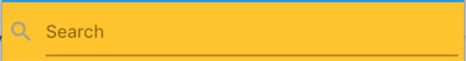
Is there a proper way to add a clear button to the TextField?
Just like this picture from Material design guidelines:
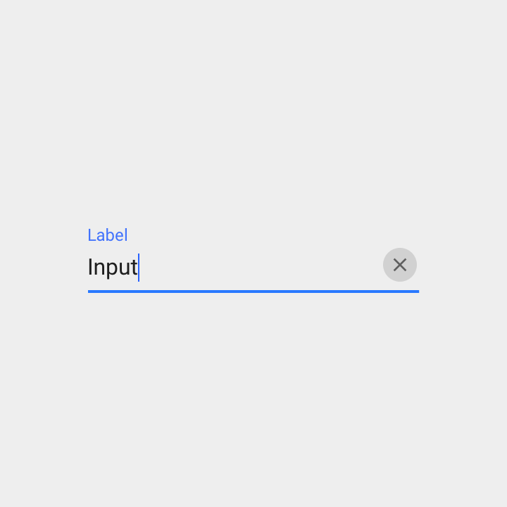
What I found is to set a clear IconButton in the InputDecoration's suffixIcon. Is this the right way?
Is there a proper way to add a clear button to the TextField?
Just like this picture from Material design guidelines:
What I found is to set a clear IconButton in the InputDecoration's suffixIcon. Is this the right way?
Output:
Create a variable
var _controller = TextEditingController();
And your TextField:
TextField(
controller: _controller,
decoration: InputDecoration(
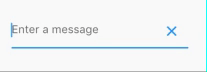
hintText: 'Enter a message',
suffixIcon: IconButton(
onPressed: _controller.clear,
icon: Icon(Icons.clear),
),
),
)
        Container(
            margin: EdgeInsets.only(left: 16.0),
            child: TextFormField(
              controller: _username,
              decoration: InputDecoration(
                  hintText: '请输入工号',
                  filled: true,
                  prefixIcon: Icon(
                    Icons.account_box,
                    size: 28.0,
                  ),
                  suffixIcon: IconButton(
                      icon: Icon(Icons.remove),
                      onPressed: () {
                        debugPrint('222');
                      })),
            ),
          ),
use iconButton
Try this -
final TextEditingController _controller = new TextEditingController();
new Stack(
            alignment: const Alignment(1.0, 1.0),
            children: <Widget>[
              new TextField(controller: _controller,),
              new FlatButton(
                  onPressed: () {
                     _controller.clear();
                  },
                  child: new Icon(Icons.clear))
            ]
        )
Here’s another answer expanding a bit on @Vilokan Lab’s answer, which wasn’t really doing it for me since FlatButton has a minimum width of 88.0, and thus the clear button was not appearing right-aligned with the TextField at all.
So I went ahead and made my own button class, and applied that using a Stack, here is my process:
Button class:
class CircleIconButton extends StatelessWidget {
final double size;
final Function onPressed;
final IconData icon;

CircleIconButton({this.size = 30.0, this.icon = Icons.clear, this.onPressed});

@override
Widget build(BuildContext context) {
  return InkWell(
    onTap: this.onPressed,
    child: SizedBox(
        width: size,
        height: size,
        child: Stack(
          alignment: Alignment(0.0, 0.0), // all centered
          children: <Widget>[
            Container(
              width: size,
              height: size,
              decoration: BoxDecoration(
                  shape: BoxShape.circle, color: Colors.grey[300]),
            ),
            Icon(
              icon,
              size: size * 0.6, // 60% width for icon
            )
          ],
        )));
  }
}
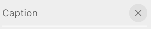
Then apply like so as InputDecoration to your TextField:
var myTextField = TextField(
  controller: _textController,
  decoration: InputDecoration(
      hintText: "Caption",
      suffixIcon: CircleIconButton(
        onPressed: () {
          this.setState(() {
            _textController.clear();
          });
        },
      )),
  },
);
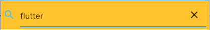
To get this:
Unhighlighted state
Highlighted / selected state.
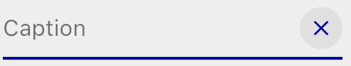
Note this colouring comes free when you use suffixIcon.
Note you can also Stack it in your TextField like this, but you won't get the auto-colouring you get when you use suffixIcon:
var myTextFieldView = Stack(
  alignment: Alignment(1.0,0.0), // right & center
  children: <Widget>[
    TextField(
      controller: _textController,
      decoration: InputDecoration(hintText: "Caption"),
    ),
    Positioned(
      child: CircleIconButton(
        onPressed: () {
          this.setState(() {
            _textController.clear();
          });
        },
      ),
    ),
  ],
);
Search TextField with icon and clear button
import 'package:flutter/material.dart';

  class SearchTextField extends StatefulWidget{
    @override
    State<StatefulWidget> createState() {
      // TODO: implement createState
      return new SearchTextFieldState();
    }
  }

  class SearchTextFieldState extends State<SearchTextField>{
    final TextEditingController _textController = new TextEditingController();

    @override
    Widget build(BuildContext context) {
      // TODO: implement build
      return new Row(children: <Widget>[
        new Icon(Icons.search, color: _textController.text.length>0?Colors.lightBlueAccent:Colors.grey,),
        new SizedBox(width: 10.0,),
        new Expanded(child: new Stack(
            alignment: const Alignment(1.0, 1.0),
            children: <Widget>[
              new TextField(
                decoration: InputDecoration(hintText: 'Search'),
                onChanged: (text){
                  setState(() {
                    print(text);
                  });
                },
                controller: _textController,),
              _textController.text.length>0?new IconButton(icon: new Icon(Icons.clear), onPressed: () {
                setState(() {
                  _textController.clear();
                });
              }):new Container(height: 0.0,)
            ]
        ),),
      ],);
    }
  }
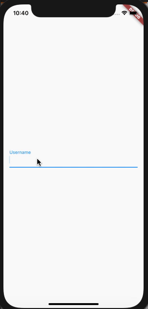
TextEditingController is used to check the current state of Text, where we can decide whether we can show the cancel icon or not, depend on the availability of Text.
  var _usernameController = TextEditingController();

  @override
  Widget build(BuildContext context) {
    return Scaffold(
      body: Padding(
        padding: const EdgeInsets.all(16.0),
        child: Center(
          child: TextField(
            controller: _usernameController,
            onChanged: (text) {
              setState(() {});
            },
            decoration: InputDecoration(
                labelText: 'Username',
                suffixIcon: _usernameController.text.length > 0
                    ? IconButton(
                        onPressed: () {
                          _usernameController.clear();
                          setState(() {});
                        },
                        icon: Icon(Icons.cancel, color: Colors.grey))
                    : null),
          ),
        ),
      ),
    );
  }
Output:
TextFormField(
                  controller:_controller
                  decoration: InputDecoration(
                    suffixIcon: IconButton(
                      onPressed: (){
                        _controller.clear();
                      },
                      icon: Icon(
                      Icons.keyboard,
                      color: Colors.blue,
                    ),
                    ),

                  ),
                )
Here's a snippet of my code that works.
What it does: only show clear button if text field value is not empty
class _MyTextFieldState extends State<MyTextField> {
  TextEditingController _textController;
  bool _wasEmpty;

  @override
  void initState() {
    super.initState();
    _textController = TextEditingController(text: widget.initialValue);
    _wasEmpty = _textController.text.isEmpty;
    _textController.addListener(() {
      if (_wasEmpty != _textController.text.isEmpty) {
        setState(() => {_wasEmpty = _textController.text.isEmpty});
      }
    });
  }

  @override
  void dispose() {
    _textController.dispose();
    super.dispose();
  }

  @override
  Widget build(BuildContext context) {
    return TextFormField(
          controller: _textController,
          decoration: InputDecoration(
            labelText: widget.label,
            suffixIcon: _textController.text.isNotEmpty
                ? Padding(
                    padding: const EdgeInsetsDirectional.only(start: 12.0),
                    child: IconButton(
                      iconSize: 16.0,
                      icon: Icon(Icons.cancel, color: Colors.grey,),
                      onPressed: () {
                        setState(() {
                          _textController.clear();
                        });
                      },
                    ),
                  )
                : null,
          ),);
...
TextField(
  decoration: InputDecoration(
    suffixIcon: IconButton(
      icon: Icon(
        Icons.cancel,
      ),
      onPressed: () {
        _controllerx.text = '';
      }
    ),
  )
)
To add icon inside the textfield. You must have to use suffixIcon or prefixIcon inside the Input decoration.
TextFormField(
    autofocus: false,
    obscureText: true,
    decoration: InputDecoration(
       labelText: 'Password',
       suffixIcon: Icon(
                    Icons.clear,
                    size: 20.0,
                  ),
       border: OutlineInputBorder(
       borderRadius: BorderRadius.all(Radius.circular(0.0)),
     ),
      hintText: 'Enter Password',
      contentPadding: EdgeInsets.all(10.0),
    ),
  );
Didn't want to go the StatefulWidget route. Here's an example using TextEditingController and StatelessWidget (with Providers pushing updates). I keep the controller in the static field.
class _SearchBar extends StatelessWidget {
  static var _controller = TextEditingController();

  @override
  Widget build(BuildContext context) {
    var dictionary = Provider.of<Dictionary>(context);

    return TextField(
        controller: _controller,
        autofocus: true,
        onChanged: (text) {
          dictionary.lookupWord = text;
        },
        style: TextStyle(fontSize: 20.0),
        decoration: InputDecoration(
            border: InputBorder.none,
            hintText: 'Search',
            suffix: GestureDetector(
              onTap: () {
                dictionary.lookupWord = '';
                _controller.clear();
              },
              child: Text('x'),
            )));
  }
}
If you want a ready-to-use Widget, which you can just put in a file and then have a reusable element you can use everywhere by inserting ClearableTextField(), use this piece of code:
import 'package:flutter/material.dart';

class ClearableTexfield extends StatefulWidget {
  ClearableTexfield({
    Key key,
    this.controller,
    this.hintText = 'Enter text'
  }) : super(key: key);

  final TextEditingController controller;
  final String hintText;

  @override
  State<StatefulWidget> createState() {
    return _ClearableTextfieldState();
  }
}

class _ClearableTextfieldState extends State<ClearableTexfield> {
  bool _showClearButton = false;

  @override
  void initState() {
    super.initState();
    widget.controller.addListener(() {
      setState(() {
        _showClearButton = widget.controller.text.length > 0;
      });
    });
  }

  @override
  Widget build(BuildContext context) {
    return TextField(
      controller: widget.controller,
      decoration: InputDecoration(
        hintText: widget.hintText,
        suffixIcon: _getClearButton(),
      ),
    );
  }

  Widget _getClearButton() {
    if (!_showClearButton) {
      return null;
    }

    return IconButton(
      onPressed: () => widget.controller.clear(),
      icon: Icon(Icons.clear),
    );
  }
}
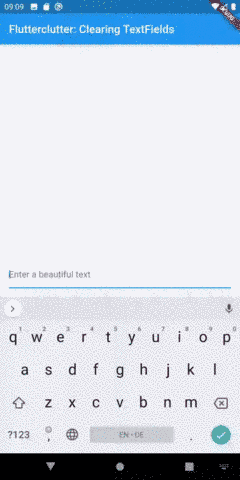
Further explanations can be found on this page:
https://www.flutterclutter.dev/flutter/tutorials/text-field-with-clear-button/2020/104/
It also builds upon IconButton, but has the advantage of only displaying the clear button when there is text inside the textfield.
Looks like this:
You can also use TextFormField.
First create Form Key. final _formKeylogin = GlobalKey<FormState>();
Form(key: _formKeylogin,
                child: Column(
                  children: [
                    Container(
                      margin: EdgeInsets.all(20.0),
                      child: TextFormField(

                        style: TextStyle(color: WHITE),
                        textInputAction: TextInputAction.next,
                        onChanged: (companyName) {
                        },

                        validator: (companyName) {
                          if (companyName.isEmpty) {
                            return 'Please enter company Name';
                          } else {
                            return null;
                          }
                        },
                      ),
And in OnTap or onPress Method.
_formKeylogin.currentState.reset();
Robust solution based on the code written by the Flutter team
Here is a fully reusuable ClearableTextFormField with maximum configuration, most of the code for this clearable text field here is from the commits on Apr 1, 2021 of the Flutter team for the built-in TextFormField. The ClearableTextFormField accepts the same params as and works similarly to the built-in TextFormField.
import 'package:flutter/material.dart';
import 'package:flutter/services.dart';

// A [TextFormField] with a clear button
class ClearableTextFormField extends FormField<String> {
  /// Creates a [FormField] that contains a [TextField].
  ///
  /// When a [controller] is specified, [initialValue] must be null (the
  /// default). If [controller] is null, then a [TextEditingController]
  /// will be constructed automatically and its `text` will be initialized
  /// to [initialValue] or the empty string.
  ///
  /// For documentation about the various parameters, see the [TextField] class
  /// and [new TextField], the constructor.
  ClearableTextFormField({
    Key? key,
    this.controller,
    String? initialValue,
    FocusNode? focusNode,
    InputDecoration decoration = const InputDecoration(),
    TextInputType? keyboardType,
    TextCapitalization textCapitalization = TextCapitalization.none,
    TextInputAction? textInputAction,
    TextStyle? style,
    StrutStyle? strutStyle,
    TextDirection? textDirection,
    TextAlign textAlign = TextAlign.start,
    TextAlignVertical? textAlignVertical,
    bool autofocus = false,
    bool readOnly = false,
    ToolbarOptions? toolbarOptions,
    bool? showCursor,
    String obscuringCharacter = '•',
    bool obscureText = false,
    bool autocorrect = true,
    SmartDashesType? smartDashesType,
    SmartQuotesType? smartQuotesType,
    bool enableSuggestions = true,
    MaxLengthEnforcement? maxLengthEnforcement,
    int? maxLines = 1,
    int? minLines,
    bool expands = false,
    int? maxLength,
    ValueChanged<String>? onChanged,
    GestureTapCallback? onTap,
    VoidCallback? onEditingComplete,
    ValueChanged<String>? onFieldSubmitted,
    FormFieldSetter<String>? onSaved,
    FormFieldValidator<String>? validator,
    List<TextInputFormatter>? inputFormatters,
    bool? enabled,
    double cursorWidth = 2.0,
    double? cursorHeight,
    Radius? cursorRadius,
    Color? cursorColor,
    Brightness? keyboardAppearance,
    EdgeInsets scrollPadding = const EdgeInsets.all(20.0),
    bool enableInteractiveSelection = true,
    TextSelectionControls? selectionControls,
    InputCounterWidgetBuilder? buildCounter,
    ScrollPhysics? scrollPhysics,
    Iterable<String>? autofillHints,
    AutovalidateMode? autovalidateMode,
    ScrollController? scrollController,

    // Features
    this.resetIcon = const Icon(Icons.close),
  })  : assert(initialValue == null || controller == null),
        assert(obscuringCharacter.length == 1),
        assert(
          maxLengthEnforcement == null,
          'maxLengthEnforced is deprecated, use only maxLengthEnforcement',
        ),
        assert(maxLines == null || maxLines > 0),
        assert(minLines == null || minLines > 0),
        assert(
          (maxLines == null) || (minLines == null) || (maxLines >= minLines),
          "minLines can't be greater than maxLines",
        ),
        assert(
          !expands || (maxLines == null && minLines == null),
          'minLines and maxLines must be null when expands is true.',
        ),
        assert(!obscureText || maxLines == 1,
            'Obscured fields cannot be multiline.'),
        assert(maxLength == null || maxLength > 0),
        super(
          key: key,
          initialValue:
              controller != null ? controller.text : (initialValue ?? ''),
          onSaved: onSaved,
          validator: validator,
          enabled: enabled ?? true,
          autovalidateMode: autovalidateMode ?? AutovalidateMode.disabled,
          builder: (FormFieldState<String> field) {
            final _ClearableTextFormFieldState state =
                field as _ClearableTextFormFieldState;
            final InputDecoration effectiveDecoration = decoration
                .applyDefaults(Theme.of(field.context).inputDecorationTheme);
            void onChangedHandler(String value) {
              field.didChange(value);
              if (onChanged != null) onChanged(value);
            }

            return Focus(
              onFocusChange: (hasFocus) => state.setHasFocus(hasFocus),
              child: TextField(
                controller: state._effectiveController,
                focusNode: focusNode,
                decoration: effectiveDecoration.copyWith(
                  errorText: field.errorText,
                  suffixIcon:
                      ((field.value?.length ?? -1) > 0 && state.hasFocus)
                          ? IconButton(
                              icon: resetIcon,
                              onPressed: () => state.clear(),
                              color: Theme.of(state.context).hintColor,
                            )
                          : null,
                ),
                keyboardType: keyboardType,
                textInputAction: textInputAction,
                style: style,
                strutStyle: strutStyle,
                textAlign: textAlign,
                textAlignVertical: textAlignVertical,
                textDirection: textDirection,
                textCapitalization: textCapitalization,
                autofocus: autofocus,
                toolbarOptions: toolbarOptions,
                readOnly: readOnly,
                showCursor: showCursor,
                obscuringCharacter: obscuringCharacter,
                obscureText: obscureText,
                autocorrect: autocorrect,
                smartDashesType: smartDashesType ??
                    (obscureText
                        ? SmartDashesType.disabled
                        : SmartDashesType.enabled),
                smartQuotesType: smartQuotesType ??
                    (obscureText
                        ? SmartQuotesType.disabled
                        : SmartQuotesType.enabled),
                enableSuggestions: enableSuggestions,
                maxLengthEnforcement: maxLengthEnforcement,
                maxLines: maxLines,
                minLines: minLines,
                expands: expands,
                maxLength: maxLength,
                onChanged: onChangedHandler,
                onTap: onTap,
                onEditingComplete: onEditingComplete,
                onSubmitted: onFieldSubmitted,
                inputFormatters: inputFormatters,
                enabled: enabled ?? true,
                cursorWidth: cursorWidth,
                cursorHeight: cursorHeight,
                cursorRadius: cursorRadius,
                cursorColor: cursorColor,
                scrollPadding: scrollPadding,
                scrollPhysics: scrollPhysics,
                keyboardAppearance: keyboardAppearance,
                enableInteractiveSelection: enableInteractiveSelection,
                selectionControls: selectionControls,
                buildCounter: buildCounter,
                autofillHints: autofillHints,
                scrollController: scrollController,
              ),
            );
          },
        );

  /// Controls the text being edited.
  ///
  /// If null, this widget will create its own [TextEditingController] and
  /// initialize its [TextEditingController.text] with [initialValue].
  final TextEditingController? controller;
  final Icon resetIcon;

  @override
  _ClearableTextFormFieldState createState() => _ClearableTextFormFieldState();
}

class _ClearableTextFormFieldState extends FormFieldState<String> {
  TextEditingController? _controller;
  bool hasFocus = false;

  TextEditingController get _effectiveController =>
      widget.controller ?? _controller!;

  @override
  ClearableTextFormField get widget => super.widget as ClearableTextFormField;

  @override
  void initState() {
    super.initState();
    if (widget.controller == null)
      _controller = TextEditingController(text: widget.initialValue);
    else
      widget.controller!.addListener(_handleControllerChanged);
  }

  @override
  void didUpdateWidget(ClearableTextFormField oldWidget) {
    super.didUpdateWidget(oldWidget);
    if (widget.controller != oldWidget.controller) {
      oldWidget.controller?.removeListener(_handleControllerChanged);
      widget.controller?.addListener(_handleControllerChanged);

      if (oldWidget.controller != null && widget.controller == null)
        _controller =
            TextEditingController.fromValue(oldWidget.controller!.value);
      if (widget.controller != null) {
        setValue(widget.controller!.text);
        if (oldWidget.controller == null) _controller = null;
      }
    }
  }

  @override
  void dispose() {
    widget.controller?.removeListener(_handleControllerChanged);
    super.dispose();
  }

  @override
  void didChange(String? value) {
    super.didChange(value);

    if (_effectiveController.text != value)
      _effectiveController.text = value ?? '';
  }

  @override
  void reset() {
    // setState will be called in the superclass, so even though state is being
    // manipulated, no setState call is needed here.
    _effectiveController.text = widget.initialValue ?? '';
    super.reset();
  }

  void setHasFocus(bool b) => setState(() => hasFocus = b);

  void _handleControllerChanged() {
    // Suppress changes that originated from within this class.
    //
    // In the case where a controller has been passed in to this widget, we
    // register this change listener. In these cases, we'll also receive change
    // notifications for changes originating from within this class -- for
    // example, the reset() method. In such cases, the FormField value will
    // already have been set.
    if (_effectiveController.text != value)
      didChange(_effectiveController.text);
  }

  /// Invoked by the clear suffix icon to clear everything in the [FormField]
  void clear() {
    WidgetsBinding.instance!.addPostFrameCallback((_) {
      _effectiveController.clear();
      didChange(null);
    });
  }
}
Read more about the assert statement in the Dart language doc.
Below are the explanations for the additional code added to the built-in TextFormField
Optional resetIcon param for the ClearableTextFormField
Additional code inside _ClearableTextFormFieldState:
/// Invoked by the clear suffix icon to clear everything in the [FormField]
  void clear() {
    WidgetsBinding.instance!.addPostFrameCallback((_) {
      _effectiveController.clear();
      didChange(null);
    });
  }
addPostFrameCallback() ensures the passed-in function is only called on Widget build complete (when the TextFormField has been fully built and rendered on the screen). U can read more about it in this thread.
The following state and setState allows u to keep track of the focus change in TextField (when the field is focused or unfocused):
bool hasFocus = false;
void setHasFocus(bool b) => setState(() => hasFocus = b);
Additional code inside the builder method of the extended FormField<String> (the super() parts):
Hide the clear button when the field's value is empty or null:
suffixIcon:
((field.value?.length ?? -1) > 0 && state.hasFocus)
    ? IconButton(
        icon: resetIcon,
        onPressed: () => state.clear(),
        color: Theme.of(state.context).hintColor,
      )
    : null,
Rebuild the TextField on focus and unfocus to show and hide the clear button:
Focus(
  onFocusChange: (hasFocus) => state.setHasFocus(hasFocus),
  child: TextField(// more code here...),
)
To clear a button when the input it is not empty and with focus.
Create a controller variable:
//Clear inputs
final _nameInputcontroller = TextEditingController();
Create a FocusNode:
late FocusNode focusNodeNameInput;

@override
void initState() {
 super.initState();

 //FocusNode for all inputs
 focusNodeNameInput = FocusNode();
 focusNodeNameInput.addListener(() {
  setState(() {});
 });
}

@override
void dispose() {
 // Clean up the focus node when the Form is disposed.
 focusNodeNameInput.dispose();

 super.dispose();
}
And the TextFormField:
TextFormField(
 controller: _nameInputcontroller,
 focusNode: focusNodeNameInput,
 decoration: InputDecoration(
  labelText: LocaleKeys.name.tr(),
  labelStyle: TextStyle(
   color: focusNodeNameInput.hasFocus ? AppColors.MAIN_COLOR : null,
  ),
  focusedBorder: const UnderlineInputBorder(
   borderSide: BorderSide(
    color: AppColors.MAIN_COLOR,
   ),
  ),
  suffixIcon: _nameInputcontroller.text.isNotEmpty || focusNodeNameInput.hasFocus
   ? IconButton(
      onPressed: _nameInputcontroller.clear,
      icon: const Icon(
         Icons.clear,
         color: AppColors.MAIN_COLOR,
      ),
     ) : null,
   ),
  ),
IconButton(
              icon: Icon(Icons.clear_all),
              tooltip: 'Close',
              onPressed: () {
              },
            )