3

I'm new to SVG and I'm trying to animate these objects with CSS.

I was reading some documentation but I have not achieved anything.

I had another idea: "Divide the object into smaller parts, export all those parts in svg, and then with CSS go showing the parts of the object until it is complete"

But before trying that I wanted to ask for help.

This is what I was trying to do (obviously this must be a fluid animation):

enter image description here

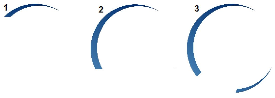
Here are the 2 examples that I was trying to animate. I think the most complicated one is the one on the left

<div class="demo">
  <svg class="progress"
    xmlns="http://www.w3.org/2000/svg"
    xmlns:xlink="http://www.w3.org/1999/xlink" viewBox="0 0 209.29 106.77">
    <defs>
        <style>.cls-1{fill:url(#linear-gradient);}.cls-2{fill-rule:evenodd;fill:url(#linear-gradient-2);}</style>
        <linearGradient id="linear-gradient" x1="208.06" y1="15.09" x2="148.49" y2="88.62" gradientUnits="userSpaceOnUse">
            <stop offset="0" stop-color="#bababa"/>
            <stop offset="0.28" stop-color="#979797"/>
            <stop offset="1" stop-color="#424242"/>
        </linearGradient>
        <linearGradient id="linear-gradient-2" x1="12.55" y1="97.95" x2="78.02" y2="26.75" gradientUnits="userSpaceOnUse">
            <stop offset="0" stop-color="#4682b4"/>
            <stop offset="1" stop-color="#002e6e"/>
        </linearGradient>
    </defs>
    <g id="c2" data-name="c2">
        <g id="Layer_1" data-name="Layer 1">
            <path class="cls-1" d="M135.21,71.21,130,76.3a52.67,52.67,0,0,0,9.56,8.58l1.43-1.76L208.64,0ZM160.15,89.3,158,93a52.93,52.93,0,0,0,14.44,1.23l.55-1.38L209.29,3.59Z"/>
            <path class="cls-2" d="M24.42,9.83A52.69,52.69,0,0,0,8.24,82.57a51.86,51.86,0,0,0,3.65,5l5.16-5,.15-.15c-.68-.92-1.35-1.87-2-2.85a49.58,49.58,0,0,1,65.44-70A52.71,52.71,0,0,0,24.42,9.83Zm59,84.7a49.52,49.52,0,0,1-24.12,7.71l-1.61,4-.24.58A52.67,52.67,0,0,0,101.3,74.63,49.52,49.52,0,0,1,83.4,94.53Z"/>
        </g>
    </g>
  </svg>
</div>
Jonatan Lavado
  • 954
  • 2
  • 15
  • 26

1 Answers1

2

You can animate the gradient by animating the color-stop and/or the offset. Then by adjusting different values you may create the effect you want.

Here is a simple example where I animate the colors of the left one and the offset of the right one.

<div class="demo">
  <svg class="progress"
    xmlns="http://www.w3.org/2000/svg"
    xmlns:xlink="http://www.w3.org/1999/xlink" viewBox="0 0 209.29 106.77">
    <defs>
        <style>.cls-1{fill:url(#linear-gradient);}.cls-2{fill-rule:evenodd;fill:url(#linear-gradient-2);}</style>
        <linearGradient id="linear-gradient" x1="208.06" y1="15.09" x2="148.49" y2="88.62" gradientUnits="userSpaceOnUse">
            <stop offset="0" stop-color="#bababa"/>
            <stop offset="0.28" stop-color="#979797">
              <animate  attributeName="offset" values=".0;.28" dur="8s" fill="freeze"  /> 
            </stop>
            <stop offset="1" stop-color="#424242">
                <animate attributeName="offset" values="0;1" dur="8s" fill="freeze"  /> 
            </stop>
            <stop offset="1" stop-color="rgba(0,0,0,0)">
                <animate attributeName="offset" values="0;1" dur="8s" fill="freeze"  /> 
            </stop>
        </linearGradient>
        <linearGradient id="linear-gradient-2" x1="12.55" y1="97.95" x2="78.02" y2="26.75" gradientUnits="userSpaceOnUse">
            <stop offset="0" stop-color="rgba(0,0,0,0)">            
                <animate attributeName="stop-color" values="rgba(0,0,0,0); #4682b4" dur="8s" fill="freeze"  /> 
            </stop>
            <stop offset="1" stop-color="rgba(0,0,0,0)">  
                <animate attributeName="stop-color" values="rgba(0,0,0,0); #002e6e" dur="8s" fill="freeze"  />    
            </stop>  
        </linearGradient>
    </defs>
    <g id="c2" data-name="c2">
        <g id="Layer_1" data-name="Layer 1">
            <path class="cls-1" d="M135.21,71.21,130,76.3a52.67,52.67,0,0,0,9.56,8.58l1.43-1.76L208.64,0ZM160.15,89.3,158,93a52.93,52.93,0,0,0,14.44,1.23l.55-1.38L209.29,3.59Z"/>
            <path class="cls-2" d="M24.42,9.83A52.69,52.69,0,0,0,8.24,82.57a51.86,51.86,0,0,0,3.65,5l5.16-5,.15-.15c-.68-.92-1.35-1.87-2-2.85a49.58,49.58,0,0,1,65.44-70A52.71,52.71,0,0,0,24.42,9.83Zm59,84.7a49.52,49.52,0,0,1-24.12,7.71l-1.61,4-.24.58A52.67,52.67,0,0,0,101.3,74.63,49.52,49.52,0,0,1,83.4,94.53Z"/>
        </g>
    </g>
  </svg>
</div>

Some usefull links:

https://css-tricks.com/guide-svg-animations-smil/

https://designmodo.com/animate-svg-gradients/

https://css-tricks.com/smil-is-dead-long-live-smil-a-guide-to-alternatives-to-smil-features/

Temani Afif
  • 245,468
  • 26
  • 309
  • 415
  • Thank you, the animation on the right is what I was looking for, but can the same thing be achieved with the object on the left? I will read about this – Jonatan Lavado Feb 22 '18 at 22:15
  • @L.Flor yes sure :) simply animate the offset of the left one ;) i tried to show both type, color and offset .. and you can also combine both of them, etc ... i let you play with it and if you sill have some issue let me know ;) – Temani Afif Feb 22 '18 at 22:17
  • Good answer !! But we aware that the long term support of SMIL is not warranted – vals Feb 23 '18 at 16:55
  • @vals yes right ;) i will add another link for this to have some alternatives – Temani Afif Feb 23 '18 at 19:02
  • I have a question, how would I do if I have 2 elements and I want to hide the first element for about 2 seconds (it's an example). So, the first element remains hidden and only the second element is animated and once the second element ends its animation, the first element appears and animates. – Jonatan Lavado Feb 24 '18 at 23:23
  • In summary, how can I hide an element for a few seconds? – Jonatan Lavado Feb 24 '18 at 23:27
  • 1
    @L.Flor there is two attribute with animate element of svg called `begin` `end` .. you are interested with the begin wher you can specify the "when" the animation should begin and this can be linked with another animation .. here is an example, https://stackoverflow.com/questions/31690880/svg-animation-delay-on-each-repetition and you can do some search about these attribute and you will find many other ;) – Temani Afif Feb 24 '18 at 23:30
  • I already got it, I did not know that I could also apply the animation to the `path` thanks again! – Jonatan Lavado Feb 25 '18 at 00:32