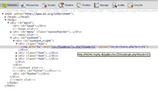
I want to create three columns like I do with Bootstrap 3, but here I don't get three columns and I get three rows.
<!DOCTYPE html>
<html>

  <head>
    <link data-require="bootstrap@4.0.0" data-semver="4.0.0" rel="stylesheet" href="https://maxcdn.bootstrapcdn.com/bootstrap/4.0.0/css/bootstrap.min.css" />
    <script data-require="bootstrap@4.0.0" data-semver="4.0.0" src="https://maxcdn.bootstrapcdn.com/bootstrap/4.0.0/js/bootstrap.min.js"></script>
    <script data-require="popper.js@1.12.9" data-semver="1.12.9" src="https://unpkg.com/popper.js@1.12.9/dist/umd/popper.min.js"></script>
    <link rel="stylesheet" href="style.css" />
    <script src="script.js"></script>
  </head>

  <body>
    <div class = "container-fluid">
      <div class = "row">
        <div class = "col-md-4">Left</div>
        <div class = "col-md-4">Center</div>
        <div class = "col-md-4">Right</div>
      </div>
    </div>
  </body>

</html>
Plunker: https://plnkr.co/edit/6gRm3dsYxBjCdKR5V7Dy?p=info
What am I doing wrong?
Edit I
Here is the wide of my screen:
As you can see I don't get columns, I get rows. The width of my screen is bigger than 1200px.
I'm using Angular 5.
Fixed
It was my fault. I didn't include Bootstrap CSS file in my angular code.
