I'm using foundation 6.4 on one of my projects. And have the following layout to overcome.
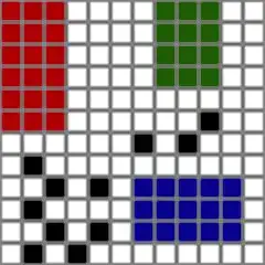
On mobile the layout needs to look like this:

On Desktop the layout needs to look like this:

My code looks like this:
The Html:
<div class="row box-wrapper">
    <div class="column small-12 small-order-1 large-6 large-order-1 box-header box">
        Header
    </div>
    <div class="column small-8 small-order-2 large-6 large-order-3 box-filter box">
        Filter
    </div>
    <div class="column small-4 small-order-3 large-6 large-order-2 box-sort box">
        Sort
    </div>
    <div class="column small-12 small-order-4 large-6 large-order-4 box-products box">
        Products
    </div>
    <div class="column small-12 small-order-5 large-6 large-order-5 box-content box">
        Content
    </div>
</div>
The CSS:
.box-wrapper {
  background: #bfbfbf;
}

  .box {
    width: 100%;
  }

  .box-header {
    background: red;
    align-self: flex-start;
  }

  .box-filter {
    background: blue;
    align-self: flex-start;
  }

  .box-sort {
    background: green;
    align-self: flex-start;
  }

  .box-products {
    background: orange;
    height: 200px;
    align-self: flex-start;
  }

  .box-content {
    background: aqua;
    align-self: flex-start;
  }
Code pen here
My current problem is that the content is not climbing next to the Filters for desktop as you can see in the following image:

Is this even achievable via flex?