4

I have two plots that share the y-axis but have different x-axes. I used facet_grid to separate them appropriately (see figure), but the two x-axes need to have different titles (instead of the one title "Num Cell Lines.Tissue"). I've seen something similar done by creating 2 ggplot objects first then use a function like ggplotGrob. Is there a way to do this directly?

Edit 1: to include data, code

Data:

Variable  Condition  Num.CellLines.Tissue   Percent.Altered
V1        C1                 1              0.20149254
V1        C1                 2              0.03731343
V1        C1                 3              0
V1        C1                 4              0
V1        C1                 5              0
V2        C2                 1              0.74893617
V2        C2                 2              0.37446809
V2        C2                 3              0.16595745
V2        C2                 4              0.09787234
V2        C2                 5              0.06808511
V2        C2                 6              0.05531915
V2        C2                 7              0.02553191
V2        C2                 8              0.01702128
V2        C2                 9              0.01276596
V2        C2                10              0.00851064
V2        C3                 1              0.88554217
V2        C3                 2              0.68072289
V2        C3                 3              0.40361446
V2        C3                 4              0.22289157
V2        C3                 5              0.11445783
V2        C3                 6              0.06626506
V2        C3                 7              0.04819277
V2        C3                 8              0.01807229
V2        C3                 9              0.01807229
V2        C3                10              0.01204819
V2        C4                 1              0.87301587
V2        C4                 2              0.6984127
V2        C4                 3              0.52380952
V2        C4                 4              0.38095238
V2        C4                 5              0.25925926
V2        C4                 6              0.14285714
V2        C4                 7              0.07407407
V2        C4                 8              0.04232804
V2        C4                 9              0.03703704
V2        C4                10              0.03174603

Code:

ggplot(data, aes(y=Percent.Altered, x = Num.CellLines.Tissue, color= Condition )) + geom_line(size=1) + facet_grid(. ~ Variable, scales="free_x")

enter image description here

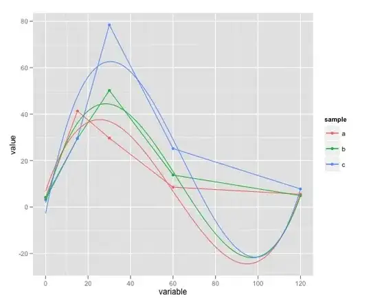
Edit 2: Image of ideal plot

The labels V1 and V2 show up the way I want them to by default, and they are different from what the titles of the x-axes below them should be.
enter image description here

bashmike
  • 73
  • 1
  • 2
  • 8

1 Answers1

3

We can use switch = 'x' then place strip.placement = "outside"

library(tidyverse)

text = "Variable  Condition  Num.CellLines.Tissue   Percent.Altered
V1        C1                 1              0.20149254
V1        C1                 2              0.03731343
V1        C1                 3              0
V1        C1                 4              0
V1        C1                 5              0
V2        C2                 1              0.74893617
V2        C2                 2              0.37446809
V2        C2                 3              0.16595745
V2        C2                 4              0.09787234
V2        C2                 5              0.06808511
V2        C2                 6              0.05531915
V2        C2                 7              0.02553191
V2        C2                 8              0.01702128
V2        C2                 9              0.01276596
V2        C2                10              0.00851064
V2        C3                 1              0.88554217
V2        C3                 2              0.68072289
V2        C3                 3              0.40361446
V2        C3                 4              0.22289157
V2        C3                 5              0.11445783
V2        C3                 6              0.06626506
V2        C3                 7              0.04819277
V2        C3                 8              0.01807229
V2        C3                 9              0.01807229
V2        C3                10              0.01204819
V2        C4                 1              0.87301587
V2        C4                 2              0.6984127
V2        C4                 3              0.52380952
V2        C4                 4              0.38095238
V2        C4                 5              0.25925926
V2        C4                 6              0.14285714
V2        C4                 7              0.07407407
V2        C4                 8              0.04232804
V2        C4                 9              0.03703704
V2        C4                10              0.03174603"

data <- read.table(text = text, header = TRUE)
head(data)
#>   Variable Condition Num.CellLines.Tissue Percent.Altered
#> 1       V1        C1                    1      0.20149254
#> 2       V1        C1                    2      0.03731343
#> 3       V1        C1                    3      0.00000000
#> 4       V1        C1                    4      0.00000000
#> 5       V1        C1                    5      0.00000000
#> 6       V2        C2                    1      0.74893617

ggplot(data, aes(y = Percent.Altered, x = Num.CellLines.Tissue, color = Condition )) + 
  geom_line(size = 1) + facet_grid(. ~ Variable, scales = "free_x", switch = 'x') +
  theme_classic(base_size = 16) +
  theme(strip.placement = "outside") +
  theme(axis.title.x = element_blank(),
        strip.background = element_blank())

# Append the original x-axis label. Code taken from the ref below 
# http://ggplot2.tidyverse.org/reference/as_labeller.html
appender <- function(string, prefix = "Num.CellLines.Tissue: ") paste0(prefix, string)
ggplot(data, aes(y = Percent.Altered, x = Num.CellLines.Tissue, color = Condition )) + 
  geom_line(size = 1) + 
  facet_grid(. ~ Variable, 
             labeller = as_labeller(appender),
             scales = "free_x", switch = 'x') +
  theme_classic(base_size = 16) +
  theme(strip.placement = "outside") +
  theme(axis.title.x = element_blank(),
        strip.background = element_blank())  

Edit based on OP's new picture, we need to plot V1 & V2 separately then merge together using cowplot::plot_grid function:

# V1
p1 <- ggplot(data %>% filter(Variable == "V1"), 
             aes(y = Percent.Altered, x = Num.CellLines.Tissue, color = Condition )) + 
  geom_line(size = 1) + 
  facet_grid(. ~ Variable, scales = "free_x") +
  scale_y_continuous(limits = c(0, 1), expand = c(0, 0)) +
  theme_classic(base_size = 16) +
  theme(
    legend.position = "none", 
    plot.margin = unit(c(0, 0, 0, 0), "cm")) +
  scale_color_brewer(palette = "Set1") +
  xlab("# Tissues")

# V2
p2 <- ggplot(data %>% filter(Variable == "V2"), 
             aes(y = Percent.Altered, x = Num.CellLines.Tissue, color = Condition )) + 
  geom_line(size = 1) + 
  facet_grid(. ~ Variable, scales = "free_x") +
  scale_y_continuous(limits = c(0, 1), expand = c(0, 0)) +
  theme_classic(base_size = 16) +
  theme(
    legend.position = "none", 
    plot.margin = unit(c(0, 0, 0, 0), "cm")) +
  scale_color_brewer(palette = "Dark2") +
  xlab("# Cell Lines") + ylab("")

# Remove the y-axis for the 2nd plot - p2 then merge 2 plots
cowplot::plot_grid(p1, 
                   p2 + 
                     theme(axis.text.y = element_blank(),
                           axis.line.y = element_blank(),
                           axis.title.y= element_blank(),
                           axis.ticks.y= element_blank()),
                   nrow = 1,
                   rel_widths = c(1.2, 1),
                   align = 'h', axis = 'tb')

Created on 2018-03-04 by the reprex package (v0.2.0).

Tung
  • 26,371
  • 7
  • 91
  • 115
  • I'm confused why (or if) OP would want this? V1 and V2 do not represent the ticks on the x axis? – tyluRp Mar 04 '18 at 07:05
  • 1
    You're right. Maybe OP wants `Num.CellLines.Tissue: 1` & `Num.CellLines.Tissue: 2`, etc. But at least OP has an option to do it now – Tung Mar 04 '18 at 07:11
  • 1
    Ah you could be right. I couldn't figure out why this would be desirable. Thanks! – tyluRp Mar 04 '18 at 07:12
  • This almost solves it. Is there then a way to make two plot titles to replace the labels that are now at the bottom? – bashmike Mar 04 '18 at 07:15
  • @bashmike: I'm not sure if I understand your request. Can you draw your expected output in Paint or similar software then add it to your question? – Tung Mar 04 '18 at 07:18
  • @Tung I added an image of what it would ideally look like. The key question is how to keep the labels at the top (V1 and V2) and have different titles for the x-axes. If I didn't need the labels at the top as well, then using 'switch' would have solved it. – bashmike Mar 04 '18 at 19:11
  • 1
    @bashmike: I don't think it's possible to do it with `facet`. You will probably need to plot each panel individually then merge them together. See example here https://stackoverflow.com/questions/47667729/how-can-i-align-multiple-plots-by-their-titles-instead-of-plot-area – Tung Mar 05 '18 at 00:58
  • 1
    @bashmike: see my edit for a solution using `cowplot` – Tung Mar 05 '18 at 01:56