What is the best way and best practice to achieve this layout? Meaning it will stay consistent on iPad, Android or desktop. CSS Grids? Flexbox? Logo div should be centered on the page vertically and horizontally. Text divs should be centered in the middle of the logo div.
Asked
Active
Viewed 65 times
3 Answers
1
There is no right way, you could use anything you like, however i would suggest flexbox for that demande, but you could do it with grid or so..
.container{
  display: flex;
  justify-content: space-around; /* to meet your need or space-between*/
  align-items: center; /* vertical */
}
.container{ /* get all the space */
  position: absolute;
  top: 0;
  right: 0;
  bottom: 0;
  left: 0;
}

.container, .container > .item{
  display: flex;
  justify-content: space-around; /* horizontal, nice to try: center or space-between*/
  align-items: center; /* vertical */
}

.item {
  border: 2px solid blue;
  width: 150px;
  height: 100px;
}

.large{
  height: 200px;
}

@media screen and (max-width: 480px) { /* using media query to detect screen size */
  .container{
    flex-direction: column; /* switch display into column */
  }
}
<div class="container">
<div class="item">Text Div Centered</div>
<div class="item large">Logo Centered</div>
<div class="item">Text Div Centered</div>
</div>
Fabien Greard
- 1,854
- 1
- 16
- 26
-
How would i center this vertically? – gointern Mar 04 '18 at 14:24
-
Align-items, whats your problem ? – Fabien Greard Mar 04 '18 at 14:27
-
Also can this be responsive, go into a single column when lower than 480px width? – gointern Mar 04 '18 at 14:32
-
align the divs vertically on the page so it has the space padding on the top as on the bottom. – gointern Mar 04 '18 at 14:33
-
well i have updated my answer, with what i think you"re asking – Fabien Greard Mar 04 '18 at 14:41
-
Thanks that looks great. Is it possible to bring two text divs closer together? – gointern Mar 04 '18 at 17:07
-
Use margin property inside your items when you need to adjust thing – Fabien Greard Mar 04 '18 at 21:47
0
Could you use a table? and remove border / cellspacing??
   td {
    display: table-cell;
    text-align: center;
    vertical-align: middle;
    }
<table>
<tr>
<td><div class="div1">test</div></td>
<td><div class="div2">test</div></td>
<td><div class="div3">test</div></td>
</tr>
<tr>
<td><div class="div1">test</div></td>
<td><div class="div2">test</div></td>
<td><div class="div3">test</div></td>
</tr>
</table>
Harun Diluka Heshan
- 1,155
- 2
- 18
- 30
IT__try
- 1
0
You can use Flexbox to achieve that. At first create a .flex container with display:flex property. Now apply flex:1 to its children. All its children acquire an equal width.
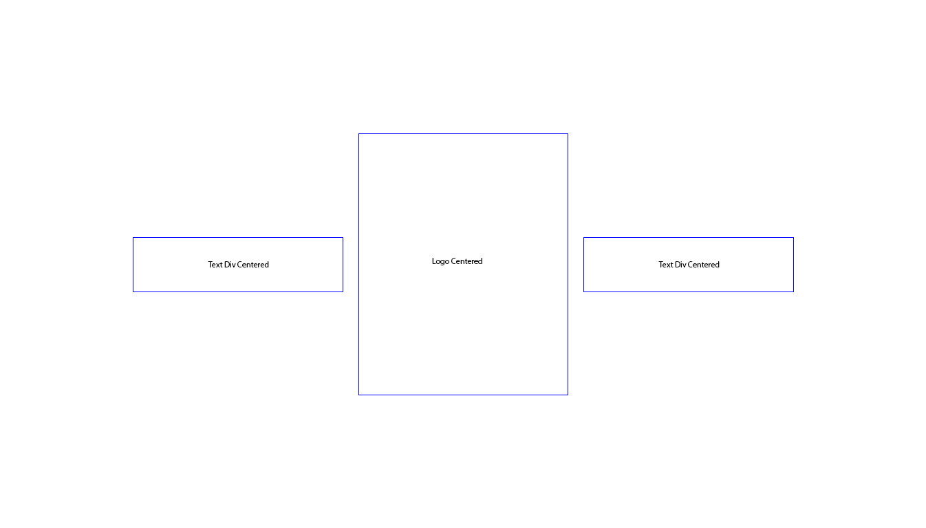
But from the image shown, your Logo Divs height is larger, then apply the same here on the individual element. But, if you observe, nothing is centered. So, in order to center every box, you need to use the properties align-items:center and justify-content:center on the .flex.
Even now the text inside is not centered, but the boxes are centered vertically and horizontally. To achieve the same on the children, apply display:flex and the same centering method described above to its children too. Now the content of the children i.e, the text inside is centered as well.
.flex, .flex > div{
  display:flex;
  align-items:center;
  justify-content:center;
}
.flex > div{
  flex:1;
  height:80px;
  margin:5px;
  border:1px solid blue;
}
.flex .logoDiv{
  height:150px;
  width:100%;
}
<div class='flex'>
<div class='textDiv'>Text Div Centered</div>
<div class='logoDiv'>Logo Centered</div>
<div class='textDiv'>Text Div Centered</div>
</div>
Sreekanth Reddy Balne
- 3,264
- 1
- 18
- 44
-
-
adding the properties: `align-items:center;` and ` justify-content:center;` to `display:flex` centers the content both vertically and horizontally. – Sreekanth Reddy Balne Mar 04 '18 at 19:22