6

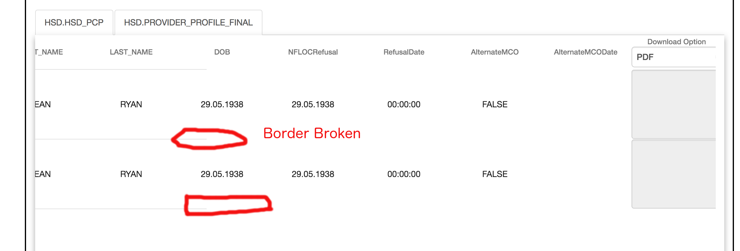
I am using Angular Material Data table in my application. I need to display multiple columns with a horizontal scroll table. I am facing an issue with the table row border. It's not displaying an entire width of the row. Please check the attached image for your reference. Please help me to resolve this issue.

Please check the Link for Code reference

https://stackblitz.com/edit/angular-mdxik6?file=app%2Ftable-basic-example.html

enter image description here

Thanks in Advance.

jnathn
  • 28
  • 3
Hariharan Subramanian
  • 1,360
  • 2
  • 12
  • 22

9 Answers9

2

Both header row and column rows are display flex by default, changing it to display inline-flex will fix above issue

.mat-header-row, .mat-row {
    display: inline-flex;
}
vittaljk
  • 21
  • 4
1

Use display grid in case of ipad and mobile device screens

mat-table {
   display: -ms-grid ;
   display: grid;
}
1

This might help someone else as this is an old post. Please refer to https://stackblitz.com/edit/angular-mdxik6-gnpzuh?embed=1&file=app/table-basic-example.css

Just add the following to your your-comp-component.css or your-comp-component.scss

.mat-row, .mat-header-row {
min-width: 2800px;
width: 100%;
}
Saqib
  • 371
  • 2
  • 13
1

Best resolve I did overcome this problem.

  1. Hold dynamic data column with css

    columns = [
            {columnDef: 'select', width: 75},
            ...........
    ]
    
  2. Recalculate css min width if you implement a show/hide function

    recalculateCss() {
        let cellWidth = 0;
        for (let i = 0; i < this.selected.length; i++) {
            const cell = this.selected[i];
            const column = this.columns.filter((value, index) => value.columnDef === cell);
            cellWidth += column[0] ? column[0].width : 0;
        }
        this.minWidth = cellWidth;
    }
    
  3. Add css in both mat-header-row and mat-row

    [style.min-width.px]="minWidth"
    
RalfFriedl
  • 1,134
  • 3
  • 11
  • 12
Thapld
  • 37
  • 9
0

Material uses a flex layout so you could add align-self: stretch; to the columns CSS. This should stretch the auto-sized items to fit the table.

Edit

Stackblitz

Removing your header and cell width element helps. You want to set your rows to have a 100% width then set a desired minimum.

.mat-row, .mat-header-row { min-width: 1123px; width:100%; }

jnathn
  • 28
  • 3
0

You have style properties that are working against each other. You've set min-width: 150px; for each column, and you have 13 columns which totals 1950px. Plus you've set width: 1123px; on each row which is (obviously) less than 1950px. Also, you set max-width: 1123px; - same width as your rows - on the table itself, but the table needs to be wider than the row in order to show the scrollbar. If you fix those problems, the border will display properly. Try setting just your row width and leaving out the table and column widths settings.

G. Tranter
  • 16,766
  • 1
  • 48
  • 68
0

Guys this is will help you solving such issues

You have to start using :

width: max-content;

.mat-row,
.mat-header-row {
  min-width: 1123px;
  width: 100%;
  width: max-content;
}

.mat-table {
  overflow: scroll;
  max-height: 500px;
}

.mat-cell,
.mat-header-cell {
  min-width: 90px;
}
/*unnecessary to make table header fixed*/
.mat-header-row {
  top: 0;
  position: sticky;
  z-index: 1;
  background-color: inherit;
  text-align: center;
}

find browsers support : https://caniuse.com/#search=fit-content

Hasan Daghash
  • 1,681
  • 1
  • 17
  • 29
0

You need to set the expected with of the table in mat-table{min-width} plus the mat-row left and right paddings (24px each).

In your example case:

.mat-table {
  min-width: calc((13 * 150px) + 48px);
}

or

.mat-table {
  min-width: 1998px;
}

Hope this helps!!!

Carlos Cuesta
  • 1,262
  • 1
  • 17
  • 20
0

Try to use below styling. It helps to render data & borders correctly when more columns in mat-table. (horizontal scrolling issue resolved)

.mat-header-cell{
    background-color: inherit;
}
Jason
  • 2,493
  • 2
  • 27
  • 27