So I'm pretty new to grid layout and I was stuck at the following problem.
What I got so far is this: codepen
And here's the relevant grid part:
grid-template:
  'img date'
  'img head'
  'img sub'
  'desc desc';
grid-template-rows: auto auto 1fr 1fr;
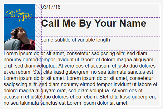
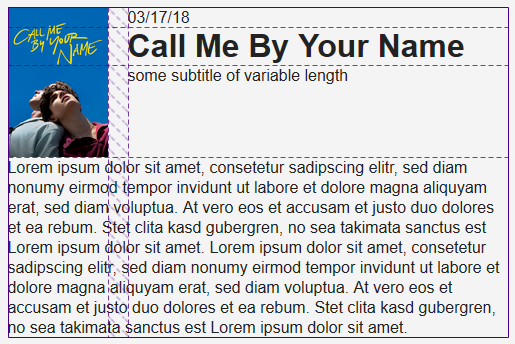
Now my problem is that the date, head and sub all take up equal space, but what I want is for date and head to take up the minimum available space, i.e. "stick to the top". I managed to do that by giving the first two rows fixed heights like so
grid-template-rows: 30px 50px auto auto
but that seems like an ugly solution, especially because the heading is of variable length. I also tried
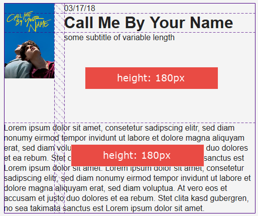
grid-template-rows: auto auto 1fr 1fr
but that leaves me with some ugly white-space between the subtitle and the description.
So... what's the "grid way" of achieving my goal?
body {
  background: #ddd;
  color: #222;
  font-family: Roboto, sans-serif;
}

* {
  margin: 0; padding: 0;
}

.movie {
  margin: 20px auto;
  display: grid;
  grid-column-gap: 20px;
  grid-template:
    'img date'
    'img head'
    'img sub'
    'desc desc';
  grid-template-columns: 100px auto;
  /* grid-template-rows: auto auto 1fr 1fr; */
  width: 500px;
  background: #f4f4f4;
  border-radius: 3px;
  padding: 20px;
}

.movie__date {
  grid-area: date;
}

.movie__img {
  grid-area: img;
  width: 100%;
}

.movie__description {
  grid-area: desc;
  margin-top: 20px;
}

.movie__subtite {
  grid-area: sub;
}

.movie__heading {
  grid-area: head;
}
<div class="movie">
<img src="https://image.tmdb.org/t/p/w1280/nPTjj6ZfBXXBwOhd7iUy6tyuKWt.jpg" class="movie__img"></img>
<p class="movie__date">03/17/18</p>
<h1 class="movie__heading">Call Me By Your Name</h1>
<p class="movie__subtitle">some subtitle of variable length</p>
<p class="movie__description">Lorem ipsum dolor sit amet, consetetur sadipscing elitr, sed diam nonumy eirmod tempor invidunt ut labore et dolore magna aliquyam erat, sed diam voluptua. At vero eos et accusam et justo duo dolores et ea rebum. Stet clita kasd gubergren, no sea takimata sanctus est Lorem ipsum dolor sit amet. Lorem ipsum dolor sit amet, consetetur sadipscing elitr, sed diam nonumy eirmod tempor invidunt ut labore et dolore magna aliquyam erat, sed diam voluptua. At vero eos et accusam et justo duo dolores et ea rebum. Stet clita kasd gubergren, no sea takimata sanctus est Lorem ipsum dolor sit amet.</p>
</div>