-2

I have this:

span {
    padding: 10px;
    display: inline;
}

[title]:hover::before {
    background: #333;
    top: 20%;
    background: rgba(0,0,0,.8);
    border-radius: 5px;
    color: #fff;
    content: attr(title);
    padding: 5px 15px;
    position: absolute;
    z-index: 98;
    width: auto;
}
<span class="dijitButtonContents" id="saveButton" title="Save as draft"><span id="saveButton_label">Save</span></span>

And I need to add a pointing arrow like this:

enter image description here

Can anyone help me achieve this by using only pseudo elements?

Thanks.

Uyghur Lives Matter
  • 18,820
  • 42
  • 108
  • 144
Athar K
  • 191
  • 3
  • 18

3 Answers3

6

Like this?

span {
  padding: 10px;
  display: inline;
}

[title] {
  position: relative;
}

[title]:hover:before {
  background: #333;
  top: 100%;
  background: rgba(0, 0, 0, .8);
  border-radius: 5px;
  color: #fff;
  content: attr(title);
  padding: 5px 15px;
  position: absolute;
  z-index: 98;
  width: auto;
  margin-top: 10px;
}

[title]:hover:after {
  width: 0;
  height: 0;
  border-left: 5px solid transparent;
  border-right: 5px solid transparent;
  border-bottom: 10px solid #333;
  content: ' ';
  position: absolute;
  top: 100%;
  left: 50%;
}
<span class="dijitButtonContents" id="saveButton" title="Save as draft"><span id="saveButton_label">Save</span></span>
GreyRoofPigeon
  • 17,833
  • 4
  • 36
  • 59
  • Many thanks. Can you tell me how to make the tooltip box appear in the middle of the arrow? – Athar K Mar 19 '18 at 16:35
  • Here, title also occurs and shows 2 popups. How to hide that? – Hary Sep 14 '20 at 08:59
  • @Hary, please start a new question, can't judge it without seeing the code – GreyRoofPigeon Sep 14 '20 at 11:41
  • @LinkinTED, Sure will do. But what I was asking is, if you hover the "save" in the example, there are 2 popups occurring. One the default browser tooltip for title and the other is the customized one. – Hary Sep 14 '20 at 13:10
  • 2
    @Hary, ah okay, that is what you mean. As far as I know, you can't disable the title behaviour of the browser. You could however try to use a data-* attribute instead of the title attribute. – GreyRoofPigeon Sep 14 '20 at 13:21
2

I used a CSS triangle generator to create the arrow.

Edit: Added CSS for center alignment. Also provided comments in CSS explaining each value.

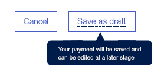
Add :hover pseudo selector to show tooltips only on hover. I removed them for easier development.

.center-align {
  text-align: center;
}
[title] {
  position: relative;
}
[title]:before,
[title]:after {
  z-index: 98;
}

[title]:before {
  bottom: -10px;
  /* calculate 50% width of the parent element minus width of the current element */
  left: calc(50% - 10px);
  width: 0;
  height: 0;
  border-style: solid;
  border-width: 0 10px 10px 10px;
  border-color: transparent transparent #333 transparent;
  content: "";
  position: absolute;
  display: block;
}

[title]:after {
  background: #333;
  /* calculate single line height plus height of the arrow element */
  top: calc(1em + 10px);
  border-radius: 5px;
  color: #fff;
  content: attr(title);
  padding: 5px 10px;
  position: absolute;
  /* calculate 50% width of the parent minus half of the width of current element minus half of the padding */
  left: calc(50% - 45px - 5px); 
  /* requires fixed width for calculation above */
  width: 90px;
  text-align: center;
}
<span class="dijitButtonContents" id="saveButton" title="Save as draft">  
  <span id="saveButton_label">Save and write a long description</span>
</span>
<br/><br/><br/><br/>
<span class="dijitButtonContents" id="saveButton" title="Save as draft">  
  <span id="saveButton_label">Save</span>
</span>

<div class="center-align">
  <span class="dijitButtonContents" id="saveButton" title="Save as draft">  
  <span id="saveButton_label">Save and write a long description</span>
  </span>
  <br/><br/><br/><br/>
  <span class="dijitButtonContents" id="saveButton" title="Save as draft">  
  <span id="saveButton_label">Save</span>
  </span>
</div>
Kirill
  • 406
  • 3
  • 11
  • Many thanks @Kirill. Can you tell me how to make the tooltip box appear in the middle of the arrow? – Athar K Mar 20 '18 at 05:48
  • @AtharK Amend "left" property for [title]:hover::after. 65px should do the trick. Unfortunately since width of the text is dynamic, it's rather tricky to get exact center. Hence why I opted for left side, below hover object. – Kirill Mar 20 '18 at 16:55
  • Actually it applies to various titles hence needs to be dynamic. I cant just fix it with pixels. – Athar K Mar 20 '18 at 17:00
  • @AtharK, If you want a smart tooltip, you would be better off with a JS plugin. As you'll eventually run into issues with tooltip going outside of viewport if your title object is too close to the edge of the browser window. JS can resolve that and more ("top: 20%" is very error prone for different browser sizes). – Kirill Mar 22 '18 at 16:32
  • Thanks for your suggestions but the problem is its a system so I cant just add anything on my own. I can only do changes in CSS so thats why I need a pure css based solution. – Athar K Mar 22 '18 at 16:39
  • @AtharK, Sure, I updated my answer with middle alignment. – Kirill Mar 22 '18 at 17:20
0

tooltip using tailwind peer selectors on hover or on focus (no JS)

<script src="https://cdn.tailwindcss.com"></script>

<div class="relative ml-2 mt-1 h-24 w-48">
  <div class="peer h-10 w-10 cursor-pointer rounded-full border bg-gray-600 text-center text-2xl text-white focus:bg-black hover:bg-black" tabindex="0">? </div>
  <div class="invisible absolute left-0 top-12 h-16 w-40 rounded-lg bg-black p-2 text-md text-white shadow-2xl peer-focus:visible peer-hover:visible hover:visible">Hi!, how can i help you?</div>
  <svg viewBox="0 0 100 100" class="stroke-3 invisible absolute left-6 top-8 h-4 w-4 stroke-black peer-focus:visible peer-hover:visible hover:visible">
    <polygon points="50,0 100,100 0,100" />
  </svg>
</div>
Suhas C V
  • 104
  • 1
  • 5