0

I trying to apply word-wrap in the table cell, but it's not working.

enter image description here

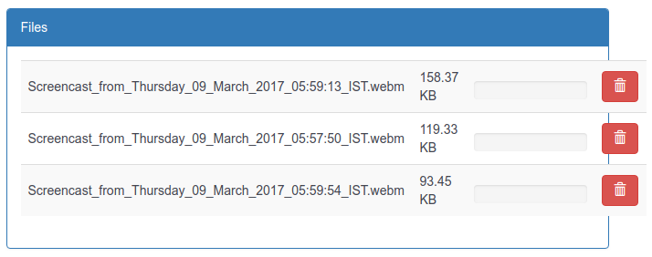
Line wraps if file name contain space, but if space not there my table going out of div.

I also tried word-wrap and width property to table cell.

display: table-cell;
width: 50%;
word-wrap: break-word;

It works with fix width in pixels, but i can't to that because i need to manage design in all width device.

What css i can apply to make word wrap if table cell have no more space to grow ?

Thanks

2 Answers2

1

Use word-break:break-all instead of word-wrap: break-word;

display: table-cell;
width: 50%;
word-break:break-all;

td {
  width:33.3%;
  word-break:break-all;
}
<table>
<tr>
  <td>largcontent_without_sapce_large_content_without_space</td>
  <td>Samll Content</td>
  <td>Test Content</td>
</tr>
<tr>
  <td>largcontent_without_sapce_large_content_without_space_content_without_space</td>
  <td>Samll Content</td>
  <td>Test Content</td>
</tr>
<tr>
  <td>largcontent_without_sapce_large_content_without_space</td>
  <td>Samll Content</td>
  <td>Test Content</td>
</tr>
</table>
Suresh Ponnukalai
  • 13,820
  • 5
  • 34
  • 54
1

You can use overflow property of css in your table.

overflow:auto;

This will be working for every screen size.

vishulg
  • 149
  • 1
  • 6