2

I'm using the slick-carousels project because I'd like to create some kind of slider that is able to show different images in a row.

So what I'd like to get is something similar to this:

image

So the carousel includes a bunch of images where 4 of them are shown at the same time while the images are centered (top & bottom got the same values).

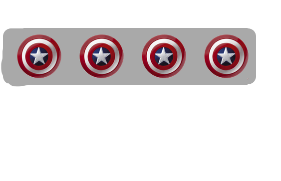
But what I get using my code looks exact like this - what a mess:

image2

$(document)
  .ready(function() {
    $('.carousel')
      .slick({
        centerMode: true,
        centerPadding: '60px',
        slidesToShow: 4,
        dots: false,
        prevArrow: false,
        nextArrow: false,
        responsive: [{
          breakpoint: 768,
          settings: {
            arrows: false,
            centerMode: true,
            centerPadding: '40px',
            slidesToShow: 3
          }
        }]
      });
  });
.carousel {
  overflow: hidden;
}

.carousel_slide {
  position: relative;
  margin-left: 2%;
}

.slick-slide {
  float: left;
}

.slick-initialized .slick-slide {
  display: block;
}

#card {
  position: absolute;
  margin-top: 10%;
  background-color: darkgray;
  border-radius: 16px;
  width: 90%;
  height: 30%;
}
<script src="https://ajax.googleapis.com/ajax/libs/jquery/2.1.1/jquery.min.js"></script>
<script src="https://cdnjs.cloudflare.com/ajax/libs/slick-carousel/1.8.1/slick.min.js"></script>


<div id="card">

  <div class="carousel" data-slick='{"slidesToShow": 4, "slidesToScroll": 4}'>
    <div class="" style="slide">
      <img style="margin: auto; top: 0; bottom: 0; width: 100%" src="http://www.stickpng.com/assets/images/580b585b2edbce24c47b290b.png">
    </div>
    <div class="carousel_slide">
      <img style="margin: auto; top: 0; bottom: 0; width: 100%" src="http://www.stickpng.com/assets/images/580b585b2edbce24c47b290b.png">
    </div>
    <div class="carousel_slide">
      <img style="margin: auto; top: 0; bottom: 0; width: 100%" src="http://www.stickpng.com/assets/images/580b585b2edbce24c47b290b.png">
    </div>
    <div class="carousel_slide">
      <img style="margin: auto; top: 0; bottom: 0; width: 100%" src="http://www.stickpng.com/assets/images/580b585b2edbce24c47b290b.png">
    </div>
  </div>

Edit:

img

How to edit my code to achieve the expected result? Any help would be very appreciated.

2 Answers2

0

Set both of the slidesToShow's to 4. There are two of them in your code. Then set negative left margin on .slick-list. https://jsfiddle.net/md9jovwy/9/

.slick-slide {
  position: relative;
  margin-left: 2%;
}
.slick-list{
margin-left: -2%;
}

How add spaces between Slick carousel item

Observer
  • 455
  • 2
  • 8
0

I'm not sure what the reason was, but I added the class carousel_slide to the first div after #card and got rid of style='slide' and I got it to work. Note that when you run this snippet, you'll only see 3 items at a time and not 4. That's because in your code you set the item count to 3 at a breakpoint of 768. So if you still want 4 just change that number.

JSFiddle: https://jsfiddle.net/xpvt214o/4687/

$('.carousel')
  .slick({
  centerMode: true,
  centerPadding: '60px',
  slidesToShow: 4,
  dots: false,
  prevArrow: false,
  nextArrow: false,
  responsive: [{
    breakpoint: 768,
    settings: {
      arrows: false,
      centerMode: true,
      centerPadding: '40px',
      slidesToShow: 3
    }
  }]
});
#card {
  position: relative;
  margin-top: 10%;
  background-color: darkgray;
  border-radius: 16px;
  width: 90%;
  height: 30%;
}

.carousel {
  overflow: hidden;
}

.carousel_slide {
  position: relative;
  margin: 0 15px;
}

.slick-slide {
  float: left;
}
<script src="https://ajax.googleapis.com/ajax/libs/jquery/2.1.1/jquery.min.js"></script>
<script src="https://cdnjs.cloudflare.com/ajax/libs/slick-carousel/1.8.1/slick.min.js"></script>

<div id="card">
  <div class="carousel" data-slick='{"slidesToShow": 4, "slidesToScroll": 4}'>
    <div class="carousel_slide">
      <img style="margin: auto; top: 0; bottom: 0; width: 100%" src="http://www.stickpng.com/assets/images/580b585b2edbce24c47b290b.png">
    </div>
    <div class="carousel_slide">
      <img style="margin: auto; top: 0; bottom: 0; width: 100%" src="http://www.stickpng.com/assets/images/580b585b2edbce24c47b290b.png">
    </div>
    <div class="carousel_slide">
      <img style="margin: auto; top: 0; bottom: 0; width: 100%" src="http://www.stickpng.com/assets/images/580b585b2edbce24c47b290b.png">
    </div>
    <div class="carousel_slide">
      <img style="margin: auto; top: 0; bottom: 0; width: 100%" src="http://www.stickpng.com/assets/images/580b585b2edbce24c47b290b.png">
    </div>
  </div>
justDan
  • 2,302
  • 5
  • 20
  • 29
  • **Looks like a good solution** - thanks so much. But would you be so kind to edit your code so that the images are centered but not completely filling up the box (so that they get smaller)? (Like in the image of my question) –  Mar 29 '18 at 18:22
  • @tempi You mean something like this? https://jsfiddle.net/xpvt214o/4765/ – justDan Mar 29 '18 at 18:23
  • @tempi So you want only 3 to display and some padding on the top and bottom of the gray box? https://jsfiddle.net/xpvt214o/4890/ I'm just trying to make sure I get what you're asking for. – justDan Mar 29 '18 at 18:36
  • Looks pretty good but with your solution I am not able to scale (change the height) of the container box. --> Changing it's height should lead to a alignment of the images. Would you be so kind to add this? :) –  Mar 29 '18 at 20:09
  • @tempi What do you mean by "should lead to an alignment of the images. Do you want to change the height of the `#card` container? – justDan Mar 29 '18 at 20:15
  • Yes and the images should be still in the middle after the height change! –  Mar 29 '18 at 20:16
  • @tempi Ok so here's what I would do. I would add a clearing element to the container that the div's are floated inside. Then you can ditch the height of the container and use padding. https://jsfiddle.net/xpvt214o/5481/ – justDan Mar 29 '18 at 20:17