-2

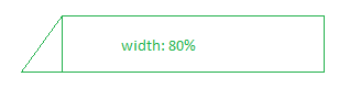
I would like to make the below shape responsive with CSS. The rectangle has width 80% of its container and has text inside it. I know how to do triangles with css using border but borders accept only pixels. How to make the whole shape responsive so when the screen size is smaller and the text inside moves to a new line, the triangle grows according to the growth of the rectangle ?

enter image description here

Code so far:

<div class="wrapper">
  <p class="text">bla blah some long text here try to resize</p>
</div>

.wrapper {
  background-color: #16b629;
  width: 80%;
  position: relative;
  left: 20%;
}

.wrapper::before {
  content: "";
  position: absolute;
  left: -23px;
  bottom: 0;

  width: 0;
  height: 0;
  border-style: solid;
  border-width: 0 0 46px 23px;
  border-color: transparent transparent #16b629 transparent;
  z-index: 999;
}

.text {
  padding: 10px 0;
  font-size: 21px;
  font-weight: bold;
  font-style: normal;
  font-stretch: normal;
  line-height: 1.27;
  letter-spacing: -0.2px;
  text-align: center;
  color: #ffffff;
  text-shadow: 0.5px 0.9px 2px rgba(27, 29, 27, 0.94);
}

https://codepen.io/anon/pen/NYzear

pollx
  • 643
  • 9
  • 21

2 Answers2

0

Try to use transform: skew() here for border instead of border because in border trick you will need to give a fixed value in px which will not be responsive with respect to content height

.wrapper {
  background-color: #16b629;
  width: 80%;
  position: relative;
  left: 20%;
}

.wrapper:after {
  content: "";
  position: absolute;
  top: 0;
  left: 0;
  right: 0;
  bottom: 0;
  background: #2bb629;
  transform: skew(-45deg);
  transform-origin: left top;
  z-index: -1;
}

.txt {
  padding: 10px 0;
  font-size: 21px;
  font-weight: bold;
  font-style: normal;
  font-stretch: normal;
  line-height: 1.27;
  letter-spacing: -0.2px;
  text-align: center;
  color: #ffffff;
  text-shadow: 0.5px 0.9px 2px rgba(27, 29, 27, 0.94);
}
<div class="wrapper">
  <p class="text">bla blah some long text here blah blah</p>
</div>
<div class="wrapper">
  <p class="text">bla blah some long text here blah blah bla blah some long text here blah blah bla blah some long text here blah blah</p>
</div>
<div class="wrapper">
  <p class="text">bla blah some long text here blah blah bla blah some long text here blah blah bla blah some long text here blah blah bla blah some long text here blah blah bla blah some long text here blah blah bla blah some long text here blah blah</p>
</div>
Bhuwan
  • 16,525
  • 5
  • 34
  • 57
0

This can be achieved using pseudo classes.Here is the updated code.

.btn {
  position: absolute;
  display: inline-block;
  height:50px; width:80%;
  text-align: center;
  color: white;
  background-color: red;
  line-height: 50px;
  text-decoration: none;
  margin-left:100px;
}
.btn:after {
  content: "";
  position: absolute;
  left: -70px;
  background-color:red;
  z-index:1;
  top:50px;
  width:50px;
  height:100px;
  transform-origin:0 0;
  transform: rotate(270deg) skewY(50deg);
}

<div class="btn">Text Here!</div>

JSFIDDLE Demo

Hope I got. Thank you.

Adil
  • 240
  • 1
  • 6
  • 19