0

I need to style those elements from gentelella template: https://colorlib.com/polygon/gentelella/contacts.html

and this is my implementation

enter image description here

<div class="col-md-4 col-sm-4  col-xs-12 profile_details">
    <div class="well profile_view">
        <div class="col-sm-12 col-xs-12">
            <div class="crop col-md-4 col-sm-12 col-xs-12 text-center ">
                <img  src= "https://media-cdn.tripadvisor.com/media/photo-s/0d/bf/07/9b/post-card-view.jpg" alt="" class="img-icon-template img-fluid ">
            </div>
            <div class=" col-md-8 col-sm-8 col-xs-12">
                <div class="">
                    <h4  class="brief titolo_template"><i>TITLE</i></h4>
                    <div><i class="fa fa-user"><strong> user XXX  </i> </div>
                    <p class="descr_p"><i class="fa fa-file-text-o"> <strong> descr: </strong> </i>something</p>
                </div>
            </div>
        </div>
        <div class="col-xs-12 bottom text-center">
            <div class="col-xs-12 col-sm-12 emphasis text-left">
                <p class="">
                    <a>relase date </a><i>dd/mm/aaaaa @endif</i>
                </p>
                <div class="col-md-6  col-sm6">
                    <a class="btn-block btn-success btn-xs text-center"
                       role="button" id="btnT2"
                       href="/templateGraphic/idxxx"
                        <i class="fa fa-sort-amount-asc "></i>view tamplate
                    </a>
                </div>
                <div class="col-md-6  col-sm-6">
                    <a class="btn-block btn-info btn-xs text-center"
                       role="button" id="btnT1"
                       href="alo/oo"
                       class="btn btn-info btn-xs">
                        <i class="fa fa-comments-o"></i> get replies
                    </a>
                </div>
            </div>
        </div>
    </div>
</div>

as you can see there are no fixed height, and if there is long description, as for example in the last box, the box is going to be bigger and bigger.

The problem is if fix max-height for the container that's will not work, same thing for the things inside because it makes all responsive rules and media query not working after.

the only solution that I've found is cutting text inside <p> with

.descr_p{
     max-height: 90px;
     text-overflow: ellipsis;
     /* white-space: nowrap; */
     overflow: hidden;
 }

but if uncomment white space: nowrap a mess like this happens: enter image description here

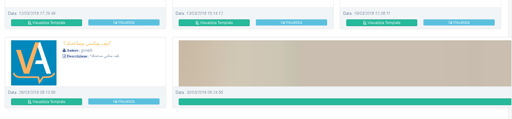
so the questions are 2 :) which one is the best way to fix maximum dimension and keep the whole thing responsive. how can I make otherwise "whitespace: nowrap" working;

apologize if I've asked silly things but I'm very newbie in CSS styling.

Jason Aller
  • 3,541
  • 28
  • 38
  • 38
JahStation
  • 893
  • 3
  • 15
  • 35

2 Answers2

3

You need to apply max-width property in descr_p according to what you want. max-height would not work.

.descr_p{
   max-width: 105px;
   text-overflow: ellipsis;
   white-space: nowrap;
   overflow: hidden;
}

Also , you can use flexbox to design your layout. You would not need to worry about size of text then.

Akanksha Sharma
  • 271
  • 1
  • 8
  • so I've even to remove "max-height" i guess, I just read something about flexbox but is not clear to me how to keep the original structure (mod gray button area etc.) with this... – JahStation Apr 03 '18 at 11:40
  • yes remove max-height. Also for flex you need one div as a parent with property display:flex and flex-flow: row wrap;. Parent div is the container that keeps all your cards. Remove positioning if any. Then read this: [link]:https://css-tricks.com/snippets/css/a-guide-to-flexbox/ – Akanksha Sharma Apr 03 '18 at 11:50
  • I was on the same link :D the first solution not works properly because it show just a line of text whatever max-width ill put. Ill try to undestand flexbox so... – JahStation Apr 03 '18 at 12:35
  • Yes if you put max-width then you will get only one line. If you want to cut the text in two lines or so then refer [https://stackoverflow.com/questions/49570197/css-ellipsis-on-fourth-line-with-read-more-with-css/49570679#49570679] – Akanksha Sharma Apr 03 '18 at 12:37
  • But try using flexbox, it is very helpful – Akanksha Sharma Apr 03 '18 at 12:37
0

Your structure is wrong. If you reduce width of the screen to below 1180px. There is not space to Address and mobile number.

you can use 'Media Object' and simplify your structure. Media Object

And for height issue you can use below jquery:

jQuery(function($) {
  var tallest = 0;
  $('.profile_view .col-sm-12').each(function() {
    var height = $(this).height();
    if (height > tallest) {
      tallest = height;
    }
  });
  $('.profile_view .col-sm-12').height(tallest);
});