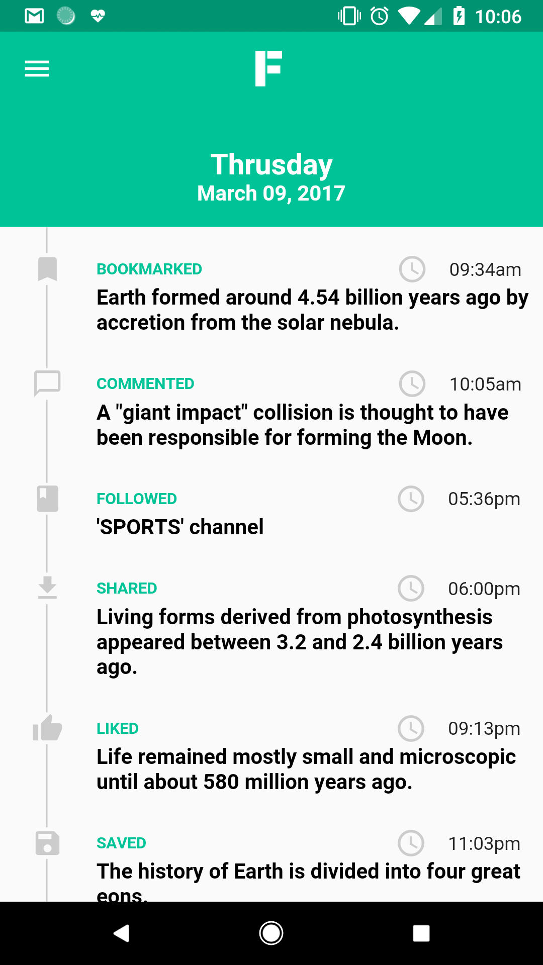
I'm trying to make timeline UI like below:
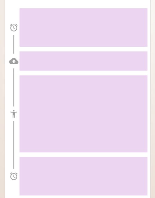
But i end up doing following:

I want to increase the height of vertical Separator when no of lines of my Description text increases. How should i do that ?
Here is the link for the code
I'm trying to make timeline UI like below:
But i end up doing following:
I want to increase the height of vertical Separator when no of lines of my Description text increases. How should i do that ?
Here is the link for the code
I like Osama's answer too but here's my quick custom implementation. It uses a CustomPainter to draw the lines.
import 'package:flutter/material.dart';

class Timeline extends StatelessWidget {
  const Timeline({
    Key? key,
    required this.children,
    this.indicators,
    this.isLeftAligned = true,
    this.itemGap = 12.0,
    this.gutterSpacing = 4.0,
    this.padding = const EdgeInsets.all(8),
    this.controller,
    this.lineColor = Colors.grey,
    this.physics,
    this.shrinkWrap = true,
    this.primary = false,
    this.reverse = false,
    this.indicatorSize = 30.0,
    this.lineGap = 4.0,
    this.indicatorColor = Colors.blue,
    this.indicatorStyle = PaintingStyle.fill,
    this.strokeCap = StrokeCap.butt,
    this.strokeWidth = 2.0,
    this.style = PaintingStyle.stroke,
  })  : itemCount = children.length,
        assert(itemGap >= 0),
        assert(lineGap >= 0),
        assert(indicators == null || children.length == indicators.length),
        super(key: key);

  final List<Widget> children;
  final double itemGap;
  final double gutterSpacing;
  final List<Widget>? indicators;
  final bool isLeftAligned;
  final EdgeInsets padding;
  final ScrollController? controller;
  final int itemCount;
  final ScrollPhysics? physics;
  final bool shrinkWrap;
  final bool primary;
  final bool reverse;

  final Color lineColor;
  final double lineGap;
  final double indicatorSize;
  final Color indicatorColor;
  final PaintingStyle indicatorStyle;
  final StrokeCap strokeCap;
  final double strokeWidth;
  final PaintingStyle style;

  @override
  Widget build(BuildContext context) {
    return ListView.separated(
      padding: padding,
      separatorBuilder: (_, __) => SizedBox(height: itemGap),
      physics: physics,
      shrinkWrap: shrinkWrap,
      itemCount: itemCount,
      controller: controller,
      reverse: reverse,
      primary: primary,
      itemBuilder: (context, index) {
        final child = children[index];
        final _indicators = indicators;

        Widget? indicator;
        if (_indicators != null) {
          indicator = _indicators[index];
        }

        final isFirst = index == 0;
        final isLast = index == itemCount - 1;

        final timelineTile = <Widget>[
          CustomPaint(
            foregroundPainter: _TimelinePainter(
              hideDefaultIndicator: indicator != null,
              lineColor: lineColor,
              indicatorColor: indicatorColor,
              indicatorSize: indicatorSize,
              indicatorStyle: indicatorStyle,
              isFirst: isFirst,
              isLast: isLast,
              lineGap: lineGap,
              strokeCap: strokeCap,
              strokeWidth: strokeWidth,
              style: style,
              itemGap: itemGap,
            ),
            child: SizedBox(
              height: double.infinity,
              width: indicatorSize,
              child: indicator,
            ),
          ),
          SizedBox(width: gutterSpacing),
          Expanded(child: child),
        ];

        return IntrinsicHeight(
          child: Row(
            mainAxisAlignment: MainAxisAlignment.start,
            children:
                isLeftAligned ? timelineTile : timelineTile.reversed.toList(),
          ),
        );
      },
    );
  }
}

class _TimelinePainter extends CustomPainter {
  _TimelinePainter({
    required this.hideDefaultIndicator,
    required this.indicatorColor,
    required this.indicatorStyle,
    required this.indicatorSize,
    required this.lineGap,
    required this.strokeCap,
    required this.strokeWidth,
    required this.style,
    required this.lineColor,
    required this.isFirst,
    required this.isLast,
    required this.itemGap,
  })  : linePaint = Paint()
          ..color = lineColor
          ..strokeCap = strokeCap
          ..strokeWidth = strokeWidth
          ..style = style,
        circlePaint = Paint()
          ..color = indicatorColor
          ..style = indicatorStyle;

  final bool hideDefaultIndicator;
  final Color indicatorColor;
  final PaintingStyle indicatorStyle;
  final double indicatorSize;
  final double lineGap;
  final StrokeCap strokeCap;
  final double strokeWidth;
  final PaintingStyle style;
  final Color lineColor;
  final Paint linePaint;
  final Paint circlePaint;
  final bool isFirst;
  final bool isLast;
  final double itemGap;

  @override
  void paint(Canvas canvas, Size size) {
    final indicatorRadius = indicatorSize / 2;
    final halfItemGap = itemGap / 2;
    final indicatorMargin = indicatorRadius + lineGap;

    final top = size.topLeft(Offset(indicatorRadius, 0.0 - halfItemGap));
    final centerTop = size.centerLeft(
      Offset(indicatorRadius, -indicatorMargin),
    );

    final bottom = size.bottomLeft(Offset(indicatorRadius, 0.0 + halfItemGap));
    final centerBottom = size.centerLeft(
      Offset(indicatorRadius, indicatorMargin),
    );

    if (!isFirst) canvas.drawLine(top, centerTop, linePaint);
    if (!isLast) canvas.drawLine(centerBottom, bottom, linePaint);

    if (!hideDefaultIndicator) {
      final Offset offsetCenter = size.centerLeft(Offset(indicatorRadius, 0));

      canvas.drawCircle(offsetCenter, indicatorRadius, circlePaint);
    }
  }

  @override
  bool shouldRepaint(CustomPainter oldDelegate) {
    return false;
  }
}
You'd call it something like:
Timeline(
  children: <Widget>[
    Container(height: 100, color: color),
    Container(height: 50, color: color),
    Container(height: 200, color: color),
    Container(height: 100, color: color),
  ],
  indicators: <Widget>[
    Icon(Icons.access_alarm),
    Icon(Icons.backup),
    Icon(Icons.accessibility_new),
    Icon(Icons.access_alarm),
  ],
),
 new ListView.builder(
                  itemBuilder: (BuildContext context, int index) {
                    return new Stack(
                      children: <Widget>[
                        new Padding(
                          padding: const EdgeInsets.only(left: 50.0),
                          child: new Card(
                            margin: new EdgeInsets.all(20.0),
                            child: new Container(
                              width: double.infinity,
                              height: 200.0,
                              color: Colors.green,
                            ),
                          ),
                        ),
                        new Positioned(
                          top: 0.0,
                          bottom: 0.0,
                          left: 35.0,
                          child: new Container(
                            height: double.infinity,
                            width: 1.0,
                            color: Colors.blue,
                          ),
                        ),
                        new Positioned(
                          top: 100.0,
                          left: 15.0,
                          child: new Container(
                            height: 40.0,
                            width: 40.0,
                            decoration: new BoxDecoration(
                              shape: BoxShape.circle,
                              color: Colors.white,
                            ),
                            child: new Container(
                              margin: new EdgeInsets.all(5.0),
                              height: 30.0,
                              width: 30.0,
                              decoration: new BoxDecoration(
                                  shape: BoxShape.circle,
                                  color: Colors.red),
                            ),
                          ),
                        )
                      ],
                    );
                  },
                  itemCount: 5,
                )
the output will be like this image 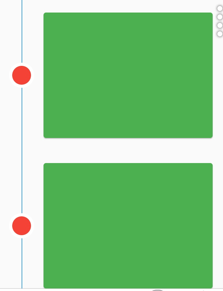
For those who are scrolling here to find an easy way to implement timelines, now you can do this easily with timeline_tile.
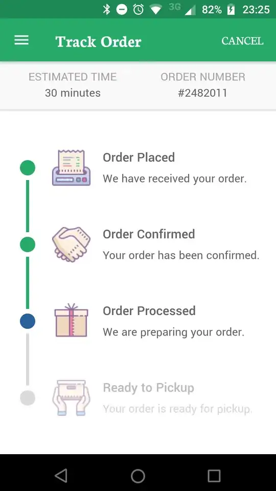
Check out this specific delivery layout:
Or this weather timeline:
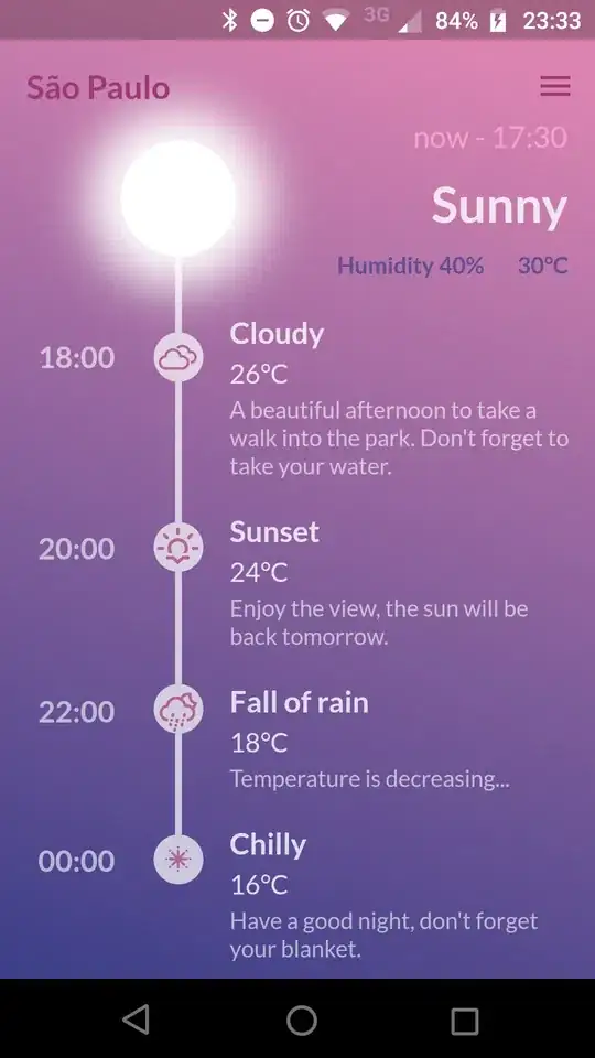
Also, the beautiful_timelines repository contains some examples built with this package.
There is other, more native and scalable way. Some solutions proposed fixed position/size values which is not really scalable if we want to have consistent experience on multiple devices with different screen resolutions.
Let me give you the mental model how to approach this problem. Let's pick this UI design that we would like to code with Flutter framework:

Seems intimidating? Which Widgets should we use? Those are really valid questions. After investigations and checking Flutter documentation it clearly looks that Flutter creators clearly focused on nice, easy examples providing simple UI solutions. This is not right. The timeline is not a simple one and we need to find tools on our own.
Let's break the problem into subproblems. First, let's just focus on a single item. We know that if we solve a problem for this one, we just can repeat such item with the help of ListView.builder or Column.
Single item approach:

The item can be divided into two sections. We can create a Column with .min height and have two Rows as children. The rows are:
Container/Icon) and the text (Text)Container and the item (Card/Material/Row)Red is simple. It is a Row with crossAxisAlignment: CrossAxisAlignment.center having the following children:
The problem arises with a Blue one. Let's use a similar approach and code it as Row with vertical line as first item, and Card as a second one.
And now we arrive with a problem which Flutter devs were not that willingful to share with us.
The problem:

The Green section is the content that we want to put in the timeline. We surely know that if we put some text, it will scale bigger for smaller devices or if the end user increases the font. Clearly speaking, we cannot make this Green item with fixed height.
And now, the question arrives:
How to make the Violet line to have the same height as the dynamic changing Green section?
A solution is IntrinsicHeight. It is a perfect Widget for such cases.
Docs state:
/// This class is useful, for example, when unlimited height is available and
/// you would like a child that would otherwise attempt to expand infinitely to
/// instead size itself to a more reasonable height.
What is reasonable for them? Hard to say. Nevertheless:
return IntrinsicHeight(
      child: Row(
        crossAxisAlignment: CrossAxisAlignment.stretch,
        children: [
          _renderLine(),
          _renderHorizontalSeparator(),
          _renderTimelineItem(),
        ],
      ),
    );
  }
Such approach makes IntrinsicHeight child, which is Row, and other children "downstream" not to fill the entire height.
So for _renderTimelineItem() it is simple -> just a regular Card with item.
But the _renderLine() should be like this:
  Widget _renderLine(Color color) => Container(
        color: color,
        height: double.infinity, // this is an equivalent's to Android' MATCH_PARENT
        width: 1,
      );
And that's it. The problem was reduced to "How to make line expand to some sibling dynamic-height Widget".
One thing worth noticing. They write in documentation for IntrinsicHeight:
/// This class is relatively expensive, because it adds a speculative layout
/// pass before the final layout phase. Avoid using it where possible. In the
/// worst case, this widget can result in a layout that is O(N²) in the depth of
/// the tree.
Really? Avoid where possible? So should we stick with fixed values (worst solution)? Is it 2008 again? We live in a world where other frameworks have been solving such problems for many years. The ConstraintLayout has been for ages in Android Framework which solves this problem at ease.
It clearly showcases the problem that Flutter framework needs to grow a bit more mature. Happy coding!
class MyTimeLine extends StatefulWidget {
 @override
 _TimeLineState createState() => _TimeLineState();
 }

class _TimeLineState extends State<MyTimeLine> {
@override
Widget build(BuildContext context) {
return new Padding(
  padding: new EdgeInsets.symmetric(horizontal: 10.0),
  child: new Column(
    children: <Widget>[
         IntrinsicHeight(
        child: new Row(
          crossAxisAlignment: CrossAxisAlignment.stretch,
          children: <Widget>[
            Wrap(
              direction: Axis.vertical,
              children: <Widget>[
                new Container(
                  width: 30.0,
                  child: new Center(
                    child: new Stack(
                      children: <Widget>[
                        new Padding(
                          padding: new EdgeInsets.only(left: 12.0),
                          child: new Container(
                              margin:
                                  new EdgeInsets.symmetric(vertical: 4.0),
                              height: double.infinity,
                              width: 1.0,
                              color: Colors.deepOrange),
                        ),
                        new Container(
                          padding: new EdgeInsets.only(),
                          child: new Icon(Icons.star, color: Colors.white),
                          decoration: new BoxDecoration(
                              color: new Color(0xff00c6ff),
                              shape: BoxShape.circle),
                        )
                      ],
                    ),
                  ),
                ),
              ],
            ),
            new Expanded(
              child: new Column(
                crossAxisAlignment: CrossAxisAlignment.start,
                children: <Widget>[
                  new Padding(
                    padding: new EdgeInsets.only(left: 20.0, top: 5.0),
                    child: new Text(
                      'Header Text',
                      style: new TextStyle(
                          fontWeight: FontWeight.w500,
                          color: Colors.deepOrange,
                          fontSize: 16.0),
                    ),
                  ),
                  new Padding(
                    padding: new EdgeInsets.only(left: 20.0, top: 5.0),
                    child: new Text(
                        'Lorem ipsum description here description here Lorem ipsum description here description here Lorem ipsum description here Lorem ipsum description here description here Lorem ipsum description here description here Lorem ipsum description here description here Lorem ipsum description here description here Lorem ipsum description here description here Lorem ipsum description here description here Lorem ipsum description here description here Lorem ipsum description here description here Lorem ipsum description here description here Lorem ipsum description here description here '),
                  )
                ],
              ),
            )
          ],
        ),
      )
    ],
  ),
);
}
}

Check out this pub. https://pub.dev/packages/timeline_widget
It helps create beautiful timeline ui with everything customised. Also available in left right and center aligned options. This is an example of how to use it!
TimelineView(
  align: TimelineAlign.rightAlign,
  lineWidth: 4,
  lineColor: Colors.deepOrange,
  imageBorderColor: Colors.deepOrange,
  image: [
    Container(
        padding: EdgeInsets.all(15),
        child: Image.asset("assets/pre-breakfast-image.png")),
    Container(
        padding: EdgeInsets.all(15),
        child: Image.asset("assets/breakfast-image.png")),
    Container(
        padding: EdgeInsets.all(15),
        child: Image.asset("assets/pre-lunch-image.png")),
    Container(
        padding: EdgeInsets.all(15),
        child: Image.asset("assets/lunch-image.png")),
    Container(
        padding: EdgeInsets.all(15),
        child: Image.asset("assets/evening-snack-image.png")),
    Container(
        padding: EdgeInsets.all(20),
        child: Image.asset("assets/dinner-image.png")),
  ],
  height: 150,
  width: MediaQuery.of(context).size.width,
  imageHeight: 50,
  children: [
    Container(
        margin: EdgeInsets.fromLTRB(20, 0, 0, 0),
        child: _widgetWeather(20, 71, 31)),
    Container(
        margin: EdgeInsets.fromLTRB(20, 0, 0, 0),
        child: _widgetWeather(15, 75, 55)),
    Container(
        margin: EdgeInsets.fromLTRB(20, 0, 0, 0),
        child: _widgetWeather(25, 73, 30)),
    Container(
        margin: EdgeInsets.fromLTRB(20, 0, 0, 0),
        child: _widgetWeather(22, 65, 35)),
    Container(
        margin: EdgeInsets.fromLTRB(20, 0, 0, 0),
        child: _widgetWeather(21, 55, 32)),
    Container(
        margin: EdgeInsets.fromLTRB(20, 0, 0, 0),
        child: _widgetWeather(20, 65, 35)),
  ],
),
you can use flutter_timeline, both body and indicator, lines are customizable.
https://github.com/softmarshmallow/flutter-timeline
this is the latest, supported package out there for flutter.
