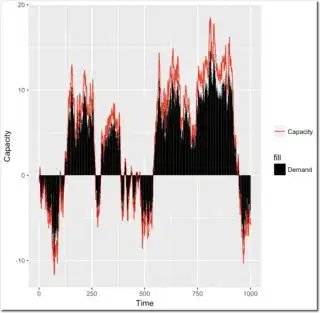
I am attempting to do the following code to get a legend that has a red line for "Capacity" and a black box for "Demand" instead of the legend in the image with a black box with red outline for "Capacity"
ggplot(df, aes(x,y2)) +
  geom_line(aes(x,y2,colour = "Capacity")) +
  geom_col(aes(x,y1,colour="Demand"), fill = "black") +
  theme(axis.ticks.x = element_blank(), axis.text.x = element_blank(), plot.title = element_text(face = "bold", hjust = 0.5)) +
  labs(title = paste("Optimal Schedule", check[[4]], "-", check[[5]], sep = " "), x = "Time (hours)", y = "Driver Hours") +
  ylim(0,max(df$y3)) +
  scale_colour_manual("", values = c("red", "black"), guide = guide_legend(override.aes = list(linetype = c("solid","blank")), shape = c(NA,NA)))
Graph with incorrect legend

